Modern Grotesque Body

Dusty Trail + Bielchon
Creates crisp high-hierarchy contrast beneath Dusty Trail headlines across menus, websites and labels.
Inspect Bielchon specimenDisclosure: MakerFileHub may earn a commission from qualifying purchases via paid links on this page. How our links work.
Notched western capitals with worn faces and a separate edge layer
Dusty Trail is a western slab capital alphabet with notched stems, a worn fill and a separate edge layer, so a word reads as a painted saloon sign with the paint coming off.
Paid link
Get this fontProject & layout blueprintsAt-a-glance maker compatibility
Fine grain and micro-texture excel in 300 DPI print, sublimation, and screen print rather than small vinyl weeding.
Visual anatomy & craft review
The D holds a squared bowl with a notch cut into the top of the stem, the U keeps two stems joined by a shallow base, the S reverses through flat curves and the Y forks with notched arms, all at a heavy even weight with square unbracketed slabs. The notch is the character: it breaks each stem at the same height across the whole word, which keeps the composition reading as one painted board rather than as separate letters. The wear sits inside the fill and the edge layer registers behind it, so a designer can print the sign in two passes and keep the outline clean. The parchment ground, the gold rules, the star and the small caption are presentation; the display face is the two words.
Notched · Western · Wear
Two-font hierarchy recipes
Tested contrast partners — pairing Dusty Trail with grounded secondary typography.
Dusty Trail + Bielchon
Creates crisp high-hierarchy contrast beneath Dusty Trail headlines across menus, websites and labels.
Inspect Bielchon specimen
Dusty Trail + Silken Luxe
Adds a warm human signature touch for 1-to-3-word callouts without competing against structured serif capitals.
Inspect Silken Luxe specimenPractical applications
Concrete hierarchy, scale and production guidance tailored to Dusty Trail’s stroke geometry.
The notched western blocks read on a bottle label at 13 pt and give a small producer the painted-sign register without a custom illustration.
Hierarchy & layout recipe
Print a 55 by 85 mm label: set the brand at 13 pt, set the flavour in a 6 pt caps slab beneath, and keep 6 mm of margin so the notch detail is not cut where the label wraps the bottle curve.
Pre-production check
A notch under 1 mm closes at 13 pt; check the printed label and drop the worn fill below that size rather than the notch.
The heavy notched slabs read at 9 cm on a painted board, and the worn fill gives a venue sign the look of a working ranch rather than a party shop.
Hierarchy & layout recipe
Paint a 700 by 450 mm board: set the greeting at 9 cm across the upper half, set the names in a 4 cm caps slab beneath, and leave 9 cm of border so the notched stems sit clear of the frame.
Pre-production check
Wear painted by hand over a print doubles the texture; check one letter at full size and choose either the print or the paint before the run.
The block weight holds in an embossed patch at 10 mm, and the separate edge layer keeps the outline clean when the fill is pressed into leather.
Hierarchy & layout recipe
Emboss a 70 by 40 mm patch: set the name at 10 mm equivalent height, keep the edge layer at 0.8 mm, and leave 6 mm of margin so the stitched border does not run into the notch.
Pre-production check
A leather die closes a fine notch; check a pressed sample and simplify the notch rather than thickening the whole stem.
Technical & licence verification
Confirm included OTF/TTF/WOFF formats, full glyph tables and licence coverage on the live store page before batch production.
Closest visual alternatives
Matched across letterform anatomy, stroke behaviour and craft applications.
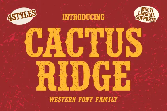
Tall notched Western slabs with small scattered erosion marks
Cactus Ridge shows yellow Western capitals on red, where pinched midsections and long broad slab ends create a tall sign shape and small dark chips interrupt the fill without any complete outline.
Ideas for this font

Condensed western capitals with stem ornaments
Saddlewick is a condensed western slab in dark brown on leather: very tall capitals, squared serifs and small nicked ornaments cut into the stems, with a spur and a star in the counters.
Ideas for this font
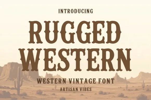
Condensed western serif with spurred stems
Rugged Western is a western display face in warm brown on a pale desert scene: condensed capitals with bracketed slab serifs, small spurs at the joins and a heavy even weight, with cacti and mesas drawn behind the words.
Ideas for this font
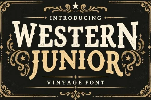
Vintage western slab with scrollwork frame
Western Junior is a vintage western display face in cream and gold on black: rounded slab capitals with small spurs and a dusty surface, set inside an elaborate scrollwork frame with stars, a rule and a banner.
Ideas for this font
Same independent foundry
Allow optional Google Analytics to measure visits and catalogue actions. Your search words and notes are not included. Privacy & storage