Modern Grotesque Body

Varsity Second + Mango Dream
Creates crisp high-hierarchy contrast beneath Varsity Second headlines across menus, websites and labels.
Inspect Mango Dream specimenDisclosure: MakerFileHub may earn a commission from qualifying purchases via paid links on this page. How our links work.
Collegiate block slab display
Varsity Second is a collegiate block in cream and tan on a dark ground: heavy slab capitals with rectangular serifs, wide stems, a flat-topped A and a squared O, stacked with a star rule above and a caption rule below.
Paid link
Get this fontProject & layout blueprintsAt-a-glance maker compatibility
Sturdy stroke walls and open counters weed cleanly on adhesive vinyl, HTV apparel film, and cut cardstock.
Visual anatomy & craft review
The two words are set at the same width and stacked tightly, and the drawing is the classic American collegiate block: the serifs are thick rectangles, the stems are wide, and the letterforms are almost square, so the pair reads as embroidered jacket lettering rather than as a poster face. The only difference between the two lines is colour, which shows the family ships as a multi-weight system for layering. Spacing is very tight, so the serifs of neighbouring letters nearly touch and the lines read as continuous bands, and the counters remain generous enough to keep the word legible at distance. Stars and thin rules bracket the display, and a football graphic sits faintly behind the text at the edges, so the page reads as a team identity plate rather than a type sample.
Collegiate, heavy, bold, athletic
Two-font hierarchy recipes
Tested contrast partners — pairing Varsity Second with grounded secondary typography.
Varsity Second + Mango Dream
Creates crisp high-hierarchy contrast beneath Varsity Second headlines across menus, websites and labels.
Inspect Mango Dream specimen
Varsity Second + Silken Luxe
Adds a warm human signature touch for 1-to-3-word callouts without competing against structured serif capitals.
Inspect Silken Luxe specimenPractical applications
Concrete hierarchy, scale and production guidance tailored to Varsity Second’s stroke geometry.
A collegiate block is the expected voice for school sport, and the heavy slab reads at a distance where a modern sans would thin out.
Hierarchy & layout recipe
Print 1,500 by 700 mm: the school name at 300 mm cap height in two lines, the fixture list in a 45 mm sans, and a 10 mm border. Keep 60 mm between the two display lines so the slab serifs never touch, and print two flat colours.
Pre-production check
Check the gap between the stacked lines at full size, where heavy serifs will collide if the leading is under a quarter of the cap height. Confirm the 45 mm fixture list reads from eight metres and that the border clears the eyelets.
A collegiate face gives alumni merchandise the institutional weight buyers expect, and the tight tracking makes a short word work as a small embroidered mark.
Hierarchy & layout recipe
Embroider a 60 mm chest mark: the word at 14 mm cap height with the serifs simplified for stitch, the association name in a 4 mm sans beneath, and a 2 mm border. Keep the mark inside a 55 mm field so the embroidery frame clears it.
Pre-production check
Check the digitised file, where thin serif details need at least 1.2 mm of stitch width; thicken the serifs for the small mark. Confirm the 4 mm name is legible at reading distance and that the mark holds on both cotton and fleece.
A collegiate block signals the institution without a logo, and the two-colour palette keeps a student magazine cheap to print while looking deliberate.
Hierarchy & layout recipe
Set the masthead at 90 pt across 190 mm, the issue line in a 9 pt sans beneath, and a 1 pt star rule at the foot. Keep the cover to two inks and leave the lower third for a single photograph.
Pre-production check
Check the masthead at 90 pt for serif collisions between letters, where tight tracking on a slab can close the gaps; add 15 units. Confirm the issue line reads at arm's length and that the rule clears the photograph by 10 mm.
Technical & licence verification
Confirm included OTF/TTF/WOFF formats, full glyph tables and licence coverage on the live store page before batch production.
Closest visual alternatives
Matched across letterform anatomy, stroke behaviour and craft applications.
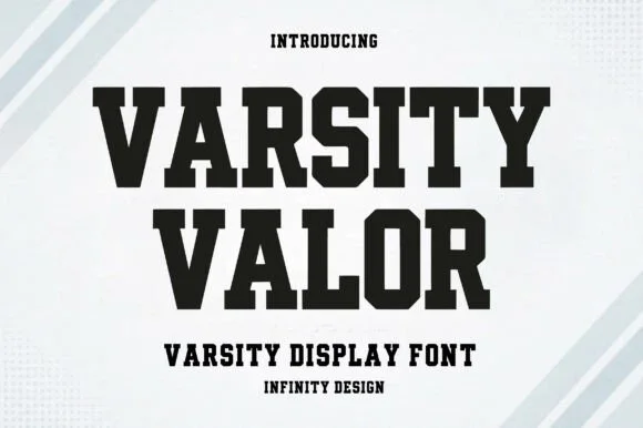
Solid varsity slab with flat serifs
Varsity Valor is a varsity display face in solid black on a pale ground: heavy capitals with thick flat serifs, flat apexes and a tight fit, with a small hatched pattern behind the words and tracked capital lines above and below.
Ideas for this font
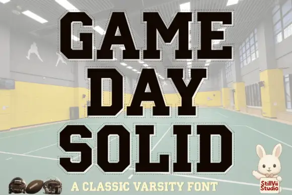
Solid varsity blocks with clipped corners and a dashed cut line around each letter
Game Day is a solid varsity block alphabet in which every letter has clipped corners and a fine dashed line running just inside its edge, so the word reads as a cut-out athletic patch.
Ideas for this font

Clean condensed collegiate slab with heavy slabs and tight fit
Apex Varsity is a clean condensed collegiate slab in which the letters run narrow and tall, the slabs are square and heavy and the fit stays tight, so a long team name holds a single line at a modest size.
Ideas for this font
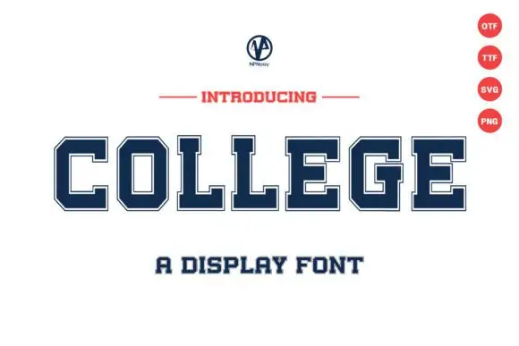
Wide collegiate capitals with thin inset borders and square slabs
College is a wide collegiate capital alphabet in which every letter carries a thin inset border and square slabs, drawn so a single word reads as a team patch.
Ideas for this font
Same independent foundry
Allow optional Google Analytics to measure visits and catalogue actions. Your search words and notes are not included. Privacy & storage