Neutral Sans Workhorse

Viking Ship + Helina
Lets Viking Ship own the focal silhouette while handling secondary copy, sizing and subheads cleanly.
Inspect Helina specimenDisclosure: MakerFileHub may earn a commission from qualifying purchases via paid links on this page. How our links work.
Figure-cut block display
Viking Ship is a black display on a white ground: heavy irregular capitals carrying pale cut-out figures of ships, warriors, shields, hammers and runes, set in two lines with engraved warriors at the sides and a chain of ring patterns drawn along the foot.
Paid link
Get this fontProject & layout blueprintsAt-a-glance maker compatibility
Sturdy stroke walls and open counters weed cleanly on adhesive vinyl, HTV apparel film, and cut cardstock.
Visual anatomy & craft review
The plate is an illustration and a specimen at once, and the two lines show the idea across a set: each capital contains a different figure, so the word reads as a row of windows onto a scene rather than as lettering, and the cut-outs are drawn as pale shapes so the letter stays solid between them. That construction sets a large size floor, because the figures close first. The engraved warriors at the sides and the ring chain along the foot are staging that names the register. It suits a shirt, a poster and a pack label for a historical or a fantasy subject, and it is a device for two words rather than a face for running text.
Decorative, viking, block, illustration
Two-font hierarchy recipes
Tested contrast partners — pairing Viking Ship with grounded secondary typography.
Viking Ship + Helina
Lets Viking Ship own the focal silhouette while handling secondary copy, sizing and subheads cleanly.
Inspect Helina specimen
Viking Ship + Worldstar
Grounds bold display lettering with classic typographic authority on posters, badges and apparel.
Inspect Worldstar specimenPractical applications
Concrete hierarchy, scale and production guidance tailored to Viking Ship’s stroke geometry.
A figure-cut display frames a period cover, and the cut-outs give the title real illustration without a second image. It suits a fantasy release.
Hierarchy & layout recipe
Set the title at 90 mm cap height across 180 mm, the author in a 12 pt serif, and the imprint at 8 pt. Print two colours on a textured stock and keep 20 mm margins.
Pre-production check
Check the title at 90 mm, where a figure can clot; keep the counters open. Confirm the 8 pt imprint survives lamination and that the ring chain clears the trim.
A figure-cut display prints as costume kit, and the illustrations inside the letters read on a shirt where a plain block would look empty.
Hierarchy & layout recipe
Print a 260 mm chest graphic: the night at 58 mm cap height, the year at 24 mm, and one ink on a light shirt. Keep the smallest figure at 4 mm and place the graphic 80 mm below the collar.
Pre-production check
Check the screen at actual mesh, where a 4 mm figure can fill; enlarge it. Wash-test one shirt and confirm the cut-outs stay open after five cycles.
A figure-cut display holds a fair poster, and the illustrations give the event a theme without a photograph of a re-enactor.
Hierarchy & layout recipe
A2 poster: the fair at 100 mm cap height, the dates in a 22 mm sans, and the site at 11 mm. Keep 28 mm margins, print two colours and keep the figures above 3 mm.
Pre-production check
Check the A2 at five metres, where a figure can vanish; keep the largest cut-outs for that distance. Confirm the 11 mm site reads at two metres and that the chain clears the block.
Technical & licence verification
Confirm included OTF/TTF/WOFF formats, full glyph tables and licence coverage on the live store page before batch production.
Closest visual alternatives
Matched across letterform anatomy, stroke behaviour and craft applications.
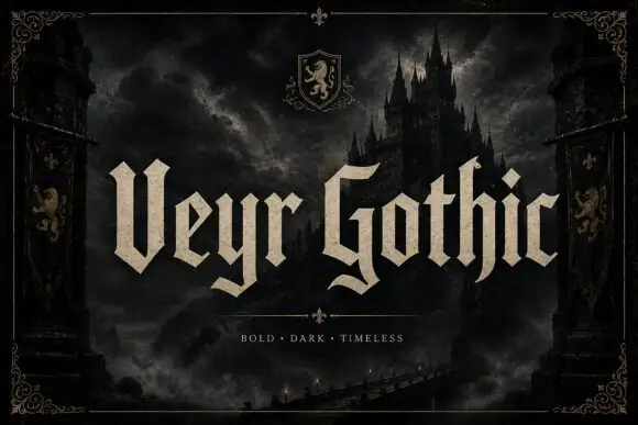
Angular blackletter with paired tips
Veyr Gothic is an angular blackletter in bone on a dark castle scene: capitals with paired V tips, low curled tails, sharp joins and a heavy even stroke, set in two words across the middle of the frame with a small line above and a tracked line beneath a divider.
Ideas for this font
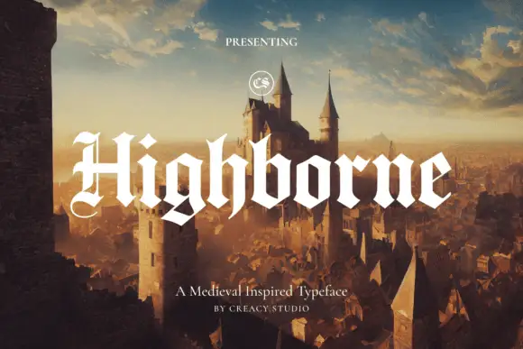
Solid blackletter with divided H and pointed angular shoulders
Highborne sets a solid blackletter across a painted castle town, its strokes rising into sharp peaks, the shoulders angled into points and the first capital divided down the middle.
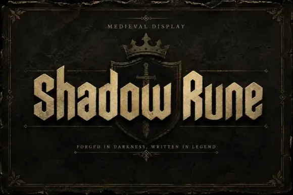
Squared narrow blackletter
Shadow Rune is a squared narrow blackletter in bone on a dark stone ground: capitals with diagonal shoulders, a clipped S, blunt stems and a small scale texture, set as two words across a shield device with a small tracked line above and a plain line beneath.
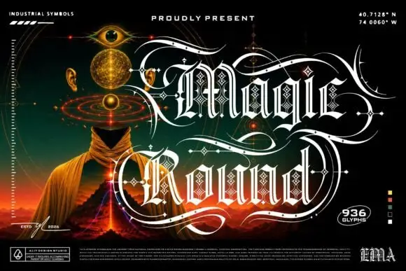
Outlined ornamental blackletter
Magic Round is an outlined ornamental blackletter in white on a dark illustrated scene: letters traced with a double line and filled with a diamond lattice, with huge swashes that sweep beneath and between the words, set in two lines above a landscape of a hooded figure, an eye and a volcano, with small technical marks at the corners.
Same independent foundry
Allow optional Google Analytics to measure visits and catalogue actions. Your search words and notes are not included. Privacy & storage