Neutral Sans Workhorse

Baroque Frame Dingbat + Nyxar
Lets Baroque Frame Dingbat own the focal silhouette while handling secondary copy, sizing and subheads cleanly.
Inspect Nyxar specimenDisclosure: MakerFileHub may earn a commission from qualifying purchases via paid links on this page. How our links work.
Intricate oval baroque frames with curling crowns and fine inner rings
Baroque Frame Dingbats is a set of oval cartouche frames drawn with acanthus scrolls, shell crests and bead mouldings, each one a typable character that can be dropped around a name.
Paid link
Get this fontProject & layout blueprintsAt-a-glance maker compatibility
Sturdy stroke walls and open counters weed cleanly on adhesive vinyl, HTV apparel film, and cut cardstock.
Visual anatomy & craft review
The card shows two rows of frames in a warm cream on a dark chocolate ground, each one an oval opening surrounded by carved ornament: some have a heavy crest at the top, others a pair of scrolls at the sides, and a few carry a pendant at the foot. The line work is fine and even, drawn as a monoline rather than as a shaded engraving, so a frame holds a name at small sizes without turning into a dark ring. The word Baroque Frame sits between the rows in a light roman with a swash on the F, and Dingbats is set beneath it in small spaced caps. The set is meant for stationery, labels and signage where a drawn cartouche would otherwise have to be commissioned, and because the frames are single-weight they print in one ink and cut cleanly from vinyl.
Intricate oval baroque frames with curling crowns and fine inner rings
Two-font hierarchy recipes
Tested contrast partners — pairing Baroque Frame Dingbat with grounded secondary typography.
Baroque Frame Dingbat + Nyxar
Lets Baroque Frame Dingbat own the focal silhouette while handling secondary copy, sizing and subheads cleanly.
Inspect Nyxar specimen
Baroque Frame Dingbat + Amor Hadena
Grounds bold display lettering with classic typographic authority on posters, badges and apparel.
Inspect Amor Hadena specimenPractical applications
Concrete hierarchy, scale and production guidance tailored to Baroque Frame Dingbat’s stroke geometry.
A frame drawn around the names gives a plain card the ornament of an engraved invitation, and the open oval leaves room for the lettering a couple actually needs.
Hierarchy & layout recipe
Print a 148 by 210 mm invitation: open the frame to 75 by 55 mm, set the names at 20 pt inside it, keep 8 mm of clear ground between the lettering and the inner oval, and hold 20 mm from the frame to the card edge.
Pre-production check
Fine scrolls break in letterpress; print one invitation in the intended process and check the crest before the full suite.
The cartouche gives a small box the look of a hand-made confection, and one frame with a name inside it is enough decoration for a plain lid.
Hierarchy & layout recipe
Print a 70 by 50 mm box label: open the frame to 42 by 30 mm, set the house name at 11 pt inside, keep 5 mm of clear ground between the letters and the oval, and hold 5 mm from the frame to the die line.
Pre-production check
The ornament eats the margin on a small label; print one label on the real board and check the pendant at the foot before ordering.
A framed numeral gives a chapter opening a period feel, and the set supplies a dozen variations so a long book does not repeat the same ornament on every page.
Hierarchy & layout recipe
Print a 152 by 229 mm page: open the frame to 22 by 28 mm around the chapter number at 14 pt, keep 16 mm of clear ground beneath before the first line at 11 pt, and hold 22 mm of margin at the top of the page.
Pre-production check
Frames reproduced small lose the shell crest; print one page at the final size and check the numeral still reads first.
Technical & licence verification
Confirm included OTF/TTF/WOFF formats, full glyph tables and licence coverage on the live store page before batch production.
Closest visual alternatives
Matched across letterform anatomy, stroke behaviour and craft applications.
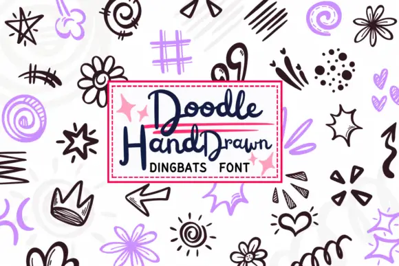
Loose black and lavender doodles with crowns, spirals and sketched bursts
Doodle Hand Drawn is a typable set of loose sketch marks — stars, spirals, flowers, crowns, arrows, lightning, hearts, dashed frames, scribbles — drawn in a quick hand and supplied in black and a soft lilac.
Ideas for this font
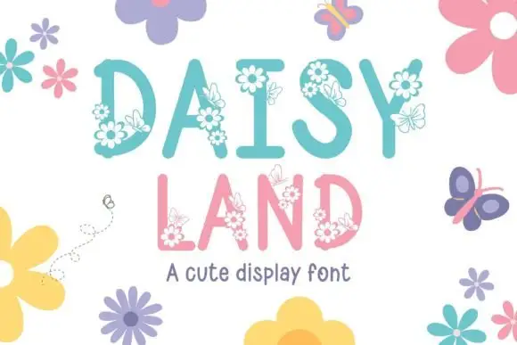
Tall soft capitals carrying small daisy clusters and fine outlined butterflies
Daisy Land is a cute display face in which each capital is a slender pastel letter with drawn daisies, leaves and butterflies attached to its stems, so a word looks like a trellis in flower.
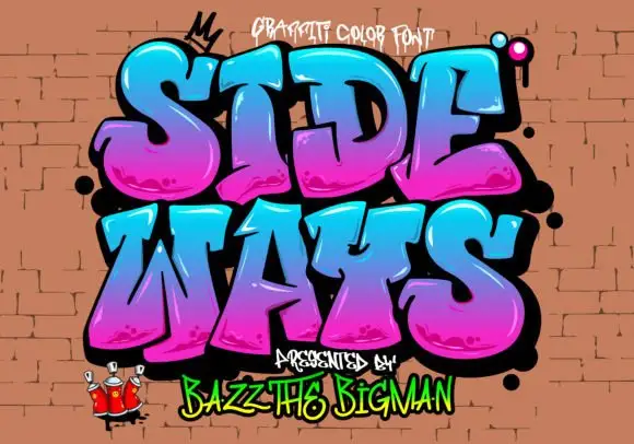
Rounded graffiti blocks with cyan-to-magenta shading and black depth
Sideways is a graffiti colour face in which the letters are fat, tilted blocks with a heavy black outline, a magenta-to-cyan gradient and a soft highlight, presented on a brick wall with sprayed drips.
Ideas for this font
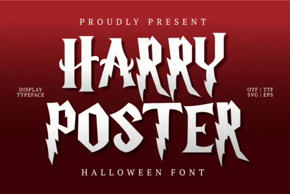
Irregular pointed capitals with lightning-like cuts and long legs
Harry Poster is a fantasy display face whose caps are cut with lightning: the stems break into jagged steps, the terminals end in points and every letter carries a hard shadow offset to one side.
Ideas for this font
Same independent foundry
Allow optional Google Analytics to measure visits and catalogue actions. Your search words and notes are not included. Privacy & storage