Neutral Sans Workhorse

Casey + One More
Lets Casey own the focal silhouette while handling secondary copy, sizing and subheads cleanly.
Inspect One More specimenDisclosure: MakerFileHub may earn a commission from qualifying purchases via paid links on this page. How our links work.
Heavy sans capitals surrounded by closely spaced sharp triangular teeth
Casey is a bold display face whose outer edge is cut into a sawtooth, filled with an orange-to-yellow gradient and outlined in navy, so a word looks cut from a jagged sticker.
Paid link
Get this fontProject & layout blueprintsAt-a-glance maker compatibility
Sturdy stroke walls and open counters weed cleanly on adhesive vinyl, HTV apparel film, and cut cardstock.
Visual anatomy & craft review
CASEY fills the middle of the card on a blue and orange watercolour ground, and each letter is a heavy block with a zigzag edge on every side, a gradient that runs from deep orange at the bottom to yellow at the top, and a navy outline that follows the teeth exactly. The teeth are regular, which is what keeps the face readable: the sawtooth is decoration on the contour, not a change to the letter skeleton. Under the word a line in a plain bold sans names the style, and a second line in small type credits the studio. A script line at the top introduces the face. The design is a poster and sticker face, made for loud announcements, sports graphics and party print, and it needs a large size and generous spacing, because the teeth of two adjacent letters can meet at small sizes and close the gaps between words.
Heavy sans capitals surrounded by closely spaced sharp triangular teeth
Two-font hierarchy recipes
Tested contrast partners — pairing Casey with grounded secondary typography.
Casey + One More
Lets Casey own the focal silhouette while handling secondary copy, sizing and subheads cleanly.
Inspect One More specimen
Casey + Amor Hadena
Grounds bold display lettering with classic typographic authority on posters, badges and apparel.
Inspect Amor Hadena specimenPractical applications
Concrete hierarchy, scale and production guidance tailored to Casey’s stroke geometry.
The jagged edges give a sports poster energy that a clean sans cannot, and the two-tone fill reads across a court from the far side of the net.
Hierarchy & layout recipe
Print an A2 poster: set the event name at 130 pt across two rows, keep 30 mm of clear ground beneath before the time at 15 pt, and hold 28 mm of margin so no sawtooth is cut at the trim.
Pre-production check
The gradient bands on cheap stock; print one poster on the intended paper and check the transition before the run.
The sticker look suits a party sign, and the heavy outline keeps each letter separate on a wall where a thin face would break up.
Hierarchy & layout recipe
Print a 500 by 350 mm board: set the greeting at 90 pt across two rows, keep 24 mm of clear ground between the rows, and hold 26 mm of border so the sawtooth stays whole on every letter.
Pre-production check
Teeth meet when letters are tracked tight; print one board at the final size and check the gaps before the set.
The face reads as a sticker at the size of a shop window, and the jagged contour survives being cut in vinyl where a soft outline would need a bridge.
Hierarchy & layout recipe
Print a 400 by 250 mm window decal: set the shop name at 80 pt on one row, keep 22 mm of clear ground beneath before the street at 12 pt, and hold 24 mm from the teeth to the decal edge.
Pre-production check
Vinyl cuts need clean teeth; print one decal and test the weed before the pair is produced.
Technical & licence verification
Confirm included OTF/TTF/WOFF formats, full glyph tables and licence coverage on the live store page before batch production.
Closest visual alternatives
Matched across letterform anatomy, stroke behaviour and craft applications.
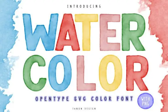
Watercolour-washed block
Watercolor is a colour display on a white ground with loose watercolour washes at the edges: simple rounded capitals, each filled with a translucent-looking wash in blue, red, yellow, pink, green or orange, with a tracked descriptor beneath and a small credit line at the foot.
Ideas for this font
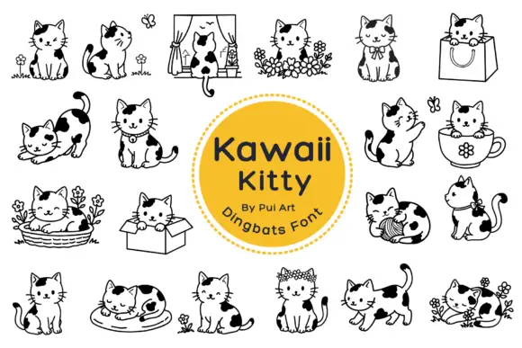
Black-patched kitten outlines in small domestic scenes
Kawaii Kitty Doodle shows black-and-white kittens with rounded heads, dark patches and small whiskers, where a window, a shopping bag, a cup, a basket, a cardboard box and a ball of yarn turn the poses into little scenes, flowers surround several cats and other figures sit alone with an upright or curled tail.
Ideas for this font
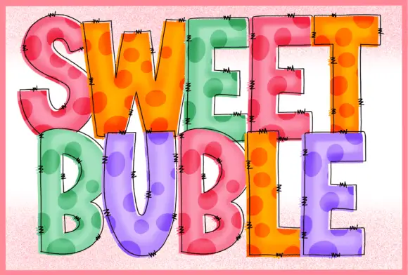
Stitched dotted translucent blocks
Sweet Buble is a colour display on a pale textured ground: tall blocks in pastel pink, orange, green and violet with large darker dots inside, a translucent-looking overlay, fine drawn edge stitches and dark outlines, set in two stacked words.
Ideas for this font
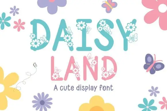
Tall soft capitals carrying small daisy clusters and fine outlined butterflies
Daisy Land is a cute display face in which each capital is a slender pastel letter with drawn daisies, leaves and butterflies attached to its stems, so a word looks like a trellis in flower.
Same independent foundry
Allow optional Google Analytics to measure visits and catalogue actions. Your search words and notes are not included. Privacy & storage