Neutral Sans Workhorse

Watercolor + Godthem
Lets Watercolor own the focal silhouette while handling secondary copy, sizing and subheads cleanly.
Inspect Godthem specimenDisclosure: MakerFileHub may earn a commission from qualifying purchases via paid links on this page. How our links work.
Watercolour-washed block
Watercolor is a colour display on a white ground with loose watercolour washes at the edges: simple rounded capitals, each filled with a translucent-looking wash in blue, red, yellow, pink, green or orange, with a tracked descriptor beneath and a small credit line at the foot.
Paid link
Get this fontProject & layout blueprintsAt-a-glance maker compatibility
Sturdy stroke walls and open counters weed cleanly on adhesive vinyl, HTV apparel film, and cut cardstock.
Visual anatomy & craft review
The plate is a colour-font sheet, and the washes at the edges of the sheet are staging that shows the medium convincingly. The letters are simple rounded blocks with a watercolour fill, and the fill carries the variation — darker at the edges, lighter in the middle — so the word reads as painted rather than as coloured. That construction sets a moderate size floor, because the wash variation turns to a flat tone first, and the plain letterforms keep the faces legible at a size where a textured face would fall apart. The descriptor and the credit are product copy. It suits a card, a tag and a nursery print, and it prints honestly in both ink and digital.
Decorative, watercolour, soft, playful
Two-font hierarchy recipes
Tested contrast partners — pairing Watercolor with grounded secondary typography.
Watercolor + Godthem
Lets Watercolor own the focal silhouette while handling secondary copy, sizing and subheads cleanly.
Inspect Godthem specimen
Watercolor + Raffined
Grounds bold display lettering with classic typographic authority on posters, badges and apparel.
Inspect Raffined specimenPractical applications
Concrete hierarchy, scale and production guidance tailored to Watercolor’s stroke geometry.
A watercolour display keeps a card soft, and the rounded forms read on a white ground where a textured face would look busy.
Hierarchy & layout recipe
A6 card: the greeting at 30 pt, the details in a 10 pt sans, and the date at 9 pt. Keep 15 mm margins, print four colours on a white card and leave 12 mm at the foot for the address.
Pre-production check
Check the 30 pt greeting at home-print resolution, where the wash flattens; keep the edges above 1.2 mm. Confirm the details read at arm's length and that the card folds flat.
A watercolour display suits a nursery, and the soft washes give a print warmth where a flat colour would look clinical. It reads as nursery art.
Hierarchy & layout recipe
Print an A4 print: the name at 45 mm cap height, the date at 10 pt, and four colours on a matte stock. Keep 25 mm margins and frame with a 40 mm mount.
Pre-production check
Check the print at A4, where a wash edge can band; keep the gradients above 1 mm. Confirm the 10 pt date reads at arm's length and that the print sits square in the mount.
A watercolour tag finishes a gift, and the pastel washes suit a soft palette better than a saturated one. It suits a soft palette.
Hierarchy & layout recipe
Print 45 by 70 mm tags: the name at 12 pt, the year at 8 pt, and four colours on a white card. Keep 5 mm inside the die, keep the washes above 0.8 mm and punch clear of a letter.
Pre-production check
Check the 12 pt name on a tag, where a wash closes; keep it above 0.8 mm. Confirm the year reads at arm's length and that the tags tie cleanly.
Technical & licence verification
Confirm included OTF/TTF/WOFF formats, full glyph tables and licence coverage on the live store page before batch production.
Closest visual alternatives
Matched across letterform anatomy, stroke behaviour and craft applications.
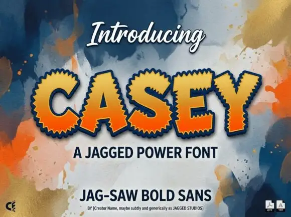
Heavy sans capitals surrounded by closely spaced sharp triangular teeth
Casey is a bold display face whose outer edge is cut into a sawtooth, filled with an orange-to-yellow gradient and outlined in navy, so a word looks cut from a jagged sticker.
Ideas for this font
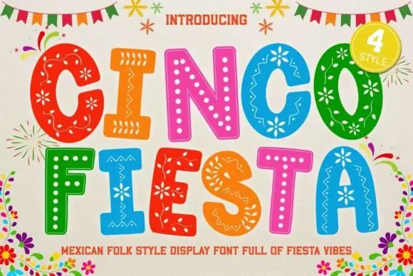
Bold festive capitals with dotted folk-style patterns
Cinco Fiesta uses broad capitals filled with floral, dotted and zigzag motifs, where each coloured letter carries a different internal pattern while keeping a strong outer silhouette.
Ideas for this font
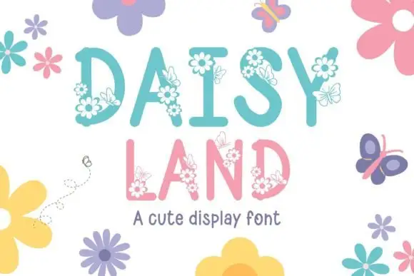
Tall soft capitals carrying small daisy clusters and fine outlined butterflies
Daisy Land is a cute display face in which each capital is a slender pastel letter with drawn daisies, leaves and butterflies attached to its stems, so a word looks like a trellis in flower.
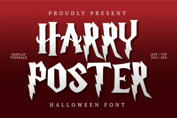
Irregular pointed capitals with lightning-like cuts and long legs
Harry Poster is a fantasy display face whose caps are cut with lightning: the stems break into jagged steps, the terminals end in points and every letter carries a hard shadow offset to one side.
Ideas for this font
Same independent foundry
Allow optional Google Analytics to measure visits and catalogue actions. Your search words and notes are not included. Privacy & storage