Modern Grotesque Body

Elden Rue + Memoir Slang
Creates crisp high-hierarchy contrast beneath Elden Rue headlines across menus, websites and labels.
Inspect Memoir Slang specimenDisclosure: MakerFileHub may earn a commission from qualifying purchases via paid links on this page. How our links work.
Bold display serif with wide bowls and a low contrast
Elden Rue is a bold display serif in which the bowls run wide, the contrast stays low and the serifs stay blunt, so a two-word title reads as a confident printed masthead rather than as a delicate one.
Paid link
Get this fontProject & layout blueprintsAt-a-glance maker compatibility
Sturdy stroke walls and open counters weed cleanly on adhesive vinyl, HTV apparel film, and cut cardstock.
Visual anatomy & craft review
The E stacks three wide arms, the l rises on a thick stem, the d closes a broad bowl, the e turns a heavy eye, the n keeps two wide stems and the R turns a blunt leg, all at a bold weight with low contrast and short, solid serifs. The width is the character: the face fills a line without stretching, which is why the sample sets two words stacked with a drawing alongside and no other type. Because the counters stay open and the weight is even, the face reads from 20 pt and holds a poster at 150 pt, and it prints in one ink. The cream ground, the drawn dog, the rule at the foot and the small credits are presentation; the green display words are the face.
Bold · Display serif · Wide
Two-font hierarchy recipes
Tested contrast partners — pairing Elden Rue with grounded secondary typography.
Elden Rue + Memoir Slang
Creates crisp high-hierarchy contrast beneath Elden Rue headlines across menus, websites and labels.
Inspect Memoir Slang specimen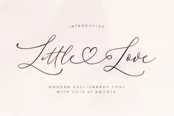
Elden Rue + Little Love
Adds a warm human signature touch for 1-to-3-word callouts without competing against structured serif capitals.
Inspect Little Love specimenPractical applications
Concrete hierarchy, scale and production guidance tailored to Elden Rue’s stroke geometry.
The wide bowls give a masthead presence without a hairline to lose, and the low contrast prints evenly on uncoated stock at 90 pt.
Hierarchy & layout recipe
Print an A4 cover: set the masthead at 90 pt across the upper third, keep 22 mm of margin at each side, and set the issue line in a 9 pt caps sans 20 mm beneath.
Pre-production check
A bold serif at 90 pt on newsprint fills its counters; check the proof and keep the sheet smooth if the word looks solid.
The bold serif reads from the far end of a counter, and the wide bowls keep a two-word bakery name clear at 20 pt on a paper bag.
Hierarchy & layout recipe
Print a bag panel: set the bakery name at 20 pt, set the product line in a 7 pt sans beneath, and keep 8 mm of margin so the wide bowls sit clear of the fold.
Pre-production check
A fold through a wide bowl cracks the print; check the bag and keep the word on a flat panel.
The bold serif suits a printed school annual, and the low contrast stays legible at 40 pt on a page printed in a single ink.
Hierarchy & layout recipe
Print an A4 page: set the header at 40 pt across the top, set the year in a 12 pt caps beneath, and keep 18 mm of margin so the block sits inside the trim.
Pre-production check
One-ink printing of a bold serif can look flat; check the page and keep the header at 40 pt or above for contrast.
Technical & licence verification
Confirm included OTF/TTF/WOFF formats, full glyph tables and licence coverage on the live store page before batch production.
Closest visual alternatives
Matched across letterform anatomy, stroke behaviour and craft applications.
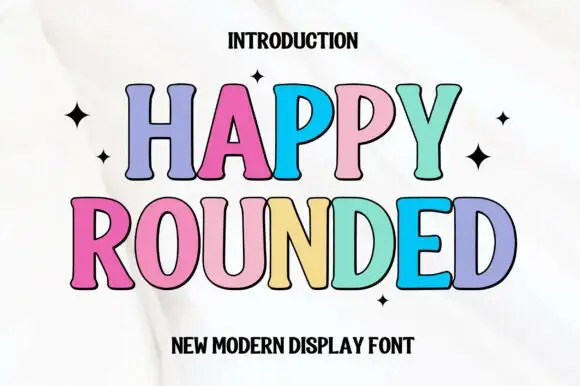
Tall display capitals with softly flared ends and gently bowed stems
Happy Rounded is a tall display serif in which the stems bow gently, the ends flare into soft spurs and the bowls stay wide, so a greeting reads as friendly lettering rather than as a formal title.
Ideas for this font
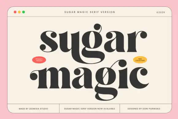
Funky fat serif display
Sugar Magic is a funky fat serif display in near-black on a warm cream panel: very heavy stems, ball terminals, swollen bowls and a lower line with a long connecting swash, set across two lines inside a rule frame with two small oval badges and a footer row of tracked notes.
Ideas for this font
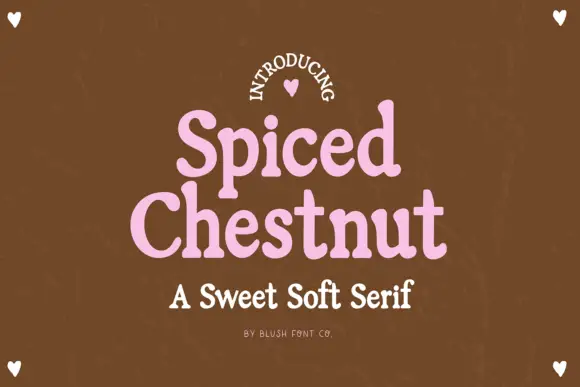
Sweet soft serif with rounded serifs
Spiced Chestnut is a sweet soft serif in pink on brown: heavy rounded letters with softened slab serifs, generous curves and a comfortable weight, set as two stacked words with a line beneath in the same family.
Ideas for this font
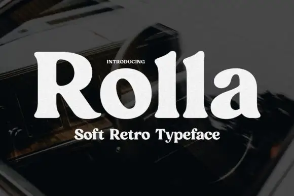
Soft retro serif display
Rolla is a soft retro serif in cream on a dark blurred ground: a single heavy weight, rounded bracket where the serifs meet the stems, a large x-height, and letters that are wide and generous without any ornament.
Ideas for this font
Same independent foundry
Allow optional Google Analytics to measure visits and catalogue actions. Your search words and notes are not included. Privacy & storage



