Modern Grotesque Body

Cowboy Block + Cultivo
Creates crisp high-hierarchy contrast beneath Cowboy Block headlines across menus, websites and labels.
Inspect Cultivo specimenDisclosure: MakerFileHub may earn a commission from qualifying purchases via paid links on this page. How our links work.
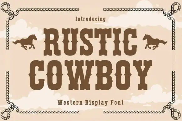
Heavy western serif capitals with middle notches and square slabs
Cowboy Block is a heavy western capital alphabet whose stems and slabs carry small notches cut through the middle, so a word reads like a carved saloon sign rather than a plain slab.
Paid link
Get this fontProject & layout blueprintsAt-a-glance maker compatibility
Sturdy stroke walls and open counters weed cleanly on adhesive vinyl, HTV apparel film, and cut cardstock.
Visual anatomy & craft review
Every letter is wide and heavy: the C opens to a deep square bracket, the O closes around a small oval counter, the W holds four heavy diagonals joined at square vertices and the B keeps two stacked bowls of equal depth. The distinguishing feature is the notch, a small rectangular cut through the middle of the stems and the slab serifs on several letters, which is what gives the face its period wood-type look. Slabs are plain and square with no bracketing, the fit is tight and the weight is uniform from stroke to stroke. Counters stay small, so a word reads as a solid block at a distance. The sand ground, the cacti, the two drawn frames and the two caption lines are presentation; the typeface is the words and the alphabet above them.
Western · Heavy · Notched
Two-font hierarchy recipes
Tested contrast partners — pairing Cowboy Block with grounded secondary typography.
Cowboy Block + Cultivo
Creates crisp high-hierarchy contrast beneath Cowboy Block headlines across menus, websites and labels.
Inspect Cultivo specimen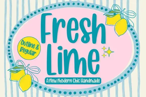
Cowboy Block + Fresh Lime
Adds a warm human signature touch for 1-to-3-word callouts without competing against structured serif capitals.
Inspect Fresh Lime specimenPractical applications
Concrete hierarchy, scale and production guidance tailored to Cowboy Block’s stroke geometry.
The western weight reads across a field and gives a painted board the look of a hand-carved sign, and the notches supply the detail a rustic venue wants without ornament.
Hierarchy & layout recipe
Set the greeting at 16 cm on a 900 by 600 mm board, set the names in a plain serif at 7 cm, and leave 12 cm of margin so the heavy slabs stay clear of a frame.
Pre-production check
Painted notches fill with a second coat; check the finished board in daylight and keep the notch open by at least 4 mm at full size.
The wood-type construction gives a feature its period voice, and the tight fit lets a long name hold a single headline line at magazine size.
Hierarchy & layout recipe
Set the header at 54 pt on the opening spread, keep the body in a 10 pt serif at 13 pt leading, and hold 18 mm below the header so the heavy slabs do not crowd the text.
Pre-production check
Heavy slabs on uncoated paper gain ink and close their notches; check the press sheet and keep the header at 50 pt if the notches begin to fill.
A western slab on a bottle signals slow-smoked, small-batch product, and the small counters keep the name readable on a 40 mm label panel.
Hierarchy & layout recipe
Set the brand at 14 pt on a 45 by 80 mm label, keep the heat level in a 6 pt sans, and leave 5 mm of margin so the notches do not touch the label border.
Pre-production check
Printing a notched slab on a curved bottle squeezes the centre letters; check a printed label wrapped on the actual bottle and open the fit if the letters touch.
Technical & licence verification
Confirm included OTF/TTF/WOFF formats, full glyph tables and licence coverage on the live store page before batch production.
Closest visual alternatives
Matched across letterform anatomy, stroke behaviour and craft applications.
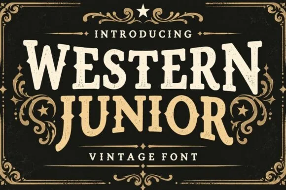
Vintage western slab with scrollwork frame
Western Junior is a vintage western display face in cream and gold on black: rounded slab capitals with small spurs and a dusty surface, set inside an elaborate scrollwork frame with stars, a rule and a banner.
Ideas for this font
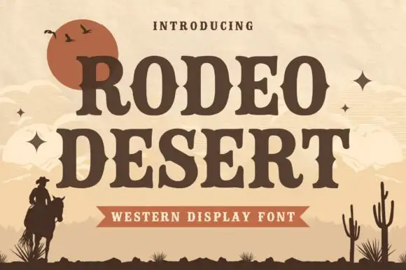
Western slab with desert setting
Rodeo Desert is a western slab in dark brown on sand: heavy bracketed serifs, spurred stems, a notched crossbar, and a composition framed by a low sun, dunes, a rider and cacti, so the pair reads as a printed rodeo poster rather than a modern slab.
Ideas for this font
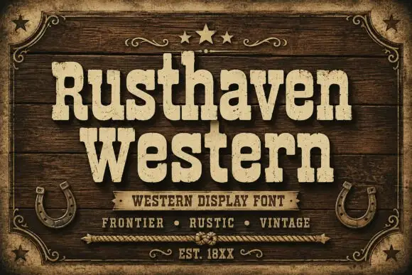
Weathered western slab display
Rusthaven Western is a weathered western slab in cream on dark timber: heavy slabs with softened corners, a chipped edge and a speckled fill, set in two lines with a ribbon banner, stars and horseshoes, so the pair reads as a brand burned into a barn door.
Ideas for this font
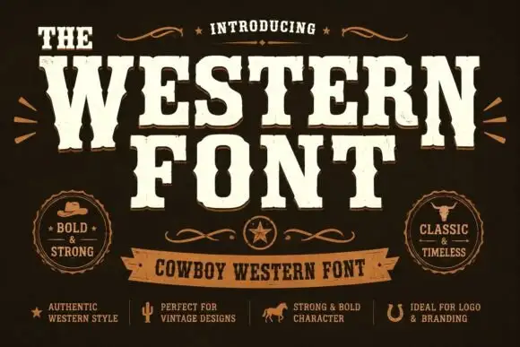
Heavy western capitals with pinched sides
The Western is a heavy western display in cream on dark brown: tall capitals with pinched waists, wedge serifs and a rough printed edge, laid out with a ribbon banner and two round badges.
Ideas for this font
Same independent foundry
Allow optional Google Analytics to measure visits and catalogue actions. Your search words and notes are not included. Privacy & storage