Editorial Serif Anchor

Baseball Classic + Gorga
Anchors Baseball Classic's fluid strokes with crisp Roman proportions on wedding suites, headers and packaging.
Inspect Gorga specimenDisclosure: MakerFileHub may earn a commission from qualifying purchases via paid links on this page. How our links work.
Thick retro sports script with high contrast and a lean
Baseball Classic is a thick retro sports script that leans forward, its downstrokes heavy and its joins thin, with looped capitals on both words and a small ball terminal at the exits.
Paid link
Get this fontProject & layout blueprintsAt-a-glance maker compatibility
Weld or Unite overlapping script joins into one continuous vector path before sending to the blade.
Visual anatomy & craft review
The capital B rises in a narrow loop above the cap line and then descends into a heavy stem, and the wide bowls that follow keep the word leaning without tipping over. The second word begins with a capital C of the same construction, so the two lines share a silhouette. Contrast is high but not delicate: downstrokes are heavy and the joins are thin enough to read as a pen moving between letters, and every exit finishes with a small round terminal, which is the detail that makes the face look like 1970s sports lettering rather than a modern script. The counters are small and the letters fit tightly, so a team name reads as a dense block. The pale ground, the brush strokes behind the words and the tracked caps lines are presentation; the script is the two words.
Retro · Athletic · Contrasted
Two-font hierarchy recipes
Tested contrast partners — pairing Baseball Classic with grounded secondary typography.
Baseball Classic + Gorga
Anchors Baseball Classic's fluid strokes with crisp Roman proportions on wedding suites, headers and packaging.
Inspect Gorga specimen
Baseball Classic + Modern Limited
Keeps small-scale dates, URLs, nutrition facts and care instructions crisp and legible below script titles.
Inspect Modern Limited specimenPractical applications
Concrete hierarchy, scale and production guidance tailored to Baseball Classic’s stroke geometry.
A retro sports script signals the bar's theme in one word, and the heavy downstrokes hold up on a dark painted sign where a fine script would disappear.
Hierarchy & layout recipe
Set the bar name at 40 cm on a 2.5 m fascia, keep the food and drink categories in a tracked caps grotesque at 8 cm, and keep 20 cm of margin so the lean is not cut by the panel edge.
Pre-production check
Painted lettering on a fascia is applied to a curved surface on older buildings; check a paper template at full size before the signwriter starts.
The thick retro script reads at a distance on a shirt back and holds up when it is screen printed in one colour, which is what most school sports budgets allow.
Hierarchy & layout recipe
Set the team name at 120 mm wide across a 300 mm back panel, keep the number in a bold block at 150 mm, and leave 20 mm between the two so the script's underline does not touch the numeral.
Pre-production check
Screen printing on a shirt stretches the ink with the fabric; check the first pull on the actual garment and open the tightest join before the run.
A retro sports script places a feature in its decade immediately, and the heavy weight holds its own against large archive photographs on the same spread.
Hierarchy & layout recipe
Set the header at 50 pt on the opening spread, keep the standfirst in a 10 pt serif with 13 pt leading, and hold 20 mm between the header and the text so the lean has clear space.
Pre-production check
Heavy script over a halftone photograph will clot; check the proof at final size and keep the header on the plain margin rather than the image.
Technical & licence verification
Confirm included OTF/TTF/WOFF formats, full glyph tables and licence coverage on the live store page before batch production.
Closest visual alternatives
Matched across letterform anatomy, stroke behaviour and craft applications.
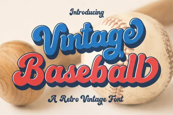
Retro layered script with an offset
Vintage Baseball is a retro script in blue and red with a navy keyline and offset: thick rounded strokes, a tight loop on the V and the B, and a shadow that sits behind each word at a fixed distance.
Ideas for this font
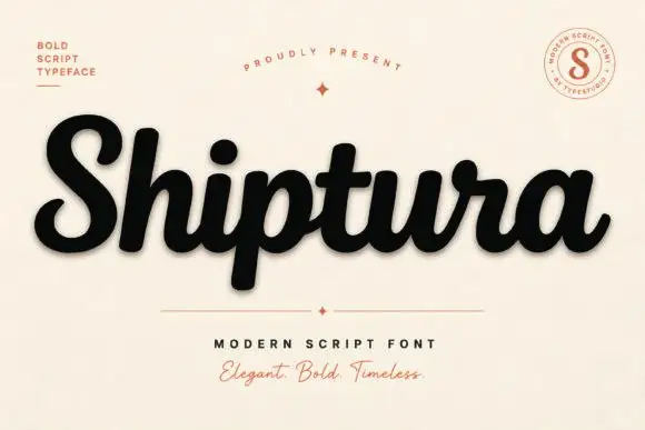
Bold connected script with a slight slant
Shiptura is a bold modern script in black with a soft shadow on cream: thick connected letters with rounded bowls, a slight rightward slant, blunt entry strokes and a small tail on the final letter, presented between two tracked capital lines and a round badge.
Ideas for this font
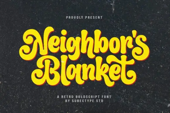
Heavy retro script with curled capitals
Neighbor's Blanket is a heavy retro script in bright yellow with a warm offset shadow, drawn with curled ball terminals and tight interlocking bowls on a chalky black ground.
Ideas for this font
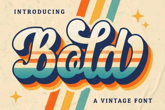
Heavy rounded vintage script with layered colour bands and a deep bounce
Bold Script is a heavy rounded vintage script whose strokes are thick and blunt, with a deep bounce across the baseline and a layered three-colour band running through the letters.
Ideas for this font
Same independent foundry
Allow optional Google Analytics to measure visits and catalogue actions. Your search words and notes are not included. Privacy & storage