Modern Grotesque Body

Rusted Letter + Limited Coffee
Creates crisp high-hierarchy contrast beneath Rusted Letter headlines across menus, websites and labels.
Inspect Limited Coffee specimenDisclosure: MakerFileHub may earn a commission from qualifying purchases via paid links on this page. How our links work.
Vintage grunge slab caps
Rusted Letter is a vintage grunge slab in cream on navy: heavy bracketed serifs, wide caps, and a corroded texture that eats into the edges and speckles the interiors, framed with hairline ornaments and two stars, so the pair reads as a stamped shipping crate rather than a modern slab.
Paid link
Get this fontProject & layout blueprintsAt-a-glance maker compatibility
Fine grain and micro-texture excel in 300 DPI print, sublimation, and screen print rather than small vinyl weeding.
Visual anatomy & craft review
Two lines are stacked and the drawing is a wide slab with the damage built in: the serifs are heavy and bracketed, the stems flare slightly, and the surface is broken by pits and chips at a consistent scale, which is what makes the two words read as the same stencil struck twice. Because the texture is even, the word still resolves at a distance, and the counters stay open enough that the corrosion never closes a letter. Spacing is generous, so each word reads as its own line rather than a block, and the specimen frames the pair with hairline rules, small corner flourishes and a tracked caption between two stars. The ground is a weathered navy panel, which gives the cream enough contrast to hold the texture.
Grunge, vintage, slab, textured
Two-font hierarchy recipes
Tested contrast partners — pairing Rusted Letter with grounded secondary typography.
Rusted Letter + Limited Coffee
Creates crisp high-hierarchy contrast beneath Rusted Letter headlines across menus, websites and labels.
Inspect Limited Coffee specimen
Rusted Letter + Abigail
Adds a warm human signature touch for 1-to-3-word callouts without competing against structured serif capitals.
Inspect Abigail specimenPractical applications
Concrete hierarchy, scale and production guidance tailored to Rusted Letter’s stroke geometry.
A corroded slab reads as a stamped crate, which suits a roaster selling by weight, and the texture hides the small variations of a short print run on kraft stock.
Hierarchy & layout recipe
Print a 70 by 100 mm label: the origin at 18 pt, the roast in a 7 pt sans, and the weight at 6 pt. Keep 5 mm inside the die and print one ink on a kraft stock so the pits read as part of the paper.
Pre-production check
Check the 18 pt origin on kraft, where the texture can turn into noise; use the cleaner cut at that size. Confirm the 6 pt weight reads on the shelf and that the label survives a sealed bag.
A corroded slab frames a maritime history as a salvaged object, and the texture gives a cover material presence without a photograph.
Hierarchy & layout recipe
Set the title at 90 mm cap height across 230 mm, the subtitle in a 12 pt roman, and the author at 9 pt caps. Print cream on a deep ground with a matte finish and keep the ornament to one hairline frame.
Pre-production check
Check the title at thumbnail size, where the corrosion reduces contrast; keep the cream light and the ink solid. Confirm the 9 pt author survives the laminate and that the frame clears the trim by 10 mm.
A grunge slab sets a vintage tone in one ink, and the texture means a home-printed card looks intentional rather than under-inked.
Hierarchy & layout recipe
A6 card: the phrase at 30 pt, the details in a 9 pt sans, and a 4 mm frame. Keep 12 mm margins and print one ink on a cream card so the pits stay visible at card size.
Pre-production check
Check the 30 pt phrase on a home printer, where the pits can fill; use the cleaner cut at that size. Confirm the 9 pt details keep a 4.5:1 contrast and that the frame does not crowd the descenders.
Technical & licence verification
Confirm included OTF/TTF/WOFF formats, full glyph tables and licence coverage on the live store page before batch production.
Closest visual alternatives
Matched across letterform anatomy, stroke behaviour and craft applications.
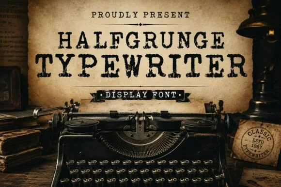
Rough-stamped grunge display typewriter slab
Halfgrunge Typewriter is a wide, muscular uppercase typewriter display font roughened with pitted metal-stamp texture and irregular edges.
Ideas for this font
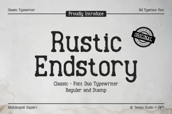
Two-cut vintage typewriter duo (Regular & Stamp)
Rustic Endstory is a two-style vintage typewriter family offering both a clean Regular cut and a weathered Stamp cut for flexible craft work.
Ideas for this font
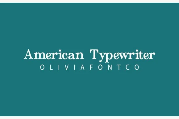
Bouncy hand-inked rounded typewriter slab
American Typewriter (by OliviaFontCo) is a soft, hand-drawn rounded slab-serif font with gentle baseline bounce and cozy craft appeal.
Ideas for this font
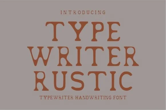
Warm hand-stamped terracotta rustic typewriter serif
Typewriter Rustic is a chunky, hand-stamped organic typewriter slab serif with soft ink-bleed curves built for cozy cottage and apothecary labels.
Ideas for this font
Same independent foundry
Allow optional Google Analytics to measure visits and catalogue actions. Your search words and notes are not included. Privacy & storage