Neutral Sans Workhorse

Funk Trip + Nyxar
Lets Funk Trip own the focal silhouette while handling secondary copy, sizing and subheads cleanly.
Inspect Nyxar specimenDisclosure: MakerFileHub may earn a commission from qualifying purchases via paid links on this page. How our links work.
Soft irregular capitals with branching lobes and pinched internal spaces
Funk Trip is a groovy vintage display face whose letters are built from rounded lobes, so each glyph looks poured rather than drawn, with alternating cream, teal and orange across the word.
Paid link
Get this fontProject & layout blueprintsAt-a-glance maker compatibility
Sturdy stroke walls and open counters weed cleanly on adhesive vinyl, HTV apparel film, and cut cardstock.
Visual anatomy & craft review
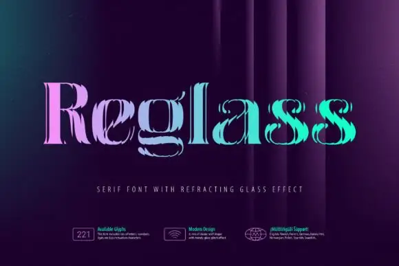
FUNK over TRIP fills the middle of a dark navy card, and the letters are the shape of the idea: fat rounded forms with two or three lobes each, no straight line anywhere, and terminals that swell before they end. The first row alternates cream, teal and orange and the second reverses the order, so the two rows read as one woven block. Behind the words large soft circles repeat at very low contrast, and along the foot three small panels in a fine mono face list the glyph count, the design note and the language support, each with a tiny drawn icon. The face is decorative in the strict sense: it carries no small details, so it holds at poster size and becomes a row of blobs at text size. It suits record sleeves, food packaging, party prints and anything that wants a washed-out summer palette rather than a hard edge.
Soft irregular capitals with branching lobes and pinched internal spaces
Two-font hierarchy recipes
Tested contrast partners — pairing Funk Trip with grounded secondary typography.
Funk Trip + Nyxar
Lets Funk Trip own the focal silhouette while handling secondary copy, sizing and subheads cleanly.
Inspect Nyxar specimen
Funk Trip + Worldstar
Grounds bold display lettering with classic typographic authority on posters, badges and apparel.
Inspect Worldstar specimenPractical applications
Concrete hierarchy, scale and production guidance tailored to Funk Trip’s stroke geometry.
The soft lobes carry a seventies mood that suits a long summer evening, and the two-colour rows fill a poster with shape instead of a photograph.
Hierarchy & layout recipe
Print a 420 by 594 mm poster: set the event name at 180 pt across two rows, keep 36 mm of clear ground beneath before the line-up at 16 pt, and hold 30 mm of margin so the swollen terminals stay whole.
Pre-production check
Thin reverse out of a dark ground closes the gaps between lobes; print one poster and check the trap before the run.
The rounded shapes suggest fruit and fizz without an illustration, and the soft palette separates the bottle from the hard-edged labels on the same shelf.
Hierarchy & layout recipe
Print a 60 by 95 mm can label: set the drink name at 26 pt on one row, keep 9 mm of clear ground beneath before the volume at 5 pt, and hold 6 mm from the widest lobe to the label edge.
Pre-production check
Curved cans distort the outer letters; print one label and wrap it on the actual can before the run is placed.
The palette does the decorating for a themed party, and one word across a board replaces a banner, a garland and a printed backdrop at once.
Hierarchy & layout recipe
Print a 700 by 500 mm board: set the greeting at 120 pt across two rows, keep 26 mm of clear ground between the rows, and hold 32 mm of border so no lobe touches the edge of the board.
Pre-production check
Warm inks drift towards green on foam board; print one board and compare the orange with the digital file before the set.
Technical & licence verification
Confirm included OTF/TTF/WOFF formats, full glyph tables and licence coverage on the live store page before batch production.
Closest visual alternatives
Matched across letterform anatomy, stroke behaviour and craft applications.
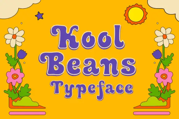
Soft retro mixed case with curled terminals and bulbous bowls
Kool Beans sets a fat seventies serif with bulbous serifs and curled terminals in purple on cream, then letter-spaces it loosely across three rows that bounce along a soft curve.
Ideas for this font
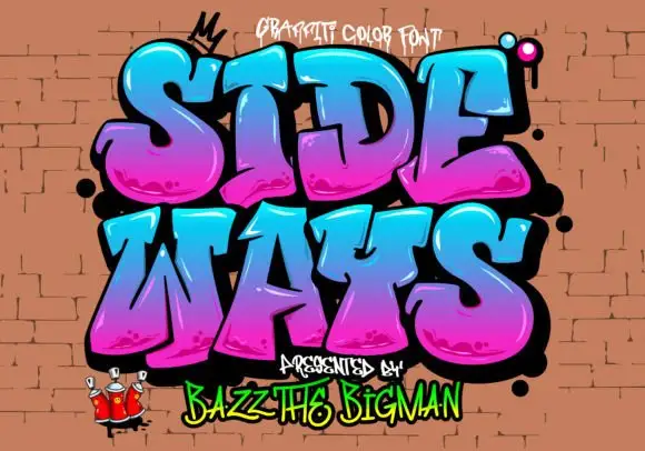
Rounded graffiti blocks with cyan-to-magenta shading and black depth
Sideways is a graffiti colour face in which the letters are fat, tilted blocks with a heavy black outline, a magenta-to-cyan gradient and a soft highlight, presented on a brick wall with sprayed drips.
Ideas for this font
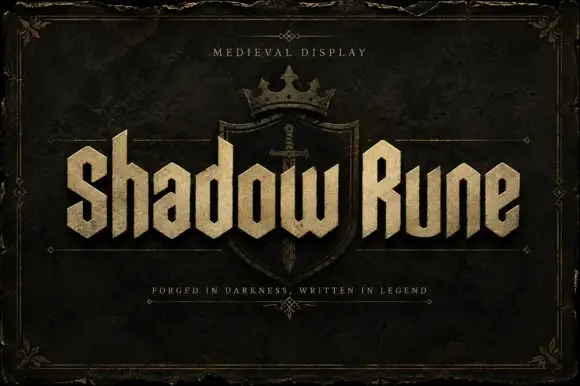
Squared narrow blackletter
Shadow Rune is a squared narrow blackletter in bone on a dark stone ground: capitals with diagonal shoulders, a clipped S, blunt stems and a small scale texture, set as two words across a shield device with a small tracked line above and a plain line beneath.
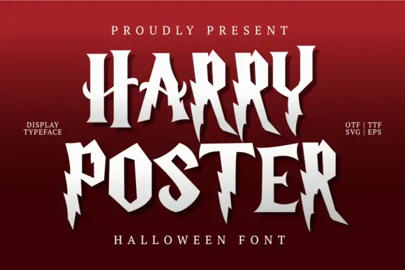
Irregular pointed capitals with lightning-like cuts and long legs
Harry Poster is a fantasy display face whose caps are cut with lightning: the stems break into jagged steps, the terminals end in points and every letter carries a hard shadow offset to one side.
Ideas for this font
Same independent foundry
Allow optional Google Analytics to measure visits and catalogue actions. Your search words and notes are not included. Privacy & storage