Neutral Sans Workhorse

Kool Beans + Bielchon
Lets Kool Beans own the focal silhouette while handling secondary copy, sizing and subheads cleanly.
Inspect Bielchon specimenDisclosure: MakerFileHub may earn a commission from qualifying purchases via paid links on this page. How our links work.
Soft retro mixed case with curled terminals and bulbous bowls
Kool Beans sets a fat seventies serif with bulbous serifs and curled terminals in purple on cream, then letter-spaces it loosely across three rows that bounce along a soft curve.
Paid link
Get this fontProject & layout blueprintsAt-a-glance maker compatibility
Sturdy stroke walls and open counters weed cleanly on adhesive vinyl, HTV apparel film, and cut cardstock.
Visual anatomy & craft review
The words sit on a hot orange ground framed by cartoon daisies, tulips and pink blooms in terracotta pots, with a sun, clouds and small stars filling the corners. Each letter carries a cream outline inside a purple fill, and the shapes swell at the stems and pinch at the joins so the word looks inflated rather than drawn. The baseline wanders on purpose and the three rows step in and out, which is what gives the sample its poster energy. Because the face is a colour font with an outline, it needs contrast behind it and it needs size; shrunk to a label, the outline eats the fill and the curls become noise.
Soft retro mixed case with curled terminals and bulbous bowls
Two-font hierarchy recipes
Tested contrast partners — pairing Kool Beans with grounded secondary typography.
Kool Beans + Bielchon
Lets Kool Beans own the focal silhouette while handling secondary copy, sizing and subheads cleanly.
Inspect Bielchon specimen
Kool Beans + Medvilea Editorial
Grounds bold display lettering with classic typographic authority on posters, badges and apparel.
Inspect Medvilea Editorial specimenPractical applications
Concrete hierarchy, scale and production guidance tailored to Kool Beans’s stroke geometry.
The bulbous shapes and the outlined fill carry the decade without a photograph, and the stacked rows fill a poster with one short phrase.
Hierarchy & layout recipe
Print an A2 poster: set the three rows at 96 pt, keep 26 mm of clear ground beneath before the date at 18 pt, and keep 28 mm of border so the curls stay inside the sheet.
Pre-production check
The outline needs a contrasting ground; check the proof against your chosen paper colour first.
The bouncy lettering keeps a number-and-name card light, and the fat shapes stay readable on a folded card held in the hand.
Hierarchy & layout recipe
Print a 148 by 105 mm card: set the greeting at 38 pt across two rows, keep 14 mm of clear ground beneath before the details at 9 pt, and keep 12 mm of margin on each side of the fold.
Pre-production check
Curled terminals take space; check the longest word at final size before the card print run.
The seventies shapes give a cart a period look that photographs well, and a two-word flavour name fits the fat letters at cart size.
Hierarchy & layout recipe
Print a 200 by 300 mm cart panel: set the flavour at 54 pt on one row, keep 18 mm of clear ground beneath before the price at 16 pt, and keep 20 mm of border around the panel.
Pre-production check
Outlines merge at small sizes; check the panel proof before the cart is sign-written by hand.
Technical & licence verification
Confirm included OTF/TTF/WOFF formats, full glyph tables and licence coverage on the live store page before batch production.
Closest visual alternatives
Matched across letterform anatomy, stroke behaviour and craft applications.
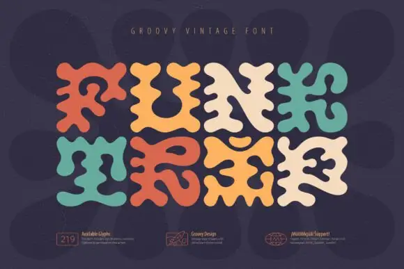
Soft irregular capitals with branching lobes and pinched internal spaces
Funk Trip is a groovy vintage display face whose letters are built from rounded lobes, so each glyph looks poured rather than drawn, with alternating cream, teal and orange across the word.
Ideas for this font
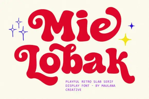
Bulbous retro mixed case with long curled entry and exit strokes
Mie Lobak sets a fat retro slab in deep red, its stems swollen, its serifs rounded into bulbs and several letters finishing in a curl, so the word looks hand-painted on a shopfront.
Ideas for this font
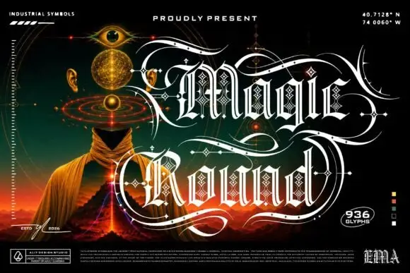
Outlined ornamental blackletter
Magic Round is an outlined ornamental blackletter in white on a dark illustrated scene: letters traced with a double line and filled with a diamond lattice, with huge swashes that sweep beneath and between the words, set in two lines above a landscape of a hooded figure, an eye and a volcano, with small technical marks at the corners.
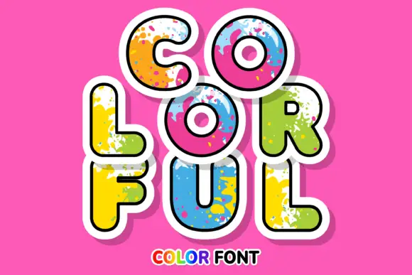
Rounded sticker-like capitals with bright paint splashes and broad white edging
Colorful sets fat rounded caps in a solid colour with a spatter of paint across the letter, a white sticker outline and a soft shadow, so a word looks like a painted cut-out.
Ideas for this font
Same independent foundry
Allow optional Google Analytics to measure visits and catalogue actions. Your search words and notes are not included. Privacy & storage