Neutral Sans Workhorse

Fire Flame Grunge + Hermano
Lets Fire Flame Grunge own the focal silhouette while handling secondary copy, sizing and subheads cleanly.
Inspect Hermano specimenDisclosure: MakerFileHub may earn a commission from qualifying purchases via paid links on this page. How our links work.
Narrow distressed capitals with flame-shaped upper edges and orange-yellow colouring
Fire Flame Grunge shows two rows of coloured capitals on black, where tall narrow block letters carry speckled gaps across their strokes and pointed flame silhouettes rise from every top, while the fill shades from red-orange at the baseline to yellow at the tips.
Paid link
Get this fontProject & layout blueprintsAt-a-glance maker compatibility
Fine grain and micro-texture excel in 300 DPI print, sublimation, and screen print rather than small vinyl weeding.
Visual anatomy & craft review
The bodies stay narrow and blocky, the tops break into jagged flame points, the speckles bite into the fill and the gradient runs bottom to top. That heat gradient is the character: the colour does the work of an illustration, which is why the sample needs a black ground and no other element. The flame tips and the distress have to be checked in your own file before you promise them elsewhere. Keep 44 pt so the points stay sharp and proof a reduced size where the gaps can close.
Narrow distressed capitals with flame-shaped upper edges and orange-yellow colouring
Two-font hierarchy recipes
Tested contrast partners — pairing Fire Flame Grunge with grounded secondary typography.
Fire Flame Grunge + Hermano
Lets Fire Flame Grunge own the focal silhouette while handling secondary copy, sizing and subheads cleanly.
Inspect Hermano specimen
Fire Flame Grunge + Wolles Elegant Modern Serif
Grounds bold display lettering with classic typographic authority on posters, badges and apparel.
Inspect Wolles Elegant Modern Serif specimenPractical applications
Concrete hierarchy, scale and production guidance tailored to Fire Flame Grunge’s stroke geometry.
The flame tips give a grill night a poster with heat in it, and the narrow blocks keep two short words readable across a wall.
Hierarchy & layout recipe
Print an A2 poster: set the title at 90 pt across two rows with 26 mm between baselines, keep 28 mm of clear ground beneath before the date at 18 pt, and keep 24 mm of border so the tips stay inside.
Pre-production check
Speckles close under 40 pt; check the proof and hold the title at 60 pt or above on the board.
The jagged tops read as fire at a distance, which suits a bonfire sign where a painted illustration would be lost in the dark.
Hierarchy & layout recipe
Print a 600 by 300 mm board: set the greeting at 56 mm on one row, keep 24 mm of clear ground beneath before the time at 15 pt, and keep 26 mm of border all round.
Pre-production check
The gradient may be cover treatment; check the file before planning a two-colour print of the sign.
The flame tops carry a heat claim on a small bottle label, and the red-to-yellow fill still reads at 45 mm wide on a shelf.
Hierarchy & layout recipe
Print a 45 by 80 mm bottle label: set the brand at 18 pt on one row, keep 9 mm of clear ground beneath before the heat level at 6 pt, and keep 6 mm to the die edge.
Pre-production check
Distress marks under 1 mm disappear at label size; check the plate proof before the bottle run.
Technical & licence verification
Confirm included OTF/TTF/WOFF formats, full glyph tables and licence coverage on the live store page before batch production.
Closest visual alternatives
Matched across letterform anatomy, stroke behaviour and craft applications.
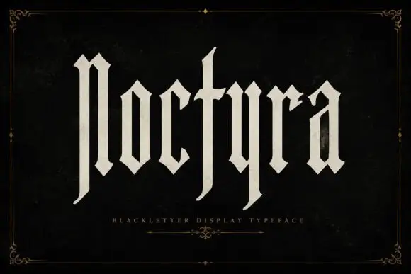
Extremely tall blackletter with blade-like lower extensions
Noctyra is a tall blackletter display face with narrow letters, needle-sharp spurs and thinner stems than a textura, set inside a hairline frame of corner flourishes.
Ideas for this font
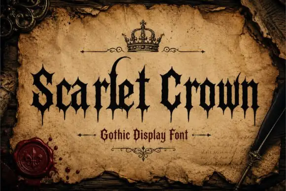
Sharp gothic display
Scarlet Crown is a sharp blackletter in black on aged parchment: narrow mixed case with spear-like feet, a high curling l and pointed terminals, framed by a drawn crown above, rules with flourishes and a wax seal at the lower left, with a plain line beneath naming the style.
Ideas for this font
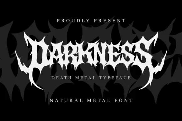
Wide metal capitals with jagged cuts and curved outer spikes
Darkness is death metal lettering: letters fused into a single spiked mass, blade points reaching above and below the line, and a mirrored build that reads as a sigil before it reads as a word.
Ideas for this font
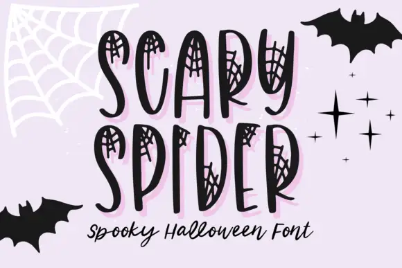
Web-inset tall narrow display
Scary Spider is a display face on a lilac ground: tall uneven narrow capitals with small spiderweb networks drawn inside their upper and side openings, a pale pink offset shadow, bats and stars around the frame, and a script line beneath in black.
Ideas for this font
Same independent foundry
Allow optional Google Analytics to measure visits and catalogue actions. Your search words and notes are not included. Privacy & storage