Neutral Sans Workhorse

Darkness + Cenura
Lets Darkness own the focal silhouette while handling secondary copy, sizing and subheads cleanly.
Inspect Cenura specimenDisclosure: MakerFileHub may earn a commission from qualifying purchases via paid links on this page. How our links work.
Wide metal capitals with jagged cuts and curved outer spikes
Darkness is death metal lettering: letters fused into a single spiked mass, blade points reaching above and below the line, and a mirrored build that reads as a sigil before it reads as a word.
Paid link
Get this fontProject & layout blueprintsAt-a-glance maker compatibility
Sturdy stroke walls and open counters weed cleanly on adhesive vinyl, HTV apparel film, and cut cardstock.
Visual anatomy & craft review
DARKNESS sits across the middle of a black card in white, and the word is drawn as one silhouette: the stems of adjacent letters merge, a row of spikes runs along the top edge, and the S and the final letters throw blades downward past the baseline. Behind the type a large dark spiked shape repeats at low contrast, which gives the composition depth without a photograph. Two spaced captions, one above and one below, name the style and the foundry in a plain grotesque at a fraction of the size, and they are the only quiet elements on the page. The face is a logo treatment rather than a text face: the point is the silhouette, and the letters resolve only on a second look. It belongs on band art and merch, and it needs a large size and a black ground to work at all.
Wide metal capitals with jagged cuts and curved outer spikes
Two-font hierarchy recipes
Tested contrast partners — pairing Darkness with grounded secondary typography.
Darkness + Cenura
Lets Darkness own the focal silhouette while handling secondary copy, sizing and subheads cleanly.
Inspect Cenura specimen
Darkness + Orvelia
Grounds bold display lettering with classic typographic authority on posters, badges and apparel.
Inspect Orvelia specimenPractical applications
Concrete hierarchy, scale and production guidance tailored to Darkness’s stroke geometry.
The fused silhouette reads as a band mark from the door, and the white-on-black contrast survives the low light of a small venue.
Hierarchy & layout recipe
Print an A2 poster: set the headline at 330 mm wide across the upper half, keep 34 mm of clear ground beneath before the door time at 12 pt, and hold 26 mm of margin around the spikes on every side.
Pre-production check
Blade points are the first thing to break in cheap printing; print one poster at the final size and check the tips.
The lettering is the subject, so the cover carries the mark alone and lets a small caption block underneath explain the title.
Hierarchy & layout recipe
Print a 210 by 280 mm cover: set the mark at 170 mm wide at the top, keep 28 mm of clear ground beneath before the title block at 12 pt, and hold 22 mm from the lowest blade to the bottom trim.
Pre-production check
Fine points print as dirt on uncoated covers; print one cover on the real stock and check the edges first.
The mark holds as a single-colour screen print, and a fused silhouette is recognisable even when the label is unknown to the viewer.
Hierarchy & layout recipe
Print a 280 by 360 mm back print: set the mark at 260 mm wide, keep 34 mm of clear ground beneath before the catalogue number at 9 pt, and hold 28 mm from the blades to the print edge.
Pre-production check
Coarse screens close the narrow gaps between letters; print one pull and check the counters before the run.
Technical & licence verification
Confirm included OTF/TTF/WOFF formats, full glyph tables and licence coverage on the live store page before batch production.
Closest visual alternatives
Matched across letterform anatomy, stroke behaviour and craft applications.
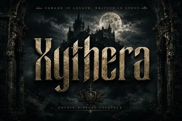
Textured gothic display
Xythera is a textured gothic display in gold on a dark scene: tall capitals with sharp spurs, a carved surface, and a stone-like speckle inside the strokes, framed by an arched stone border with a moonlit castle behind, so the plate reads as a fantasy title rather than a blackletter.
Ideas for this font
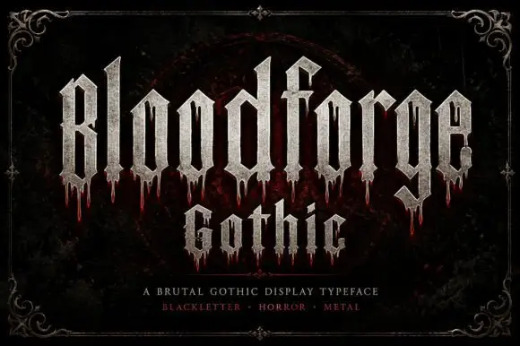
Narrow Gothic strokes with long drip-like lower extensions
Bloodforge Gothic is a brutal gothic display face: tall narrow letters with a stone texture, sharp spurs that end in points, and drip marks hanging from several of the stems.
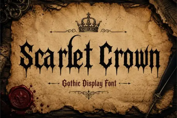
Sharp gothic display
Scarlet Crown is a sharp blackletter in black on aged parchment: narrow mixed case with spear-like feet, a high curling l and pointed terminals, framed by a drawn crown above, rules with flourishes and a wax seal at the lower left, with a plain line beneath naming the style.
Ideas for this font
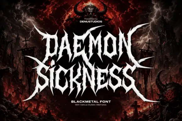
Jagged metal capitals with pointed horns and long outer blades
Daemon Sickness is death metal lettering: letters fused into a single spiked mass, blade points rising above the line and long symmetric wings sweeping out to both sides.
Ideas for this font
Same independent foundry
Allow optional Google Analytics to measure visits and catalogue actions. Your search words and notes are not included. Privacy & storage