Modern Grotesque Body

Famous Design + Clyne Sans
Creates crisp high-hierarchy contrast beneath Famous Design headlines across menus, websites and labels.
Inspect Clyne Sans specimenDisclosure: MakerFileHub may earn a commission from qualifying purchases via paid links on this page. How our links work.
Broad chamfered varsity blocks broken by large rough chips
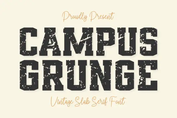
Famous Design shows black capitals on a pale scratched surface, where the O clips into an octagonal bowl, the M carries a deep central cut, the broad feet hold the baseline and large rough chips break the outer edges of several letters.
Paid link
Get this fontProject & layout blueprintsAt-a-glance maker compatibility
Fine grain and micro-texture excel in 300 DPI print, sublimation, and screen print rather than small vinyl weeding.
Visual anatomy & craft review
The blocks stay broad, the corners chamfer, the feet run wide and the chips cut deep. That damage is the character: the word reads as a stamped plate that has been knocked about, which is why the sample sits on a scratched ground. The chipped areas can merge with the counters when reduced, so keep 44 pt, inspect the chosen face and test on absorbent stock where the edges soften further. The chips are the risk: they merge with the counters at small sizes and the letter prints as two separate blocks, so keep 44 pt and inspect the damaged letters you actually need.
Broad chamfered varsity blocks broken by large rough chips
Two-font hierarchy recipes
Tested contrast partners — pairing Famous Design with grounded secondary typography.
Famous Design + Clyne Sans
Creates crisp high-hierarchy contrast beneath Famous Design headlines across menus, websites and labels.
Inspect Clyne Sans specimen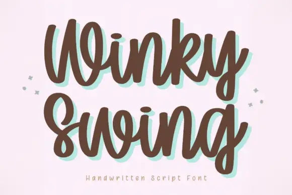
Famous Design + Winky Swing
Adds a warm human signature touch for 1-to-3-word callouts without competing against structured serif capitals.
Inspect Winky Swing specimenPractical applications
Concrete hierarchy, scale and production guidance tailored to Famous Design’s stroke geometry.
The varsity blocks suit a shirt, and the broad feet hold a team name at 65 mm across a printed panel, where the chipped edges stay visible in one ink.
Hierarchy & layout recipe
Print a 280 mm back panel: set the team name at 65 mm on one row, keep 12 mm between letters so the chips stay separate, and keep 18 mm of margin from the side seams.
Pre-production check
Chips under 2 mm vanish on fabric; check the transfer proof, hold the name at 55 mm and print one test shirt first.
The chipped slabs give a bottle character, and the chamfered bowls hold a two-word name at 22 pt on a 55 by 70 mm label, where the rough edges read as wear.
Hierarchy & layout recipe
Print a 55 by 70 mm label: set the name at 22 pt on one row, keep 10 mm of clear ground beneath before the strength at 6 pt, and keep the label pale so the black blocks hold.
Pre-production check
Absorbent label stock blurs the chips; check the plate proof and choose a coated sheet at 22 pt or above.
The heavy blocks read on a door, and the chamfered forms hold a short name at 50 mm on a painted panel, where the octagonal O stays distinct.
Hierarchy & layout recipe
Paint a 600 by 300 mm panel: set the workshop name at 50 mm on one row, keep 22 mm of clear ground beneath before the hours at 14 pt, and keep 24 mm of border so the chips are not cut.
Pre-production check
The paper texture is background, not part of the letters; check the actual contours first.
Technical & licence verification
Confirm included OTF/TTF/WOFF formats, full glyph tables and licence coverage on the live store page before batch production.
Closest visual alternatives
Matched across letterform anatomy, stroke behaviour and craft applications.
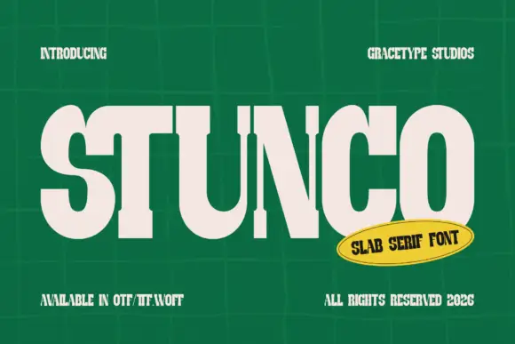
Compressed high contrast slab
Stunco is a compressed slab display in cream on a green tiled wall: very narrow capitals with heavy stems, high contrast, rounded outer curves and slab serifs, set as one large word with a credit above and three notes at the foot, beside a yellow oval naming the style.
Ideas for this font
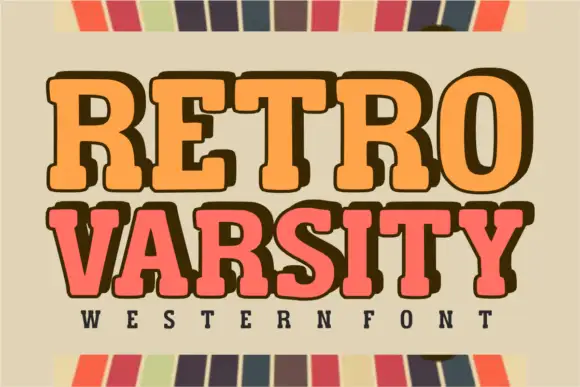
Retro western varsity slab
Retro Varsity is a western-flavoured varsity slab in orange and coral on a sage ground: heavy rounded slabs with deep shoulders, a slight bounce and an extrusion on one line, flanked by a striped border top and bottom with a tracked line naming the category beneath.
Ideas for this font
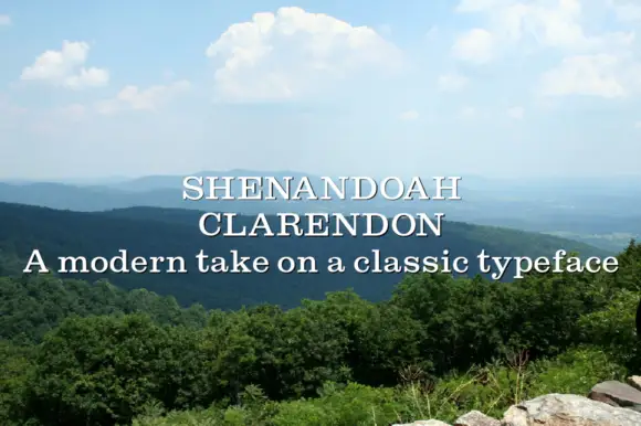
Clarendon-style slab family
Shenandoah Clarendon Family is a moderate bracketed slab in white over a photograph of a wooded mountain range: mixed case with open bowls, conventional proportions and sturdy bracketed serifs, set in two lines with a plain sentence beneath as a strapline.
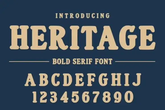
Soft rounded slab capitals with bracketed feet and compact counters
Heritage shows cream capitals on navy, followed by a full A to J alphabet row and a digit row including zero. Rounded serif ends and bracketed joins soften the heavy main strokes, the R leg curls, and the G keeps an open rounded bowl with a short inward bar instead of an angular varsity notch.
Ideas for this font
Same independent foundry
Allow optional Google Analytics to measure visits and catalogue actions. Your search words and notes are not included. Privacy & storage