Modern Grotesque Body

Campus Grunge + Godthem
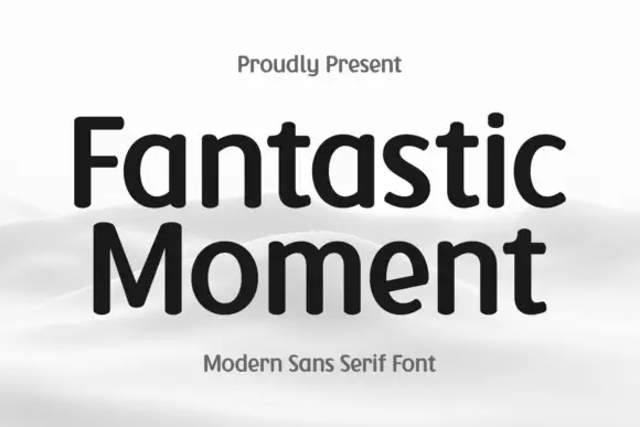
Creates crisp high-hierarchy contrast beneath Campus Grunge headlines across menus, websites and labels.
Inspect Godthem specimenDisclosure: MakerFileHub may earn a commission from qualifying purchases via paid links on this page. How our links work.
Heavy angular slabs with broad diagonal scars
Campus Grunge shows black athletic blocks on pale cream: large pale chips and diagonal scars interrupt the squared stems while clipped bowl corners and broad feet remain visible beneath the wear.
Paid link
Get this fontProject & layout blueprintsAt-a-glance maker compatibility
Fine grain and micro-texture excel in 300 DPI print, sublimation, and screen print rather than small vinyl weeding.
Visual anatomy & craft review
The skeleton stays collegiate with clipped corners and wide feet, and the damage arrives as broad diagonal cuts rather than fine speckle. The scar direction is the character: the wear runs across the letter in one movement, which is why the sample sets a short word at large size. Because each cut removes a significant piece of stroke, keep 34 pt before the letter loses its structure, and treat the small gold script captions as separate type rather than part of the face.
Athletic · Scratched · Clipped
Two-font hierarchy recipes
Tested contrast partners — pairing Campus Grunge with grounded secondary typography.
Campus Grunge + Godthem
Creates crisp high-hierarchy contrast beneath Campus Grunge headlines across menus, websites and labels.
Inspect Godthem specimen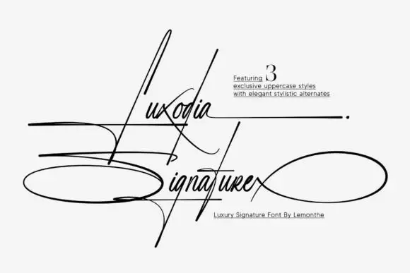
Campus Grunge + Luxodia Signature
Adds a warm human signature touch for 1-to-3-word callouts without competing against structured serif capitals.
Inspect Luxodia Signature specimenPractical applications
Concrete hierarchy, scale and production guidance tailored to Campus Grunge’s stroke geometry.
The scarred blocks read on fabric, and the clipped corners hold the name together at 80 mm across a printed chest. The scarred blocks also keep a shirt print from looking clean.
Hierarchy & layout recipe
Print a 300 mm chest print: set the name at 80 mm, keep every scar at 4 mm minimum, keep the clipped corners at 4 mm, and keep 40 mm of clear shirt beneath for the number. Keep the number on a plain row.
Pre-production check
A scar printed under 2 mm reads as a gap in the letter; check the film at full size and widen the cut, not the stroke.
The worn slabs suit a workshop sign, and the broad feet stay solid at 60 mm on a painted board in one colour. The wide feet also hold a painted sign together.
Hierarchy & layout recipe
Paint a 600 by 250 mm board: set the name at 60 mm, keep the scars at 5 mm, and keep 26 mm of border so the clipped corners stay inside the frame. Keep the store name to two words.
Pre-production check
A diagonal scar painted thin closes up in a second coat; check the mask and keep every cut at 5 mm. Check the mask before the second coat.
The distressed blocks give a small label attitude, and the wide feet stay clear at 22 pt on a 55 mm panel. The honest wear also suits a skate label. The wear then reads as age rather than as damage on the shelf.
Hierarchy & layout recipe
Print a 55 by 35 mm label: set the shop name at 22 pt, keep the scars at 2 mm, and set the town in a 6 pt mono beneath with 4 mm of clear ground. Keep the scars away from the die edge.
Pre-production check
At label size the scars can remove a whole stroke; check a proof at 22 pt before approving the design. Keep the town line plain.
Technical & licence verification
Confirm included OTF/TTF/WOFF formats, full glyph tables and licence coverage on the live store page before batch production.
Closest visual alternatives
Matched across letterform anatomy, stroke behaviour and craft applications.
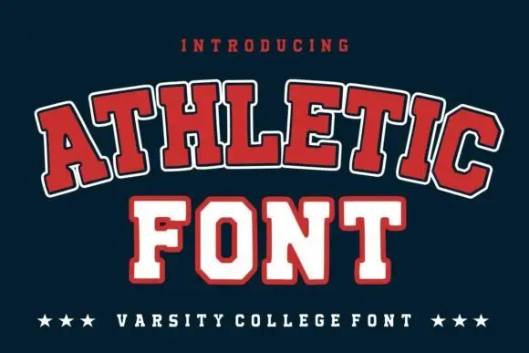
Broad outlined collegiate slabs with clipped corners in an arched specimen
Athletic is a broad collegiate slab in which the capitals clip their corners, the feet run wide and a pale and dark outline separate the fill from the ground, so a team name reads as an arched badge letter.
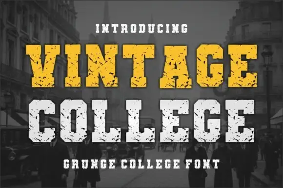
Grunge college slab with picket serifs
Vintage College is a grunge college slab in worn yellow and white on a dark street photograph: fat capitals with picket serifs, a heavy even weight and a scratched surface that eats into every edge.
Ideas for this font

Layered athletic jersey capitals with a stitched fill and star detail
Soccer Football Jersey is a layered athletic capital alphabet in which each letter carries a stitched fill, a heavy keyline and an offset shadow, so a team name reads as the appliqué on a match jersey.
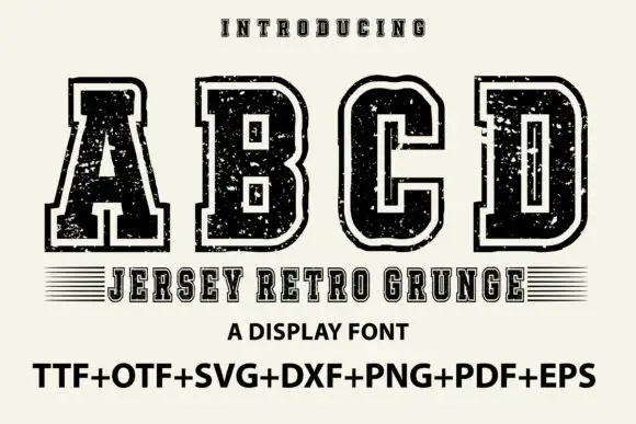
Outlined collegiate slabs with speckled wear
Jersey Retro Grunge shows large collegiate A, B, C and D forms with broad slabs and clipped corners, where a pale inset outline separates the dark letter bodies from an outer black edge and small scratches and holes roughen both the fill and the contour.
Ideas for this font
Same independent foundry
Allow optional Google Analytics to measure visits and catalogue actions. Your search words and notes are not included. Privacy & storage