Modern Grotesque Body

Shenandoah Clarendon Family + Corven
Creates crisp high-hierarchy contrast beneath Shenandoah Clarendon Family headlines across menus, websites and labels.
Inspect Corven specimenDisclosure: MakerFileHub may earn a commission from qualifying purchases via paid links on this page. How our links work.
Clarendon-style slab family
Shenandoah Clarendon Family is a moderate bracketed slab in white over a photograph of a wooded mountain range: mixed case with open bowls, conventional proportions and sturdy bracketed serifs, set in two lines with a plain sentence beneath as a strapline.
Paid link
Get this fontProject & layout blueprintsAt-a-glance maker compatibility
Sturdy stroke walls and open counters weed cleanly on adhesive vinyl, HTV apparel film, and cut cardstock.
Visual anatomy & craft review
The plate sets the family in its element rather than on a specimen ground, and the photograph of the ridge gives the words scale and quiet. The drawing is a Clarendon-style slab: the serifs are bracketed rather than blunt, the bowls are open, and the proportions are conventional, which makes the face usable for a heading and a short paragraph rather than display only. That construction gives a modest size floor and keeps the letterforms readable at body sizes, which is the practical reason to buy a Clarendon for a magazine or a label. The strapline beneath names the face's intent plainly. Because the serifs are bracketed, the face holds on uncoated stock better than a blunt slab, which matters for packaging.
Slab, clarendon, traditional, sturdy
Two-font hierarchy recipes
Tested contrast partners — pairing Shenandoah Clarendon Family with grounded secondary typography.
Shenandoah Clarendon Family + Corven
Creates crisp high-hierarchy contrast beneath Shenandoah Clarendon Family headlines across menus, websites and labels.
Inspect Corven specimen
Shenandoah Clarendon Family + Stylish
Adds a warm human signature touch for 1-to-3-word callouts without competing against structured serif capitals.
Inspect Stylish specimenPractical applications
Concrete hierarchy, scale and production guidance tailored to Shenandoah Clarendon Family’s stroke geometry.
A Clarendon gives a regional title warmth and authority, and the bracketed serifs hold on newsprint where a blunt slab clogs.
Hierarchy & layout recipe
Set the heading at 32 pt, the standfirst at 11 pt, and the caption at 8.5 pt on a 120 mm measure. Keep the leading at 1.35 and leave 6 mm above each heading.
Pre-production check
Check the 32 pt heading on newsprint, where a bracket can fill; keep the serifs above 0.3 mm. Confirm the 8.5 pt caption keeps a 4.5:1 contrast and that the heading breaks cleanly.
A Clarendon reads as a long-established brand, and the open bowls hold a variety name on a small label. A cider house needs to look established.
Hierarchy & layout recipe
Print a 70 by 90 mm label: the brand at 15 pt, the variety at 9 pt, and the volume at 7 pt. Keep 5 mm inside the die and keep the bracketed serifs above 0.4 mm.
Pre-production check
Check the 15 pt brand on a curved bottle, where a bracket can fill; keep it above 0.4 mm. Confirm the 7 pt volume reads on the shelf and that the label holds in a chiller.
A Clarendon suits an older institution, and the sturdy serifs read from a distance on a carved or painted panel. Older institutions read as trust.
Hierarchy & layout recipe
Fabricate a 900 by 320 mm panel: the hall at 110 mm cap height, the rooms in a 24 mm slab, and a 4 mm rule. Keep 25 mm margins and specify a matte finish rather than gloss.
Pre-production check
Check the panel at 110 mm, where a bracket can look soft in metal; keep it above 3 mm. Confirm the 24 mm rooms read at three metres and that the rule clears the fixings at each end.
Technical & licence verification
Confirm included OTF/TTF/WOFF formats, full glyph tables and licence coverage on the live store page before batch production.
Closest visual alternatives
Matched across letterform anatomy, stroke behaviour and craft applications.

Condensed varsity slab
Summer Varsity is a condensed varsity slab in white on a sunset photograph of palms: tall narrow caps with heavy flat serifs, a high waist and narrow counters, set in two stacked lines with small tracked captions above and below, so the block reads as a team banner.
Ideas for this font

Thin wide geometric slab
Novoid is a thin wide geometric slab in white over a black-and-white photograph of tennis players: capitals with square bowls, small slab ends and thin even strokes, set as one large word across the foot with a four-line credits block at the upper right.
Ideas for this font
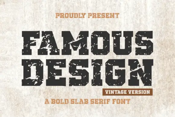
Broad chamfered varsity blocks broken by large rough chips
Famous Design shows black capitals on a pale scratched surface, where the O clips into an octagonal bowl, the M carries a deep central cut, the broad feet hold the baseline and large rough chips break the outer edges of several letters.
Ideas for this font
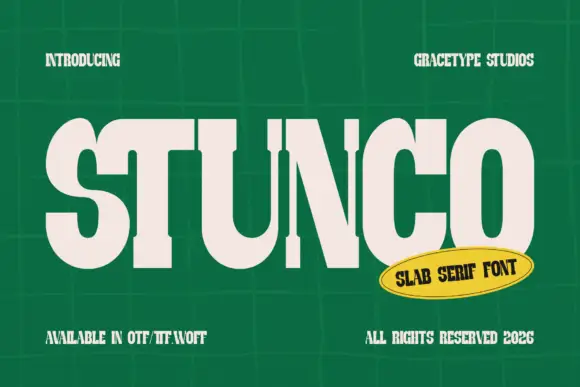
Compressed high contrast slab
Stunco is a compressed slab display in cream on a green tiled wall: very narrow capitals with heavy stems, high contrast, rounded outer curves and slab serifs, set as one large word with a credit above and three notes at the foot, beside a yellow oval naming the style.
Ideas for this font
Allow optional Google Analytics to measure visits and catalogue actions. Your search words and notes are not included. Privacy & storage