Neutral Sans Workhorse

Embroidery Stitch + Miniplate
Lets Embroidery Stitch own the focal silhouette while handling secondary copy, sizing and subheads cleanly.
Inspect Miniplate specimenDisclosure: MakerFileHub may earn a commission from qualifying purchases via paid links on this page. How our links work.
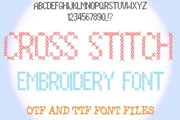
Upright sans capitals filled with dense short diagonal thread-like strokes
Embroidery Stitch uses straight-sided capitals whose faces are built from closely packed short hatch marks, where the strokes turn around curved bowls and form irregular outer edges that suggest thread laid by hand, while the letter silhouette stays a plain upright sans.
Paid link
Get this fontProject & layout blueprintsAt-a-glance maker compatibility
Sturdy stroke walls and open counters weed cleanly on adhesive vinyl, HTV apparel film, and cut cardstock.
Visual anatomy & craft review
The outline stays straight, the interior fills with dense diagonal hatching, the marks follow the bowls and the edges come out uneven. That fill is the character: the letters read as stitched patches rather than a textured sans, which is why the sample keeps the forms simple. The effect is a drawn texture rather than a machine-ready embroidery file, so test at your actual size, keep 40 pt before the hatching closes the counters and check whether the file ships a clean solid alternative.
Upright sans capitals filled with dense short diagonal thread-like strokes
Two-font hierarchy recipes
Tested contrast partners — pairing Embroidery Stitch with grounded secondary typography.
Embroidery Stitch + Miniplate
Lets Embroidery Stitch own the focal silhouette while handling secondary copy, sizing and subheads cleanly.
Inspect Miniplate specimen
Embroidery Stitch + Evoire
Grounds bold display lettering with classic typographic authority on posters, badges and apparel.
Inspect Evoire specimenPractical applications
Concrete hierarchy, scale and production guidance tailored to Embroidery Stitch’s stroke geometry.
The stitched fill suits a sewing shop, and the upright caps hold a two-word name at 24 pt on a 60 by 45 mm label, where the hatch marks stay visible at arm's length.
Hierarchy & layout recipe
Print a 60 by 45 mm label: set the name at 24 pt on one row, keep 9 mm of clear ground beneath before the town at 6 pt, and keep the ground pale so the dense hatching does not blur into it.
Pre-production check
Hatching finer than 0.5 mm fills in at label size; check the plate proof and hold the name at 22 pt.
The thread texture suits a craft title, and the straight-sided forms hold a two-word heading at 44 pt on an A4 cover, where the uneven edges read as handmade.
Hierarchy & layout recipe
Print an A4 workbook cover: set the heading at 44 pt on one row, keep 20 mm of clear ground beneath before the subtitle at 12 pt, and keep the subtitle in a plain sans so the texture stays singular.
Pre-production check
Two hatched rows on one cover vibrate against each other; check the layout and keep the subtitle solid in a plain sans at 12 pt or above.
The stitched letters give a card warmth, and the plain silhouette holds a short word at 30 pt on an A6 sheet, where the hatch fill reads as thread rather than noise.
Hierarchy & layout recipe
Print an A6 card: set the word at 30 pt on one row, keep 16 mm of clear ground beneath before the message at 11 pt, and keep the card cream so the fine marks stay soft.
Pre-production check
The counters close as the size drops; check the proof at 24 pt and keep the word at 28 pt or above.
Technical & licence verification
Confirm included OTF/TTF/WOFF formats, full glyph tables and licence coverage on the live store page before batch production.
Closest visual alternatives
Matched across letterform anatomy, stroke behaviour and craft applications.
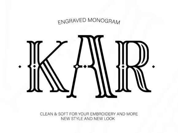
Tall outlined monogram capitals with diamond-shaped interruptions
Engraved shows three capitals drawn as several narrow parallel contours: tall flared serif ends frame open white interiors and small diamond-shaped breaks sit around the midline of each letter.
Ideas for this font
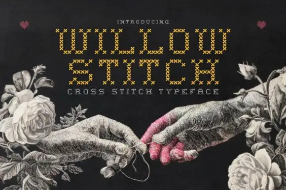
Cross-stitch constructed display
Willow Stitch is a cross-stitch display in gold on a dark ground: narrow angular capitals assembled from small stitched X marks, so each stroke is a column of crosses, set in two lines above a tracked line, with a drawn etching of two hands and roses around the words.
Ideas for this font
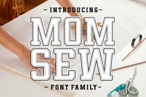
Hollow collegiate slab with stitch line
Mom Sew is a hollow collegiate slab in white on a photograph of a sewing table: heavy caps drawn as a contour with no fill, and inside each letter a dotted line that follows the shape like a running stitch, with tracked caps above and below.
Ideas for this font
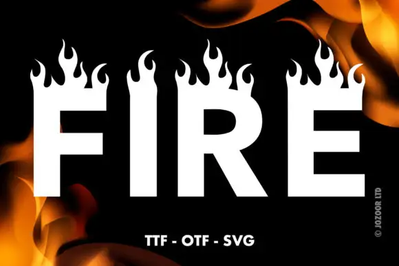
Heavy plain capitals topped by tall curling flame silhouettes
Fire is a heavy block display face in which the top of every stem opens into a row of drawn flames, so a word looks like it is burning along its upper edge.
Ideas for this font
Same independent foundry
Allow optional Google Analytics to measure visits and catalogue actions. Your search words and notes are not included. Privacy & storage