Neutral Sans Workhorse

Mom Sew + Sailors
Lets Mom Sew own the focal silhouette while handling secondary copy, sizing and subheads cleanly.
Inspect Sailors specimenDisclosure: MakerFileHub may earn a commission from qualifying purchases via paid links on this page. How our links work.
Hollow collegiate slab with stitch line
Mom Sew is a hollow collegiate slab in white on a photograph of a sewing table: heavy caps drawn as a contour with no fill, and inside each letter a dotted line that follows the shape like a running stitch, with tracked caps above and below.
Paid link
Get this fontProject & layout blueprintsAt-a-glance maker compatibility
Sturdy stroke walls and open counters weed cleanly on adhesive vinyl, HTV apparel film, and cut cardstock.
Visual anatomy & craft review
The two words are stacked and the face is sold as a family, which the lines above and below state plainly. The construction is what matters: the outer contour is a heavy college slab, and the dotted inner line sits at a fixed distance inside it, so each letter reads as a patch waiting to be stitched rather than as an outline. That makes the face a craft display cut, and it needs a reasonable size because the dots close up when the letter is small. The background photograph of hands, a pattern and scissors is context rather than decoration, and the white holds because the image is light in the centre. The palette is one colour on a photograph, which is the honest test for a face used on fabric.
Decorative, outline, stitch, collegiate
Two-font hierarchy recipes
Tested contrast partners — pairing Mom Sew with grounded secondary typography.
Mom Sew + Sailors
Lets Mom Sew own the focal silhouette while handling secondary copy, sizing and subheads cleanly.
Inspect Sailors specimen
Mom Sew + Grandeur – Elegant Classic Serif
Grounds bold display lettering with classic typographic authority on posters, badges and apparel.
Inspect Grandeur – Elegant Classic Serif specimenPractical applications
Concrete hierarchy, scale and production guidance tailored to Mom Sew’s stroke geometry.
A stitched contour reads as a made object, and the hollow letters let a small label carry the studio name without a solid block of ink.
Hierarchy & layout recipe
Print a 60 by 60 mm label: the studio at 13 pt, the class in a 6 pt sans, and a 1.2 mm stitch line. Keep 4 mm inside the die and print two colours on a white stock so the dots stay separate.
Pre-production check
Check the 13 pt stitch on a 300 dpi print, where the dots can merge into a solid line; keep them 0.6 mm apart. Confirm the 6 pt class reads at arm's length and that the label sits flat.
A stitch-line face prints as one screen and looks embroidered from a distance, which is what a craft-themed celebration wants without real stitching.
Hierarchy & layout recipe
Print a 220 mm chest graphic: the name at 55 mm cap height, the date at 30 mm, and one ink on a light shirt. Keep the dot spacing at 1 mm and place the graphic 80 mm below the collar.
Pre-production check
Check the screen at actual mesh, where a 1 mm dot can drop out; thicken the dots. Wash-test one shirt and confirm the contour stays even after five cycles.
A collegiate stitch face suits a craft classroom, and the hollow letters stay readable on a door plate where a solid block would look heavy.
Hierarchy & layout recipe
Print a 300 by 200 mm door plate: the room name at 40 mm cap height, the teacher in a 12 mm sans, and a 1.5 mm stitch line. Keep 15 mm margins and laminate the print for a wet area.
Pre-production check
Check the plate at two metres, where the dotted line can vanish under laminate glare; keep the dots above 0.8 mm. Confirm the 12 mm name reads at arm's length and that the plate hangs square.
Technical & licence verification
Confirm included OTF/TTF/WOFF formats, full glyph tables and licence coverage on the live store page before batch production.
Closest visual alternatives
Matched across letterform anatomy, stroke behaviour and craft applications.
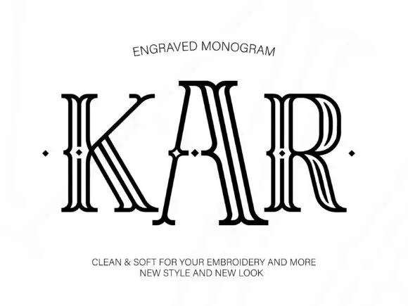
Tall outlined monogram capitals with diamond-shaped interruptions
Engraved shows three capitals drawn as several narrow parallel contours: tall flared serif ends frame open white interiors and small diamond-shaped breaks sit around the midline of each letter.
Ideas for this font
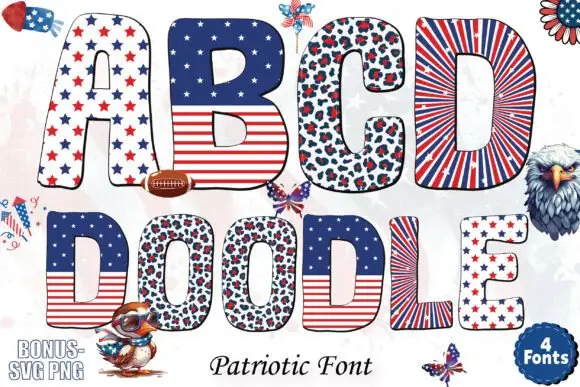
Patriotic patterned block bundle
Patriotic is a colour bundle on a pale ground: rounded capitals and a lower word filled with stars, stripes, spotted panels and starburst rays in red, white and blue, with cartoon eagles, footballs and pinwheels scattered around and a count badge at the lower right.
Ideas for this font
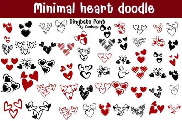
Heart doodle dingbats
Minimal Heart Doodle is a dingbat set on white beneath a plain title: rows of grouped hearts in black and red, some solid, some outlined, some hatched and some scribbled, arranged in clusters of one to four with a small credit under the title.
Ideas for this font
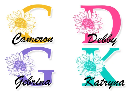
Large contrast serif initials crossed by finely drawn sunflower heads with separate script names
Cameron Monogram draws a heavy split capital with a sunflower blooming in its counter, runs a script name across the cut, and repeats the construction in four colourways.
Ideas for this font
Same independent foundry
Allow optional Google Analytics to measure visits and catalogue actions. Your search words and notes are not included. Privacy & storage