Neutral Sans Workhorse

Engraved + Inkora
Lets Engraved own the focal silhouette while handling secondary copy, sizing and subheads cleanly.
Inspect Inkora specimenDisclosure: MakerFileHub may earn a commission from qualifying purchases via paid links on this page. How our links work.
Tall outlined monogram capitals with diamond-shaped interruptions
Engraved shows three capitals drawn as several narrow parallel contours: tall flared serif ends frame open white interiors and small diamond-shaped breaks sit around the midline of each letter.
Paid link
Get this fontProject & layout blueprintsAt-a-glance maker compatibility
Sturdy stroke walls and open counters weed cleanly on adhesive vinyl, HTV apparel film, and cut cardstock.
Visual anatomy & craft review
Each stroke is a set of thin parallel lines rather than one solid shape, the ends flare outward, the interiors stay open and small diamond gaps interrupt the contour near the middle. The multi-line contour is the character: the letter reads as an engraved plate rather than a printed block, which is why three monogram letters are the whole specimen. Because the parallel lines are fine, keep 34 pt before they stay separate, and treat the cover's embroidery and monogram claims as marketing, since stitch paths and interlocking behaviour are not shown.
Monogram · Outlined · Diamond breaks
Two-font hierarchy recipes
Tested contrast partners — pairing Engraved with grounded secondary typography.
Engraved + Inkora
Lets Engraved own the focal silhouette while handling secondary copy, sizing and subheads cleanly.
Inspect Inkora specimen
Engraved + Augler
Grounds bold display lettering with classic typographic authority on posters, badges and apparel.
Inspect Augler specimenPractical applications
Concrete hierarchy, scale and production guidance tailored to Engraved’s stroke geometry.
The multi-line capitals give a monogram an engraved look, and the open interiors keep three initials readable at 40 mm on heavy card stock. The open interiors also keep a monogram from going solid at card size.
Hierarchy & layout recipe
Print a 105 by 148 mm card: set the three initials at 40 mm on one row, keep 12 mm between the letters so the contours stay apart, and set the names at 9 pt in a small caps beneath with 10 mm of clear ground.
Pre-production check
Parallel contours closer than 1 mm merge into a grey block; check the film at full size and keep the lines at 1.2 mm.
The engraved letters suit a stamp, and the even contours stay crisp at 28 mm on a printed box in one ink. A stamp needs a shallow block so the press does not squeeze the fine gaps shut.
Hierarchy & layout recipe
Print a 40 mm stamp block: set one initial at 28 mm, keep every contour at 1 mm, and keep 5 mm of clear block around the flared ends so the impression stays even. Keep the block square rather than round.
Pre-production check
A stamp that presses unevenly fills the narrow gaps; check the impression on a scrap box before marking the run.
One outlined capital starts a feature with an engraved drop cap, and the open interior keeps the letter light at 44 mm beside text. The engraved look also keeps a drop cap from dominating the column.
Hierarchy & layout recipe
Print a 210 mm page: set the initial at 44 mm, keep 6 mm of clear ground beside the first three lines of body text, and set the body at 10 pt in a serif on a 62 mm measure. Keep the body text ragged right.
Pre-production check
A drop cap set flush to the column loses the diamond breaks; check the page and keep 8 mm of white at the right edge.
Technical & licence verification
Confirm included OTF/TTF/WOFF formats, full glyph tables and licence coverage on the live store page before batch production.
Closest visual alternatives
Matched across letterform anatomy, stroke behaviour and craft applications.
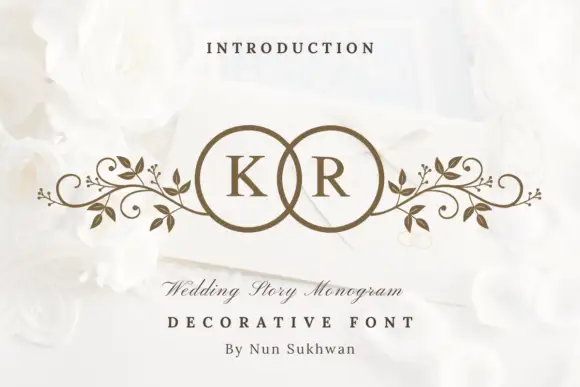
Circle-pair monogram with scrolls
Wedding Story Monogram is a two-initial monogram in bronze on a white still life: two serif capitals set inside two overlapping circles, with mirrored leafy scrolls extending sideways from the rings, staged on an envelope among white roses with a small line above and two lines beneath.
Ideas for this font
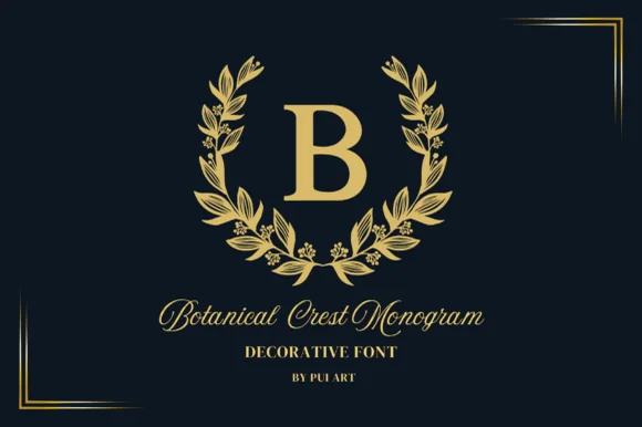
Gold laurel-wreath serif monogram
Botanical Crest Monogram surrounds classic roman initials with a poised laurel leaf wreath, built for family crests, embroidery-look prints and gifts, where clean separation between the bold central capital and the surrounding leaf ring keeps the initial readable from invitation scale up to a wall plaque.
Ideas for this font
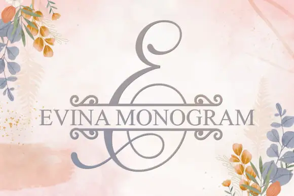
A large looping E initial split by a horizontal band with curled corner ends
Evina Monogram Font centres a tall grey E-like initial on pale pink, where thin loops extend above and below its heavier left curve and a broad round lower opening sits beneath a horizontal band that carries the personal text through the middle of the mark.
Ideas for this font
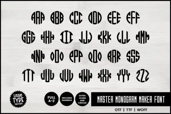
Narrow monogram letters fitted into circles
Master Monogram is a monogram set in black on white: narrow capitals drawn to be repeated and mirrored inside a circular silhouette, so each pair of letters fills a disc with stripes, plus digits and circle icons in the same weight.
Ideas for this font
Same independent foundry
Allow optional Google Analytics to measure visits and catalogue actions. Your search words and notes are not included. Privacy & storage