Neutral Sans Workhorse

Fire Font + Memoir Slang
Lets Fire Font own the focal silhouette while handling secondary copy, sizing and subheads cleanly.
Inspect Memoir Slang specimenDisclosure: MakerFileHub may earn a commission from qualifying purchases via paid links on this page. How our links work.
Heavy plain capitals topped by tall curling flame silhouettes
Fire is a heavy block display face in which the top of every stem opens into a row of drawn flames, so a word looks like it is burning along its upper edge.
Paid link
Get this fontProject & layout blueprintsAt-a-glance maker compatibility
Sturdy stroke walls and open counters weed cleanly on adhesive vinyl, HTV apparel film, and cut cardstock.
Visual anatomy & craft review
FIRE fills the frame in white on black, with photographed flames wrapping the corners of the card, and the letters themselves carry the fire: each stem ends in a cluster of three or four tongues that curl to one side, cut cleanly out of the cap height rather than drawn on top. The base of every letter stays a straight bar, so the word is anchored while the tops move, and the spacing is wide enough that the flames of neighbouring letters never touch. A small line at the foot lists the file formats, and a credit runs up the right side of the card. The letters are otherwise plain and geometric, with squared bowls, which is the right decision: the flame is the whole idea and any second detail would fight it. It is a sports, motorsport and poster face, and it needs a dark ground and a large size to work.
Heavy plain capitals topped by tall curling flame silhouettes
Two-font hierarchy recipes
Tested contrast partners — pairing Fire Font with grounded secondary typography.
Fire Font + Memoir Slang
Lets Fire Font own the focal silhouette while handling secondary copy, sizing and subheads cleanly.
Inspect Memoir Slang specimen
Fire Font + Kernova
Grounds bold display lettering with classic typographic authority on posters, badges and apparel.
Inspect Kernova specimenPractical applications
Concrete hierarchy, scale and production guidance tailored to Fire Font’s stroke geometry.
The burning edge sets the event before the copy is read, and the white letters stay clear on a dark ground where a photographic poster would go muddy.
Hierarchy & layout recipe
Print an A2 poster: set the event name at 140 pt across two rows, keep 34 mm of clear ground beneath before the time at 14 pt, and hold 30 mm from the tallest flame to the top trim.
Pre-production check
Flame tips are the first thing to break on textured stock; print one copy at the final size and check the curls before the run.
The lettering gives a review a graphic front that needs no photograph of a car, and the burning top edge reads at thumbnail size on a screen or a shelf.
Hierarchy & layout recipe
Print a 210 by 297 mm cover: set the title at 96 pt across two rows, keep 26 mm of clear ground beneath before the season line at 12 pt, and hold 20 mm from the outer letters to the trim.
Pre-production check
Heavy white coverage on coated stock shows roller marks; print one cover and check it under a raking light before the run.
The face does the shouting that a food truck needs at a roadside, and the flame cut gives the lettering a subject that matches what is being cooked.
Hierarchy & layout recipe
Print a 1800 by 450 mm side panel: set the truck name at 260 pt on one row, keep 50 mm of clear ground beneath before the menu line at 26 pt, and hold 55 mm of margin at each end of the panel.
Pre-production check
Vinyl flames lift at the tips; print one panel and check the cut after a week on the vehicle before the second side.
Technical & licence verification
Confirm included OTF/TTF/WOFF formats, full glyph tables and licence coverage on the live store page before batch production.
Closest visual alternatives
Matched across letterform anatomy, stroke behaviour and craft applications.
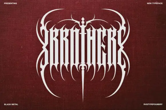
Ultra-condensed metal lettering with mirrored hooks and a long centre point
Brother is a black metal display face: mirrored letterforms fused by blade spikes that rise above the line, with long flourishes sweeping out to both sides of the word.
Ideas for this font
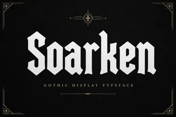
Geometric heavy blackletter
Soarken is a heavy geometric blackletter in bone on a black ground: a broad S, clipped angular bowls, flat terminals and even stroke widths, set as one word between a small ornament above and a tracked descriptor beneath, with fine corner rules at the frame.
Ideas for this font
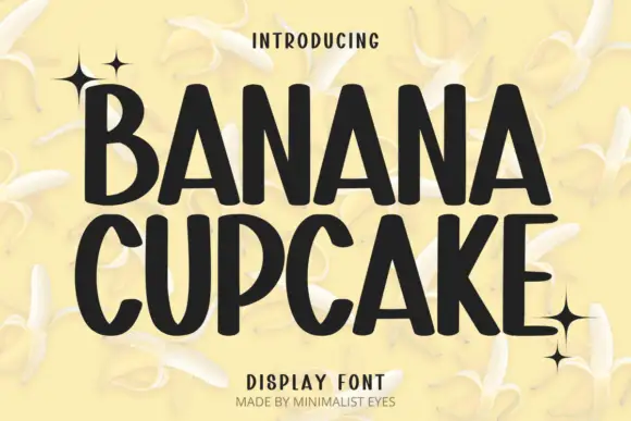
Tall playful display sans
Banana Cupcake stacks two large words in dark letters on a pale banana photograph, where tall narrow capitals fill the width, the counters squeeze into thin slots, the corners soften slightly and the letter widths shift row by row so the second word runs wider than the first.
Ideas for this font
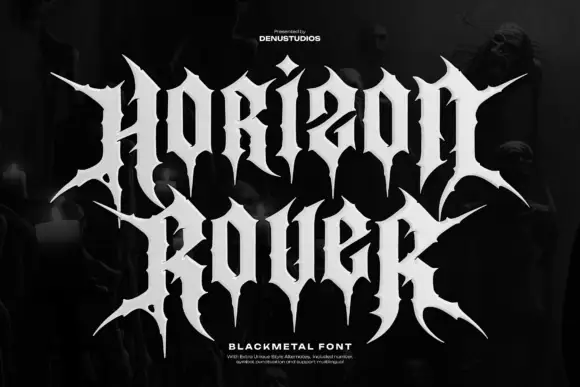
Wide black-metal capitals with long spikes and hooked shoulders
Horizon Rover draws black metal lettering: tall letterforms built from sharp spikes, hairline joins and diamond finials, so a two-word title reads as a logo stamped on a record sleeve.
Ideas for this font
Same independent foundry
Allow optional Google Analytics to measure visits and catalogue actions. Your search words and notes are not included. Privacy & storage