Editorial Serif Anchor

Embriodery + Brenco
Anchors Embriodery's fluid strokes with crisp Roman proportions on wedding suites, headers and packaging.
Inspect Brenco specimenDisclosure: MakerFileHub may earn a commission from qualifying purchases via paid links on this page. How our links work.
Heavy rounded upright handwriting with tall ascenders
Embriodery is upright handwriting in one heavy stroke, with tall flat-topped ascenders, generous rounded turns and letters that stand separately instead of joining, so a word reads as a row of soft blocks rather than a running script.
Paid link
Get this fontProject & layout blueprintsAt-a-glance maker compatibility
Weld or Unite overlapping script joins into one continuous vector path before sending to the blade.
Visual anatomy & craft review
The capital E carries a long crossbar that reaches past the stem on both sides, and the loop of the first letter is open at the top, which keeps the word from starting with a closed shape. The b and d rise to the same height on flat, slightly rounded tops, and their bowls are nearly full height, so the word has two tall rectangles inside it. The r keeps a small shoulder and no arm extension, and the y drops a straight diagonal descender with a shallow hook at the end. Strokes never vary in weight and never taper; every turn is a rounded radius of about half the stroke width, which is why the lettering looks stitched rather than drawn. Letters sit close but do not touch, and the baseline drifts a little up and down. The pale plate with roses and the tracked serif lines above and below are presentation; the typeface is the one word.
Heavy · Upright · Rounded
Two-font hierarchy recipes
Tested contrast partners — pairing Embriodery with grounded secondary typography.
Embriodery + Brenco
Anchors Embriodery's fluid strokes with crisp Roman proportions on wedding suites, headers and packaging.
Inspect Brenco specimen
Embriodery + Borsen
Keeps small-scale dates, URLs, nutrition facts and care instructions crisp and legible below script titles.
Inspect Borsen specimenPractical applications
Concrete hierarchy, scale and production guidance tailored to Embriodery’s stroke geometry.
Heavy rounded strokes read at the size of a woven label and survive being embroidered, because a single even weight converts into a satin stitch without the thin joins that break on a machine at speed.
Hierarchy & layout recipe
Set the brand at 9 pt on a 30 by 60 mm woven label, keep the fibre content in a hairline sans at 4 pt, and leave 4 mm between the lettering and the label edge so the rounded terminals do not sit on the seam.
Pre-production check
A 9 pt monoline becomes a three-pass stitch at typical density; ask the mill for the minimum finished stroke and increase the size until the letters hold without thickening.
Upright, evenly weighted letters with no joining strokes are the shapes early readers are taught to copy, and the rounded ends give a child a clear place to start and stop the pencil without a serif to negotiate.
Hierarchy & layout recipe
Set the name at 28 pt on a 210 by 297 mm folder, rule a 9 mm writing band beneath it, and keep the class and term in a plain sans at 9 pt in the top corner where it will not compete.
Pre-production check
Photocopied worksheets thin a heavy stroke unevenly across the page; print one test sheet on the classroom machine and confirm the counters of the e and a stay open at 28 pt.
A heavy rounded hand reads at the size of a cake topper, where a script with tapering joins would either snap in the cutter or lose its thinnest strokes entirely, and the upright shapes stay readable from across a table.
Hierarchy & layout recipe
Set the name at 60 mm tall on a 150 mm topper, keep the age in the same face at 30 mm beside it, and leave 8 mm of solid material around every rounded terminal so the acrylic has something to hold.
Pre-production check
Laser cutting a 60 mm topper in 3 mm acrylic is fine, but the open loop of the capital closes at this size; check the vector at full scale before the file goes to the cutter.
Technical & licence verification
Confirm included OTF/TTF/WOFF formats, full glyph tables and licence coverage on the live store page before batch production.
Closest visual alternatives
Matched across letterform anatomy, stroke behaviour and craft applications.
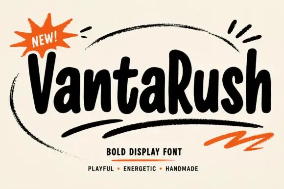
Bold playful hand display
Vanta Rush is a bold playful display in black on cream: fat rounded letters with uneven widths, a bouncy baseline, brush swooshes around the lockup and an orange burst badge, so the plate reads as a hand-painted market poster rather than a geometric face.
Ideas for this font
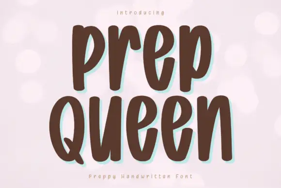
Tall heavy separate letters
Prep Queen is a tall heavy hand-drawn print in chocolate brown on pale pink: narrow letters with blunt ends, a light bounce, and a mint shadow behind each stroke.
Ideas for this font
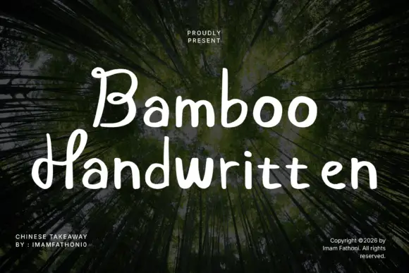
Rounded separate letters with curled capitals and a level baseline
Bamboo is rounded handwritten lettering in which the letters stand separately, the capitals curl at their ends and the baseline holds level across a phrase.
Ideas for this font
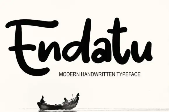
Heavy rounded connected lettering with tall stems and a wide E
Endatu is heavy rounded connected lettering whose capital E opens into a wide three-bar form while the lowercase stays tall, tight and joined, so a word reads as a dense soft block.
Ideas for this font
Same independent foundry
Allow optional Google Analytics to measure visits and catalogue actions. Your search words and notes are not included. Privacy & storage