Editorial Serif Anchor

Endatu + Grandeur – Elegant Classic Serif
Anchors Endatu's fluid strokes with crisp Roman proportions on wedding suites, headers and packaging.
Inspect Grandeur – Elegant Classic Serif specimenDisclosure: MakerFileHub may earn a commission from qualifying purchases via paid links on this page. How our links work.
Heavy rounded connected lettering with tall stems and a wide E
Endatu is heavy rounded connected lettering whose capital E opens into a wide three-bar form while the lowercase stays tall, tight and joined, so a word reads as a dense soft block.
Paid link
Get this fontProject & layout blueprintsAt-a-glance maker compatibility
Weld or Unite overlapping script joins into one continuous vector path before sending to the blade.
Visual anatomy & craft review
The capital E is the defining letter: its stem is heavy, its three bars are of equal weight, and both the top bar and the foot extend well beyond the stem, which gives the word a broad start. The lowercase letters that follow keep that weight with tall stems and round joins: the n and the d rise nearly to cap height, the a closes into a small counter, the t is crossed by a heavy bar at the top of the x-height, and the u finishes with a rounded terminal. Nothing tapers, no stroke thins at a turn, and the joins stay as heavy as the stems, which is what makes the word hold together as one soft mass. The baseline is level and the letters are closely set. The white ground, the small boat illustration and the plain subtitle are presentation; the typeface is the word.
Heavy · Rounded · Connected
Two-font hierarchy recipes
Tested contrast partners — pairing Endatu with grounded secondary typography.
Endatu + Grandeur – Elegant Classic Serif
Anchors Endatu's fluid strokes with crisp Roman proportions on wedding suites, headers and packaging.
Inspect Grandeur – Elegant Classic Serif specimen
Endatu + Corven
Keeps small-scale dates, URLs, nutrition facts and care instructions crisp and legible below script titles.
Inspect Corven specimenPractical applications
Concrete hierarchy, scale and production guidance tailored to Endatu’s stroke geometry.
The heavy connected strokes read as a painted name on a hull, and the wide capital gives a short yard name enough presence to be seen from the water.
Hierarchy & layout recipe
Set the name at 30 cm on a 2 m hull panel, keep the registration number in a clean sans at 8 cm, and hold 15 cm of clearance so the connected joins stay clear of the waterline.
Pre-production check
Hull lettering is applied to a curved and wet surface; check a paper template in place and keep the joins off any strake edge.
The rounded connected lettering suits a waterfront setting, and because the counter shapes stay open the sign is readable from the car park.
Hierarchy & layout recipe
Set the greeting at 12 cm on a 600 by 900 mm board, keep the couple's names in the same face at 6 cm, and hold 12 cm of margin so the capital's extended bars stay inside the frame.
Pre-production check
Painted board lettering near water takes salt and damp; seal both the board and the finished lettering and check that the joins do not lift.
A heavy rounded hand reads warmly on a small card and survives being printed at 12 pt where a script would lose its joins, which is what a guest house needs on a welcome note.
Hierarchy & layout recipe
Set the greeting at 16 pt at the head of a 105 by 148 mm card, set the house name in a 7 pt sans at the foot, and keep the middle half of the card clear for a handwritten message.
Pre-production check
Cards placed on a bed or a table are handled constantly; print one and check that the heavy strokes do not smudge on the chosen stock before the full run.
Technical & licence verification
Confirm included OTF/TTF/WOFF formats, full glyph tables and licence coverage on the live store page before batch production.
Closest visual alternatives
Matched across letterform anatomy, stroke behaviour and craft applications.
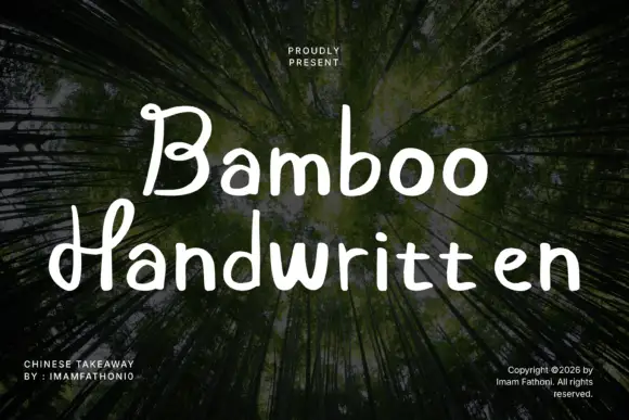
Rounded separate letters with curled capitals and a level baseline
Bamboo is rounded handwritten lettering in which the letters stand separately, the capitals curl at their ends and the baseline holds level across a phrase.
Ideas for this font
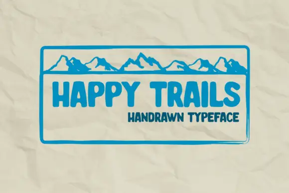
Compact heavy capitals with rounded ends and slightly irregular stems
Happy Trails is compact heavy capital lettering in which the stems wobble slightly, the ends are fully rounded and the letters sit close together, so a two-word phrase reads as a hand-drawn badge.
Ideas for this font
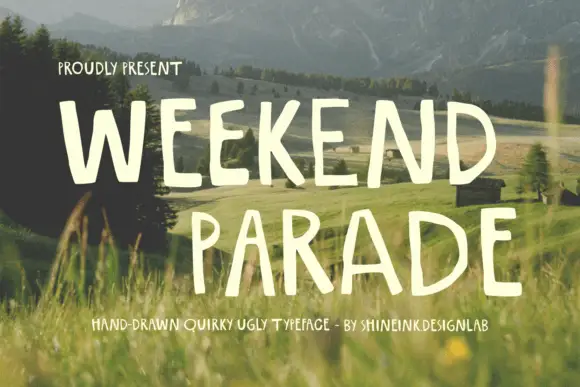
Narrow hand-drawn upright capitals
Weekend Parade is a set of tall narrow hand-drawn capitals with uneven stems, open counters and a baseline that drifts across the length of the line.
Ideas for this font
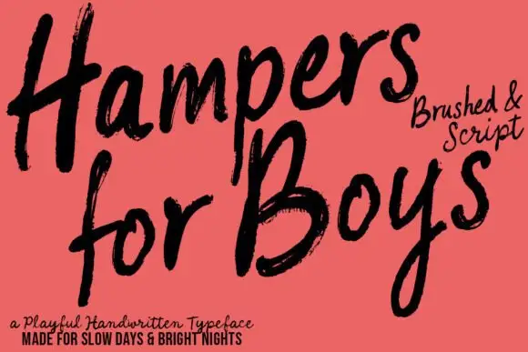
Loose brushed handwriting with slanted bodies and dry swept ends
Hampers for Boys is loose brushed handwriting in which the letters lean forward, the strokes sweep through each letter and the ends lift dry off the page.
Ideas for this font
Allow optional Google Analytics to measure visits and catalogue actions. Your search words and notes are not included. Privacy & storage