Editorial Serif Anchor

Vanta Rush + Mewah
Anchors Vanta Rush's fluid strokes with crisp Roman proportions on wedding suites, headers and packaging.
Inspect Mewah specimenDisclosure: MakerFileHub may earn a commission from qualifying purchases via paid links on this page. How our links work.
Bold playful hand display
Vanta Rush is a bold playful display in black on cream: fat rounded letters with uneven widths, a bouncy baseline, brush swooshes around the lockup and an orange burst badge, so the plate reads as a hand-painted market poster rather than a geometric face.
Paid link
Get this fontProject & layout blueprintsAt-a-glance maker compatibility
Weld or Unite overlapping script joins into one continuous vector path before sending to the blade.
Visual anatomy & craft review
The word is set once, large, and the drawing is a hand display with a loaded brush: the strokes are heavy and slightly irregular, the terminals are blunt, and the letters vary in width, which keeps the face from looking mechanical. The bounce keeps the baseline moving and the brush swooshes around the word add motion without an illustration. Because the strokes are heavy, the face holds at a distance and on fabric, and the counters stay open enough to read at label size. The ground is a flat cream with a few dry brush marks, and the copy beneath is split between a bold line and a tracked triple of adjectives in a small grotesque, which is how a craft product describes itself.
Playful, bold, handmade, energetic
Two-font hierarchy recipes
Tested contrast partners — pairing Vanta Rush with grounded secondary typography.
Vanta Rush + Mewah
Anchors Vanta Rush's fluid strokes with crisp Roman proportions on wedding suites, headers and packaging.
Inspect Mewah specimen
Vanta Rush + Saltriver Grotesk
Keeps small-scale dates, URLs, nutrition facts and care instructions crisp and legible below script titles.
Inspect Saltriver Grotesk specimenPractical applications
Concrete hierarchy, scale and production guidance tailored to Vanta Rush’s stroke geometry.
A bold hand display reads as a painted stall sign, and the heavy strokes hold at a distance where a light face would disappear among the goods.
Hierarchy & layout recipe
A2 board: the stall name at 120 mm cap height, the prices in a 20 mm sans, and a brush swoosh beneath. Keep 25 mm margins and paint two colours on a light board so the swooshes stay visible.
Pre-production check
Check the board at four metres, where the swooshes can read as smudges; keep them away from the small type. Confirm the 20 mm prices read at two metres and that the name fits without wrapping.
A playful bold face reads as a celebration and photographs well, and the heavy letters hold on fabric where a light script would break up.
Hierarchy & layout recipe
Print 800 by 400 mm: the name at 130 mm cap height, the age in a 45 mm rounded sans, and two brush marks. Keep 25 mm margins and print two colours on a light ground.
Pre-production check
Check the banner at four metres, where the uneven widths can look like a fault; keep the variation subtle. Confirm the 45 mm age reads at three metres and that the marks do not crowd the ascenders.
A bold hand label reads as a small-batch product, and the heavy strokes stay legible on a small can where a delicate face would vanish.
Hierarchy & layout recipe
Print a 60 by 90 mm label: the flavour at 17 pt, the volume in a 7 pt sans, and a small burst badge. Keep 5 mm inside the die and print two colours on a coated stock so the blunt terminals stay crisp.
Pre-production check
Check the 17 pt flavour on a curved can, where the outer letters distort; reduce the tracking. Confirm the 7 pt volume reads in the chiller and that the badge does not crowd the word.
Technical & licence verification
Confirm included OTF/TTF/WOFF formats, full glyph tables and licence coverage on the live store page before batch production.
Closest visual alternatives
Matched across letterform anatomy, stroke behaviour and craft applications.
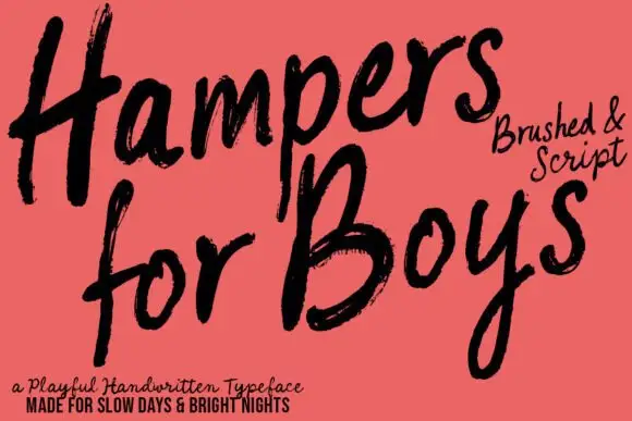
Loose brushed handwriting with slanted bodies and dry swept ends
Hampers for Boys is loose brushed handwriting in which the letters lean forward, the strokes sweep through each letter and the ends lift dry off the page.
Ideas for this font
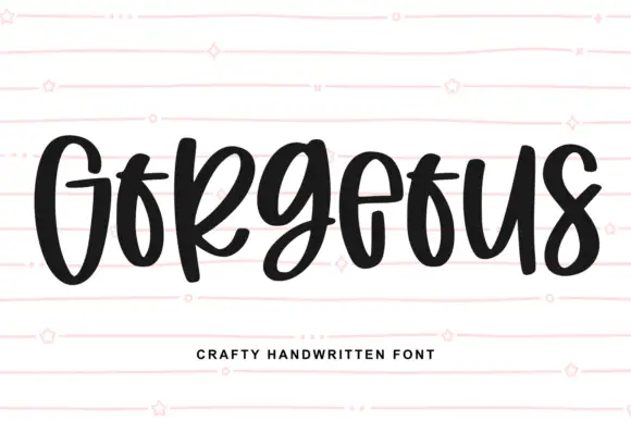
Heavy narrow handwriting with tight counters
Gorgeous is a heavy narrow handwriting that keeps a tall x-height and nearly closed counters, so a single word reads as a dense band with a lively, uneven baseline running under it.
Ideas for this font
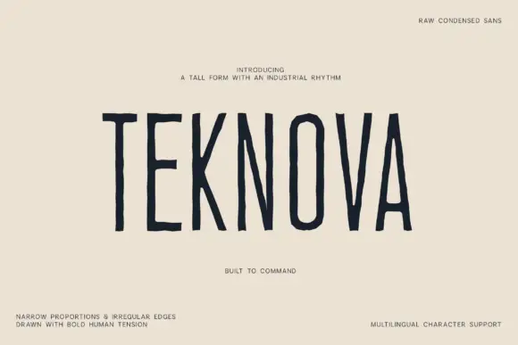
Raw condensed drawn sans
Teknova is a tall condensed sans in navy on a warm off-white sheet: narrow capitals with uneven straight stems, polygonal O corners and slightly irregular edges, set as one large word with a small line above and four tracked notes at the corners.
Ideas for this font
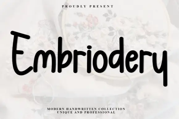
Heavy rounded upright handwriting with tall ascenders
Embriodery is upright handwriting in one heavy stroke, with tall flat-topped ascenders, generous rounded turns and letters that stand separately instead of joining, so a word reads as a row of soft blocks rather than a running script.
Ideas for this font
Same independent foundry
Allow optional Google Analytics to measure visits and catalogue actions. Your search words and notes are not included. Privacy & storage



