Editorial Serif Anchor

Sunflower + Glofi
Anchors Sunflower's fluid strokes with crisp Roman proportions on wedding suites, headers and packaging.
Inspect Glofi specimenDisclosure: MakerFileHub may earn a commission from qualifying purchases via paid links on this page. How our links work.
Handwritten brush script
Sunflower is a handwritten brush script in white over a sunflower field: a light brush stroke that swells on the downstrokes, tall loops on the S and the l, and a joined lowercase that closes with a w whose final stroke lifts into a tail.
Paid link
Get this fontProject & layout blueprintsAt-a-glance maker compatibility
Fine grain and micro-texture excel in 300 DPI print, sublimation, and screen print rather than small vinyl weeding.
Visual anatomy & craft review
The word is set across the middle of the photograph and the drawing is a brush script with moderate contrast: the downstrokes are heavier than the upstrokes but not dramatically so, the entries curl from below, and the capital S rises into a loop that leans over the following letter. The lowercase is tall and narrow, which keeps the word in one band rather than letting it drift, and the joins are continuous so the word reads as written. The final w lifts its last stroke into a small upward tail, which is the only flourish in the word, and the spacing is loose enough that the loops clear at the size shown. The ground is a field of sunflowers at dusk, and the white type sits in the darker band just above the horizon, so the contrast is carried by the composition rather than a plate.
Handwritten, brushy, flowing, warm
Two-font hierarchy recipes
Tested contrast partners — pairing Sunflower with grounded secondary typography.
Sunflower + Glofi
Anchors Sunflower's fluid strokes with crisp Roman proportions on wedding suites, headers and packaging.
Inspect Glofi specimen
Sunflower + Inkora
Keeps small-scale dates, URLs, nutrition facts and care instructions crisp and legible below script titles.
Inspect Inkora specimenPractical applications
Concrete hierarchy, scale and production guidance tailored to Sunflower’s stroke geometry.
A brush script reads as a hand-written label, which suits a honey producer selling at a farm shop, and the moderate contrast keeps the word legible on a small jar.
Hierarchy & layout recipe
Print a 55 mm round label: the name at 15 pt, the weight in a 7 pt sans caps, and the apiary in 6 pt. Keep 4 mm of clear label inside the die so the tail of the w is never cut, and print one ink on a cream stock.
Pre-production check
Check the 15 pt name on the jar, where the thin upstrokes can break on the curve; raise the weight for that substrate. Confirm the 6 pt apiary line reads at arm's length and that the tail clears the die line by 2 mm.
A brush script says hand-made and local in one word, and the light stroke reads as painted lettering on a board rather than as printed vinyl.
Hierarchy & layout recipe
Paint a 600 by 400 mm board: the word at 80 mm cap height, the produce list in a 22 mm sans, and a hand-drawn rule between. Keep 30 mm between the script's descender and the rule so the tail stays clear.
Pre-production check
Check the board at three metres in daylight, where a white script on a mid-tone board can lose its thin strokes; use a darker ground. Confirm the 22 mm list reads at arm's length and that the rule sits level with the script's baseline.
A brush script gives a florist a mark that looks drawn by the owner, and the moderate weight survives being printed on a card, a wrap and a window decal.
Hierarchy & layout recipe
Set the mark at 36 pt for the card, 14 pt for the order tag, and 70 mm wide for the window. Keep the mark one colour and build a simplified version for the tag by removing the final tail.
Pre-production check
Check the 14 pt tag version, where the loops close and the tail becomes a smudge; use the simplified mark below 18 pt. Confirm the window decal weeds cleanly and that the mark reads from the pavement.
Technical & licence verification
Confirm included OTF/TTF/WOFF formats, full glyph tables and licence coverage on the live store page before batch production.
Closest visual alternatives
Matched across letterform anatomy, stroke behaviour and craft applications.
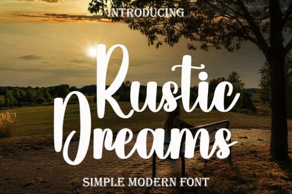
Bold chunky upright brush-marker script
Rustic Dreams is a thick, upright marker-brush script with oversized rounded capitals and heavy, super-clean strokes built for fast, dependable crafting.
Ideas for this font
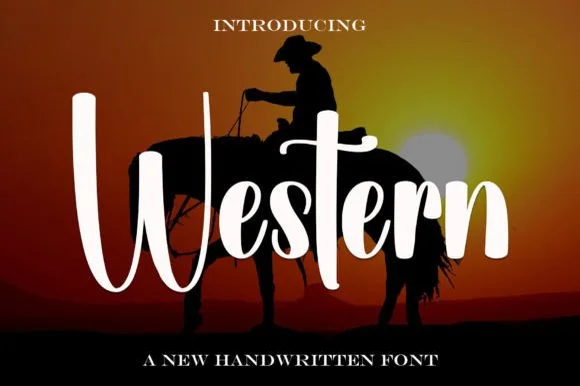
Tall brush script with long ascenders
Western is a tall brush script in white over a sunset silhouette: very long ascenders, thick swelled downstrokes, thin joins and a descender that swings below the word, set as one line with small capital lines above and below.
Ideas for this font
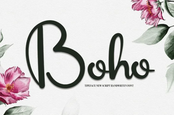
Smooth thick rounded marker-cord bohemian script
Boho (by william jhordy) is a clean, thick monoline-cord script with wide open B-bowls and super-smooth Cricut-friendly curves.
Ideas for this font
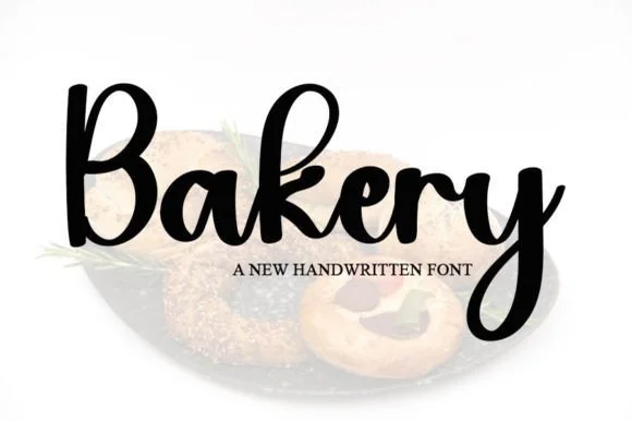
Smooth thick monoline-cord crafter script
Bakery (by ONE DESIGN) is a thick, uniform monoline-cord script with zero thin hairlines—making it the easiest cursive 'Bakery' font to weed on Cricut vinyl!
Ideas for this font
Same independent foundry
Allow optional Google Analytics to measure visits and catalogue actions. Your search words and notes are not included. Privacy & storage