Editorial Serif Anchor

Angelica + Grandeur – Elegant Classic Serif
Anchors Angelica's fluid strokes with crisp Roman proportions on wedding suites, headers and packaging.
Inspect Grandeur – Elegant Classic Serif specimenDisclosure: MakerFileHub may earn a commission from qualifying purchases via paid links on this page. How our links work.
Long oval-loop signature script with a slanted axis and open joins
Angelica is a signature script built from long oval loops, set on a slanted axis with open joins, so a two-word phrase reads as a hand-written signature rather than a formal calligraphy.
Paid link
Get this fontProject & layout blueprintsAt-a-glance maker compatibility
Weld or Unite overlapping script joins into one continuous vector path before sending to the blade.
Visual anatomy & craft review
The capital A opens as a large narrow oval that climbs above the cap line, and the capital S of the second word repeats the shape. Between them the letters stay slim and slanted: the n holds a long shoulder, the g drops a wide oval loop, the e closes against the join, the l rises into a plain stem and the t is crossed with a light bar. Weight is medium with only slight contrast at the joins, which keeps the phrase legible at 20 pt while still reading as a signature. The long ovals are what fill a tall card, and the open joins let the words sit apart without losing their connection. The pale blue ground and the two small captions beneath are presentation; the script is the two words.
Signature · Oval · Slanted
Two-font hierarchy recipes
Tested contrast partners — pairing Angelica with grounded secondary typography.
Angelica + Grandeur – Elegant Classic Serif
Anchors Angelica's fluid strokes with crisp Roman proportions on wedding suites, headers and packaging.
Inspect Grandeur – Elegant Classic Serif specimen
Angelica + Helina
Keeps small-scale dates, URLs, nutrition facts and care instructions crisp and legible below script titles.
Inspect Helina specimenPractical applications
Concrete hierarchy, scale and production guidance tailored to Angelica’s stroke geometry.
The oval loops give a studio a signature mark that reads at 16 pt on a card, and the slant keeps it from looking like a formal crest on a small format.
Hierarchy & layout recipe
Set the studio name at 16 pt on a 90 by 50 mm card, set the services in a 6 pt sans, and hold 10 mm of clearance so the tallest oval stays inside the card edge.
Pre-production check
A large oval loop near a card edge looks clipped; check the proof at final size and inset the mark rather than shrinking the loops.
The signature slant suits a pared-back invitation, and the long ovals fill a narrow card without needing a second element at 26 pt.
Hierarchy & layout recipe
Set both names at 26 pt on a 105 by 180 mm card, set the date in a small caps serif at 8 pt, and leave 16 mm between the names and the details block below.
Pre-production check
Two slanted lines on a narrow card can look like an exercise in penmanship; check the proof and keep one line in script with the rest in serif.
The oval loops read at small size on an envelope front, and the open joins keep a short pair of names from reading as a printed label.
Hierarchy & layout recipe
Set the names at 20 pt in the centre of a 110 by 220 mm envelope, set the address block in a 10 pt serif, and hold 14 mm between the names and that block.
Pre-production check
An envelope fold can cut an oval loop; check the artwork against the crease and move the mark down if a loop crosses it.
Technical & licence verification
Confirm included OTF/TTF/WOFF formats, full glyph tables and licence coverage on the live store page before batch production.
Closest visual alternatives
Matched across letterform anatomy, stroke behaviour and craft applications.
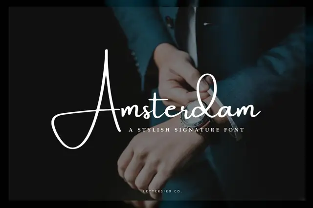
Very thin signature script with a large open capital
Amsterdam is a very thin signature script whose capital opens into a wide oval before the rest of the word runs, and the whole name is set so lightly that it reads as a pen mark on the photograph behind it.
Ideas for this font
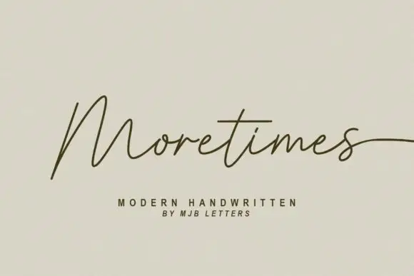
Light modern handwriting with long exits
Moretimes is a light modern handwriting script in olive brown on cream: hairline monoline strokes, an M built from open peaks, and a final s that runs out to the edge of the frame.
Ideas for this font
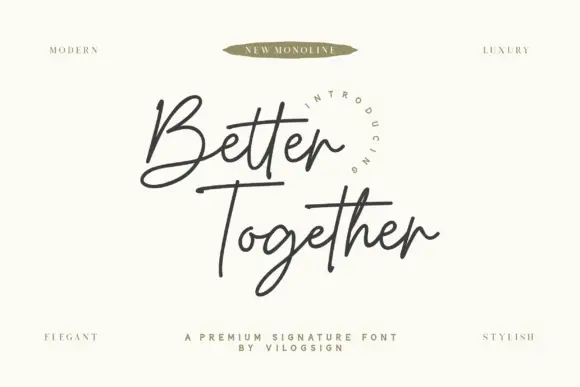
Fine crossed signature script
Better Together is a fine connected signature script with an open looped B, an even monoline weight and long horizontal strokes that cross beneath both words.
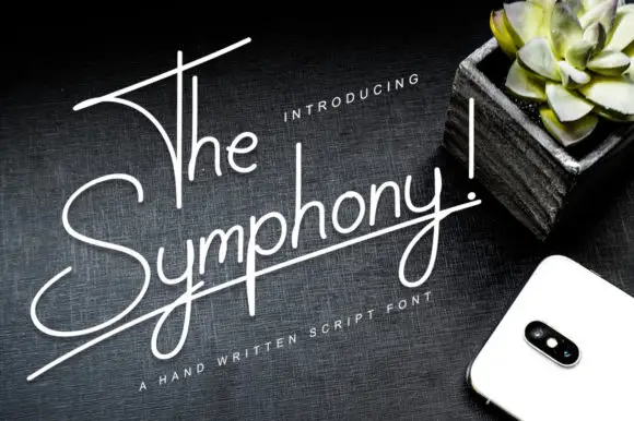
Very thin rising monoline script
The Symphony! is a very thin monoline script in white on a dark wood surface: tall narrow letters, a baseline that rises to the right, and a long horizontal stroke that underlines the whole phrase.
Ideas for this font
Same independent foundry
Allow optional Google Analytics to measure visits and catalogue actions. Your search words and notes are not included. Privacy & storage