Editorial Serif Anchor

Howdy Brother + The Lumina Awesome
Anchors Howdy Brother's fluid strokes with crisp Roman proportions on wedding suites, headers and packaging.
Inspect The Lumina Awesome specimenDisclosure: MakerFileHub may earn a commission from qualifying purchases via paid links on this page. How our links work.
Tall condensed rounded capitals, all caps
Howdy Brother is an all-caps handwriting drawn tall and narrow with thick even strokes and rounded corners, so two stacked words fill a square frame without losing the space between them.
Paid link
Get this fontProject & layout blueprintsAt-a-glance maker compatibility
Weld or Unite overlapping script joins into one continuous vector path before sending to the blade.
Visual anatomy & craft review
The cover sets HOWDY over BROTHER in white on a dark photograph, and the two lines are flush to the same width, which is what turns four and seven letters into one block. Each capital is a tall narrow oval: the O is almost twice as high as it is wide, the W keeps two shallow valleys instead of opening out, and the Y carries a short straight tail that stops above the baseline. Strokes are thick and unvarying with rounded ends, and the letters nearly touch, so the counters stay small and the word reads as a painted board rather than as writing. The cowboy photograph, the tracked caption line and the small label at the top are the listing's own presentation, not part of the alphabet.
Condensed · Rounded · Steady
Two-font hierarchy recipes
Tested contrast partners — pairing Howdy Brother with grounded secondary typography.
Howdy Brother + The Lumina Awesome
Anchors Howdy Brother's fluid strokes with crisp Roman proportions on wedding suites, headers and packaging.
Inspect The Lumina Awesome specimen
Howdy Brother + Nyxar
Keeps small-scale dates, URLs, nutrition facts and care instructions crisp and legible below script titles.
Inspect Nyxar specimenPractical applications
Concrete hierarchy, scale and production guidance tailored to Howdy Brother’s stroke geometry.
Condensed painted caps hold up at distance on a plank sign, and the tight spacing means a long stall name still fits the width of a market table without shrinking.
Hierarchy & layout recipe
Set the stall name at 8-inch cap height on a 1.2 m board, keep the price list in a plain condensed sans at 2 inches underneath, and leave 10 cm of bare board at the bottom where the trestle crosses the sightline.
Pre-production check
Hand-painting follows the letter edges, so check the narrow gaps between the double T and the H before the board is drilled and hung.
Thick rounded caps embroider cleanly because every stroke is wide enough to carry thread, and the condensed shape keeps a long brand name inside a small woven patch.
Hierarchy & layout recipe
Set the name at 14 mm cap height inside a 70 mm woven patch with an 8 mm border, keep the stitch count low by avoiding hairline joints, and hold the second line to the same width as the first so the edges stay straight.
Pre-production check
Ask the mill for a stitch-out of the W: its tight valleys are where embroidery pulls and the letter can close into a solid block.
Stacked painted capitals give a travel opener the look of a hand-lettered destination sign, which sets the tone for a reportage piece better than a neutral headline face.
Hierarchy & layout recipe
Run the two-word opener at 48 pt and 36 pt to a shared width at the top of the spread, set the standfirst at 10 pt with 5 mm of clearance, and start the first column on the line below the lowest letter.
Pre-production check
At 48 pt the even stroke is safe, but check the T crossbars against the trim: the condensed width leaves very little room to bleed the word off the edge.
Technical & licence verification
Confirm included OTF/TTF/WOFF formats, full glyph tables and licence coverage on the live store page before batch production.
Closest visual alternatives
Matched across letterform anatomy, stroke behaviour and craft applications.
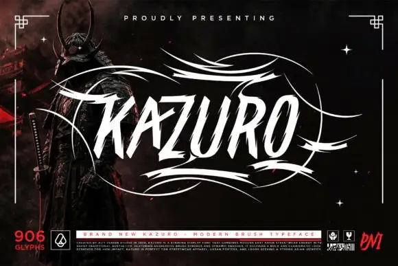
Sharp slanted brush capitals with cut terminals and a wide flourish frame
Kazuro is a sharp slanted brush alphabet in capitals, with strokes that end in hard cut angles and a flourish frame of thin sweeping lines drawn around the word.
Ideas for this font
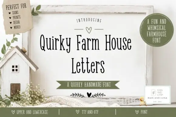
Tall narrow irregular serif letters
Quirky Farm House Letters is a tall narrow hand-drawn face with small irregular serifs, set on a painted signboard with a tiny house, sprigs and a heart, in a farmhouse palette of olive and cream.
Ideas for this font
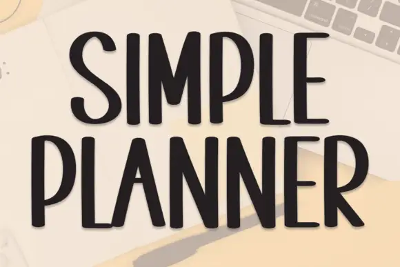
Tall condensed handwriting with light shadow
Simple Planner is a tall condensed hand-drawn display in near-black on a pale desk: narrow letters with blunt ends, a small light shadow and a level rhythm, drawn as two uppercase rows.
Ideas for this font
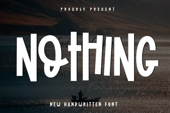
Tall compact display capitals
Nothing is a set of tall condensed hand-drawn capitals, set in white over a dark landscape: narrow stems, short crossbars and a few letters that step out of the line.
Ideas for this font
Same independent foundry
Allow optional Google Analytics to measure visits and catalogue actions. Your search words and notes are not included. Privacy & storage