Neutral Sans Workhorse

Cytone + Miniplate
Lets Cytone own the focal silhouette while handling secondary copy, sizing and subheads cleanly.
Inspect Miniplate specimenDisclosure: MakerFileHub may earn a commission from qualifying purchases via paid links on this page. How our links work.
Extended geometric Y2K techno-pop capsule display
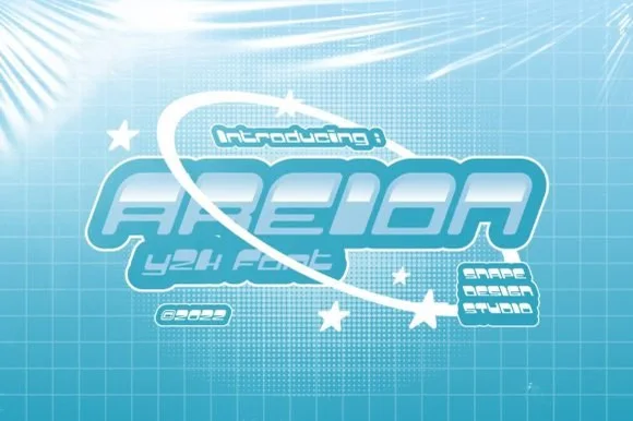
Cytone is a wide, upbeat Y2K display font sculpting low-slung geometric capsule letters built for orbital rings and glossy pop graphics.
Paid link
Get this fontProject & layout blueprintsAt-a-glance maker compatibility
Sturdy stroke walls and open counters weed cleanly on adhesive vinyl, HTV apparel film, and cut cardstock.
Visual anatomy & craft review
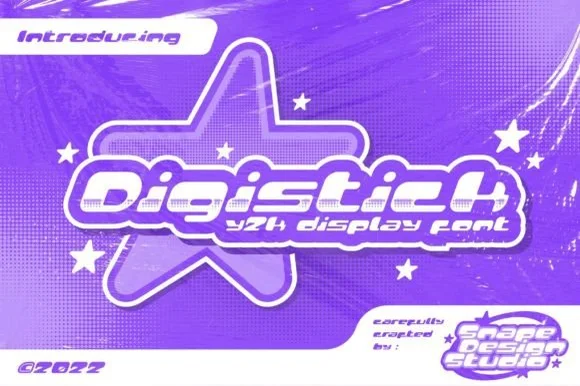
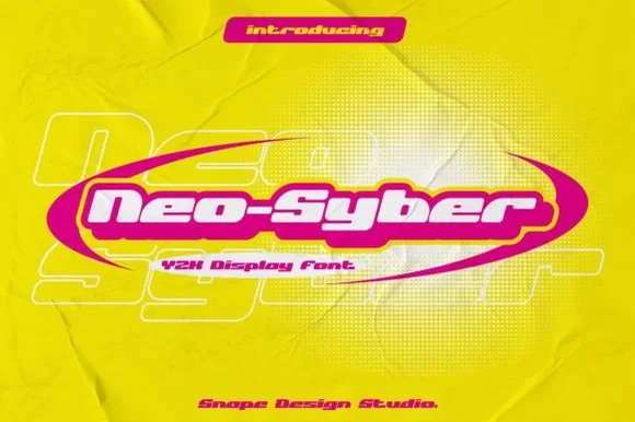
Cytone is a wide, low-slung geometric display built from capsule-shaped bowls and squared-off notched terminals, so its letters read as a row of glossy pressed pills rather than a conventional alphabet. The extended proportions come from a deliberately short x-height married to broad horizontal counters, which keeps the face legible at banner scale even when the sticker outline is applied thinly. Capitals share a uniform stroke weight with the lowercase, so all-caps headlines do not turn blotchy. The notches sit where a chisel would cut a plastic mould, and that single detail is what makes the Y2K reference convincing instead of merely rounded.
Bubblegum-Y2K · Extended · Millennium
Two-font hierarchy recipes
Tested contrast partners — pairing Cytone with grounded secondary typography.
Cytone + Miniplate
Lets Cytone own the focal silhouette while handling secondary copy, sizing and subheads cleanly.
Inspect Miniplate specimen
Cytone + Stanza
Grounds bold display lettering with classic typographic authority on posters, badges and apparel.
Inspect Stanza specimenPractical applications
Concrete hierarchy, scale and production guidance tailored to Cytone’s stroke geometry.
Cytone's capsule bowls read as injection-moulded plastic, which is exactly the material language a nail studio selling glossy press-ons wants on a counter card. The extended width fills a narrow strip without stacking words, and the notched terminals survive a small die-cut outline where a softer rounded face would blur.
Hierarchy & layout recipe
Menu card 90 x 55 mm, landscape, 3 mm bleed, 3 mm safety margin. Service names set at 14 pt cap-height-tracked +40 units, prices in a neutral narrow grotesque at 8 pt right-aligned in a separate column so the display face never carries numbers. Sticker sheet A6 portrait, six 35 mm circular dies, glyph cap-height 18 mm, 1.2 mm white keyline built into the artwork, 2 mm gap between dies.
Pre-production check
Proof the sticker sheet on the real release liner before trimming: the thin white keyline around an extended capsule can tear at the diagonal of the 'y' tail if the cut path runs closer than 0.8 mm. Measure the weeded edge, not the print.
Wide notched capitals give a club flyer the metallic pop-poster weight that a condensed face cannot, while the short x-height leaves room for a stacked date and lineup without crowding the title. The geometry is regular enough to hold a headline above a photograph and still feel like part of the image rather than a label stuck over it.
Hierarchy & layout recipe
Sleeve 12 in square, artwork 312 x 312 mm plus 3 mm bleed. Artist name 42 pt all-caps, one line, optically centred; tracklist 7.5/10 pt in a neutral grotesque, hanging indent 4 mm. Flyer A5 portrait: title at 60 pt across two lines, leading fixed at 0.92, lineup block in three columns of 42 mm with 6 mm gutters.
Pre-production check
Check the send-to-press PDF for black overprint on the notches. At 60 pt a 0.25 pt misregistration on a black-to-magenta edge shows as a red fringe on every counter, so keep display black as a rich build with a 0.3 mm trap or convert the notch edges to a single plate.
Extended capsules echo the shape of a frozen pop and hold a whole product name on one line across a cart front, where a normal-width display would wrap and lose its punch. The even stroke weight means the face still resolves through the screen of a printed wristband, which is a harsher reproduction than paper.
Hierarchy & layout recipe
Cart board 600 x 400 mm, 5 mm bleed, title 120 pt cap-height with 40 mm side margins. Flavour list in three stacked lines at 28 pt, 0.95 leading. Wristband 250 x 25 mm printed area, name 8 mm cap-height, 2 mm clear of the fold; artwork supplied at 1:1, not scaled from a logo.
Pre-production check
Wristbands are printed on woven polyester and stretch roughly 8 percent once worn, so a name set flush to the die edge pulls oval. Keep 4 mm of dead space and test on a wearer's wrist before signing off the artwork.
Technical & licence verification
Confirm included OTF/TTF/WOFF formats, full glyph tables and licence coverage on the live store page before batch production.
Closest visual alternatives
Matched across letterform anatomy, stroke behaviour and craft applications.
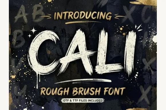
Heavy streaky hog-bristle wall-paint brush font (OTF & TTF)
Cali is a bold, wide-bristle rough brush display font streaked with authentic paint-roller and dry-brush fibers (OTF & TTF).
Ideas for this font
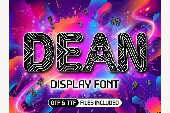
Cybernetic circuit-maze & tribal-line block display
Dean is a bold geometric block display typeface filled inside every thick stem with intricate parallel maze and circuit-board pathways.
Ideas for this font
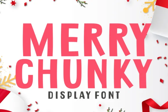
Bold slightly-angled cut-paper poster sans (All-year ready!)
Merry Chunky is a punchy, clean-cut geometric poster sans with lively cut-paper angles—and zero holiday clipart attached so it works all 365 days!
Ideas for this font
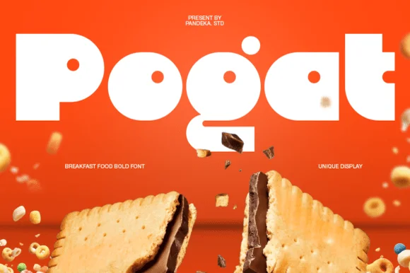
Ultra-fat heavy-packaging & cereal-box geometric display
Pogat is an ultra-heavy, slab-thick retro packaging font with massive ink mass and tiny circular pinhole counters built for snack and food branding!
Ideas for this font
Same independent foundry
Allow optional Google Analytics to measure visits and catalogue actions. Your search words and notes are not included. Privacy & storage