Neutral Sans Workhorse

Areion + Prime Nordic
Lets Areion own the focal silhouette while handling secondary copy, sizing and subheads cleanly.
Inspect Prime Nordic specimenDisclosure: MakerFileHub may earn a commission from qualifying purchases via paid links on this page. How our links work.
Ultra-wide futuristic Y2K pop-star & sci-fi block display
Areion is an ultra-wide Y2K pop-futuristic display font sculpting rounded capsule blocks with tiny geometric slit counters.
Paid link
Get this fontProject & layout blueprintsAt-a-glance maker compatibility
Sturdy stroke walls and open counters weed cleanly on adhesive vinyl, HTV apparel film, and cut cardstock.
Visual anatomy & craft review
Areion is an ultra-wide futuristic block display with a Y2K pop feel: extended squared caps, a heavy even stroke, a small bevel on the corners and a chrome-ready flat face that reads as a milled panel. The width makes every word long, so a centred block needs side room and a heading of three lines rather than one. It needs roughly 30 mm for the bevel and the squared corner to read, and it is best in one cool or acid ink on black, or a flat silver on white where the bevel prints as a thin facet.
Pop-2000 · Wide-pod · Icy-future
Two-font hierarchy recipes
Tested contrast partners — pairing Areion with grounded secondary typography.
Areion + Prime Nordic
Lets Areion own the focal silhouette while handling secondary copy, sizing and subheads cleanly.
Inspect Prime Nordic specimen
Areion + Things
Grounds bold display lettering with classic typographic authority on posters, badges and apparel.
Inspect Things specimenPractical applications
Concrete hierarchy, scale and production guidance tailored to Areion’s stroke geometry.
An ultra-wide Y2K block reads as a screen overlay rather than an editorial headline, which is what a feature about turn-of-the-century design wants. The extended caps fill the full 210 mm measure at 60 pt with no tracking, and the flat face holds a single ink on a dark page.
Hierarchy & layout recipe
Opener 210 x 297 mm, title 60 pt with 8 mm bevel clearance, standfirst 11/15 pt, data blocks 60 mm wide, 18 mm margins. Cover band 210 x 70 mm, word 44 pt.
Pre-production check
At 44 pt on the cover band the bevel facet closes and the title reads as a plain wide block with no edge. Keep bevel use at 56 pt and above, and proof one cover at 1:1.
A wide futuristic block gives a small label the look of a milled plate rather than a studio logo, which is what a pop imprint wants on a sleeve. The extended caps hold at 40 mm across the sleeve, and one metallic ink prints the sleeve and the card from one file.
Hierarchy & layout recipe
Sleeve 300 x 300 mm, word 70 mm with 10 mm bevel clearance, 20 mm margins. Card 85 x 55 mm, word 14 mm, 5 mm margins. Sticker 90 x 60 mm, word 26 mm, 5 mm die margin.
Pre-production check
A 90 x 60 mm sticker at 26 mm loses the bevel and the extended corners tear during weeding. Raise the sticker word to 36 mm or drop the bevel, and weed one sheet before the batch.
An ultra-wide block suits a summer festival because the extended caps read from across a field. The heavy stroke holds at 150 mm on a poster, and one acid ink on black prints the poster and the stage banner in a single order.
Hierarchy & layout recipe
Poster A2, word 150 mm with 18 mm bevel clearance, details 40 mm, 20 mm margins. Stage banner 3000 x 800 mm, word 260 mm, 60 mm safe edge. Crew pass 90 x 60 mm, word 14 mm, 5 mm margins.
Pre-production check
On a 90 x 60 mm crew pass the extended word at 14 mm runs off the card edge and gets trimmed. Set the pass word at two lines or 10 mm, and print one pass before the festival.
Technical & licence verification
Confirm included OTF/TTF/WOFF formats, full glyph tables and licence coverage on the live store page before batch production.
Closest visual alternatives
Matched across letterform anatomy, stroke behaviour and craft applications.
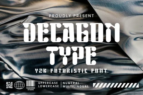
Chrome-era Y2K faceted geometric & organic-cut display
Decagon Type is a chunky Y2K futuristic display font blending ten-sided faceted block outer walls with curvy, liquid-like interior cutouts.
Ideas for this font
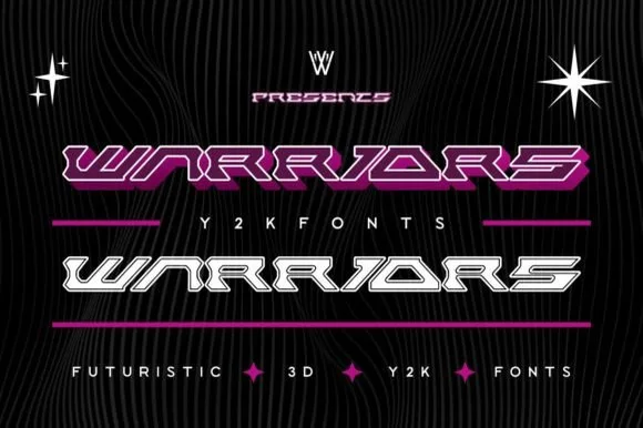
Wide speed-slanted Y2K cyber-racing display (Solid & Outline)
Warriors is an ultra-wide, forward-slanted Y2K cyberpunk display font featuring sliced horizontal speed bars in both Outline and Solid styles.
Ideas for this font
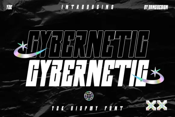
2-style condensed slanted Y2K cyberpunk sans (Solid & Outline)
Cybernetic is a sleek, condensed futuristic Y2K tech sans (NOT a medieval blackletter) showcasing matched Outline and Solid slanted cuts.
Ideas for this font
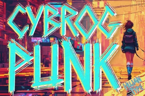
Tall jagged street-cyberpunk & graffiti-slash display
Cybrogpunk is a tall, angular street-cyberpunk display font fusing condensed industrial pillars with jagged graffiti-blade spurs.
Ideas for this font
Same independent foundry
Allow optional Google Analytics to measure visits and catalogue actions. Your search words and notes are not included. Privacy & storage