Neutral Sans Workhorse

Digistick + Limited Coffee
Lets Digistick own the focal silhouette while handling secondary copy, sizing and subheads cleanly.
Inspect Limited Coffee specimenDisclosure: MakerFileHub may earn a commission from qualifying purchases via paid links on this page. How our links work.
Playful connected-feel Y2K star-pop techno display
Digistick is a bouncy, rounded Y2K futuristic display font combining chunky pill-shaped stems, square pixel-like 'i' dots, and pop-star charm.
Paid link
Get this fontProject & layout blueprintsAt-a-glance maker compatibility
Sturdy stroke walls and open counters weed cleanly on adhesive vinyl, HTV apparel film, and cut cardstock.
Visual anatomy & craft review
A rounded techno display shown in crisp white over a five-point purple star emblem and sparkles: stout friendly characters with square dots and even stems are wrapped in lilac and white sticker rings, so the word reads as a two-thousands pop sticker rather than as a plain rounded sans. The rings are what make the face feel decal-like, and the compact lowercase keeps a nine or ten letter word tidy on a small sheet. The square dot on the i is the signature detail. The star behind is staging. Uses are party, sticker and small-label work where a friendly voice matters more than weight.
Star-pop · Millennium · Chunky-tech
Two-font hierarchy recipes
Tested contrast partners — pairing Digistick with grounded secondary typography.
Digistick + Limited Coffee
Lets Digistick own the focal silhouette while handling secondary copy, sizing and subheads cleanly.
Inspect Limited Coffee specimen
Digistick + Bulgary
Grounds bold display lettering with classic typographic authority on posters, badges and apparel.
Inspect Bulgary specimenPractical applications
Concrete hierarchy, scale and production guidance tailored to Digistick’s stroke geometry.
Friendly rounded stems with square dot accents hit the early two-thousands pop register, so a karaoke night or a Disney-era birthday reads as a themed print rather than a generic party shirt, and the sticker rings let the name sit inside a badge.
Hierarchy & layout recipe
Print a 240 mm chest graphic: the main word at 55 mm cap height stacked over a 14 mm subline, both inside one double-outlined star badge. Keep 6 mm between the word and the subline and place the badge 80 mm below the collar.
Pre-production check
Smooth rounded silhouettes cut cleanly on glitter HTV, holographic vinyl and cardstock toppers, but the square dots need transfer tape to stay aligned. Wash-test one shirt before the full run.
Compact lowercase proportions keep an eight to ten letter product name tidy on a small sticker sheet or a lip-balm label, where a wide display face would force the type down to an unreadable size.
Hierarchy & layout recipe
Print a 45 by 60 mm label: the product at 11 pt, the volume at 7 pt, and two inks on a white ground. Keep 4 mm inside the die, keep the sticker ring 2 mm clear of the text, and use a periwinkle or lavender accent.
Pre-production check
Check the 11 pt name in the hand, where the square dots can close into the stems. Confirm the ring clears the die edge and that the label survives a pocket or a bag.
The friendly rounded forms head a crochet or knitting pattern without the twee look of a script, and the sticker rings give the page the feel of a printed zine rather than a downloaded PDF.
Hierarchy & layout recipe
A4 pattern page: the title at 26 pt, the sections at 11 pt, and one ink on a white sheet. Keep 18 mm margins, set the title inside one ring, and leave 8 mm between the ring and the first paragraph.
Pre-production check
Check the page at actual size, where the ring line can fill in a photocopy; keep it above 0.4 mm. Confirm the 11 pt sections read in hand and that the header clears the fold.
Technical & licence verification
Confirm included OTF/TTF/WOFF formats, full glyph tables and licence coverage on the live store page before batch production.
Closest visual alternatives
Matched across letterform anatomy, stroke behaviour and craft applications.
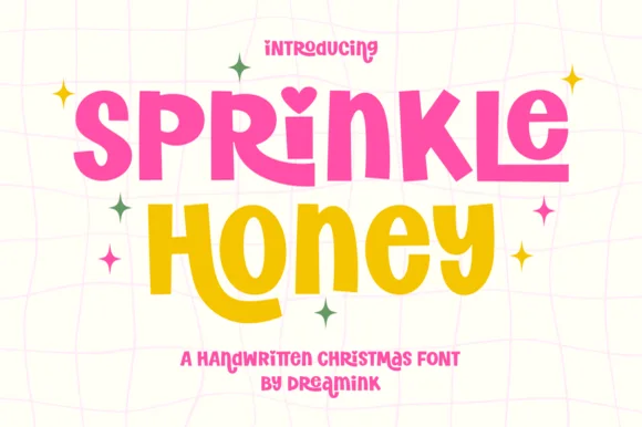
Chunky cut-paper kids' display with heart-dotted i (Year-round!)
Sprinkle Honey is a chunky, playful cut-paper display font with a sweet heart-dotted 'i'—zero Christmas icons attached so it shines all 12 months!
Ideas for this font
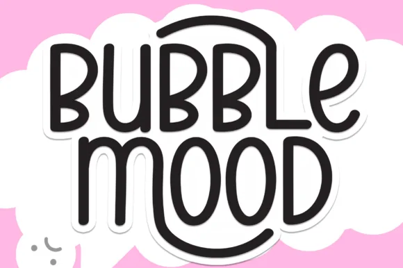
Tall rounded monoline marker display withnesting arches
Bubble Mood is a tall, medium-weight rounded marker display font where curved outer stems wrap playfully around neighboring vowels.
Ideas for this font
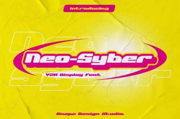
Wide Y2K display inside a swoosh
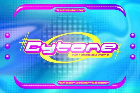
Neo-Syber is a Y2K display in white on magenta and acid yellow: very wide letters with rounded corners and a heavy outline, set inside an elliptical swoosh over a crumpled poster with huge outlined letters behind it.
Ideas for this font
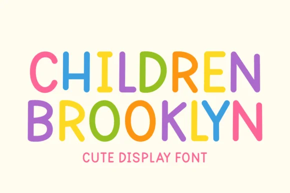
Clean rounded monoline marker caps for kids' design
Children Brooklyn is a tidy, outline-free rounded marker display font with tall friendly capitals and calm Nordic-playroom clarity.
Ideas for this font
Same independent foundry
Allow optional Google Analytics to measure visits and catalogue actions. Your search words and notes are not included. Privacy & storage