Neutral Sans Workhorse

Neo Syber + Homies
Lets Neo Syber own the focal silhouette while handling secondary copy, sizing and subheads cleanly.
Inspect Homies specimenDisclosure: MakerFileHub may earn a commission from qualifying purchases via paid links on this page. How our links work.
Wide Y2K display inside a swoosh
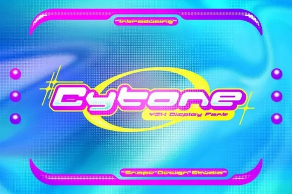
Neo-Syber is a Y2K display in white on magenta and acid yellow: very wide letters with rounded corners and a heavy outline, set inside an elliptical swoosh over a crumpled poster with huge outlined letters behind it.
Paid link
Get this fontProject & layout blueprintsAt-a-glance maker compatibility
Sturdy stroke walls and open counters weed cleanly on adhesive vinyl, HTV apparel film, and cut cardstock.
Visual anatomy & craft review
The word is set wide and low and the face is a turn-of-the-millennium display: the letters are extended well past normal proportions, the corners are rounded, the counters are narrow slots, and the strokes carry a slight taper at the ends that gives them a metallic feel. A heavy magenta outline wraps the block and continues past its ends into an elliptical swoosh, which is the shape the sample is built around, and behind it the same word is repeated at an enormous size as a white outline on the crumpled yellow ground. That layering is what makes the composition read as a poster from 2001 rather than a modern one. A small capital line at the top introduces the face, a second names it, and the studio sign sits at the foot. Neo-Syber is a display face for music artwork, event posters, apparel and packaging with a retro-futurist mood, and it needs one short word at a large size and a saturated ground.
Wide, glossy, futuristic
Two-font hierarchy recipes
Tested contrast partners — pairing Neo Syber with grounded secondary typography.
Neo Syber + Homies
Lets Neo Syber own the focal silhouette while handling secondary copy, sizing and subheads cleanly.
Inspect Homies specimen
Neo Syber + The Simple Editorial
Grounds bold display lettering with classic typographic authority on posters, badges and apparel.
Inspect The Simple Editorial specimenPractical applications
Concrete hierarchy, scale and production guidance tailored to Neo Syber’s stroke geometry.
A wide futuristic face sets the decade at a glance, and the heavy outline keeps the word readable over a busy or photographed card.
Hierarchy & layout recipe
Print a 120 by 120 mm card: set the greeting at 30 pt on one line, keep 14 mm of clear ground beneath before the details at 9 pt, and hold 12 mm of margin on all four sides.
Pre-production check
An extended face at thirty points can run past the trim; set the word and measure the overhang before printing.
A Y2K display gives a cover its period without a photograph, and the outline swoosh fills a page that would otherwise need artwork.
Hierarchy & layout recipe
Print a 210 by 297 mm cover: set the title at 80 pt on one line, keep 24 mm of clear ground beneath before the coverlines at 10 pt, and hold 16 mm of margin on all four sides.
Pre-production check
A saturated yellow ground is hard to print evenly; proof one cover and check the flat areas before the run.
A wide futuristic face reads at a distance and photographs well under coloured light, which is what a club flyer has to survive.
Hierarchy & layout recipe
Print a 900 by 400 mm banner: set the name at 140 pt on one line, keep 32 mm of clear ground beneath before the date at 28 pt, and hold 24 mm of border on all four sides.
Pre-production check
Coloured lighting shifts magenta badly; print one banner section and check it under the venue lights before the full run.
Technical & licence verification
Confirm included OTF/TTF/WOFF formats, full glyph tables and licence coverage on the live store page before batch production.
Closest visual alternatives
Matched across letterform anatomy, stroke behaviour and craft applications.
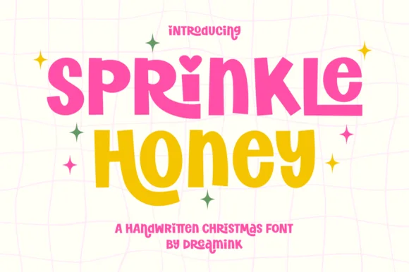
Chunky cut-paper kids' display with heart-dotted i (Year-round!)
Sprinkle Honey is a chunky, playful cut-paper display font with a sweet heart-dotted 'i'—zero Christmas icons attached so it shines all 12 months!
Ideas for this font
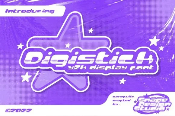
Playful connected-feel Y2K star-pop techno display
Digistick is a bouncy, rounded Y2K futuristic display font combining chunky pill-shaped stems, square pixel-like 'i' dots, and pop-star charm.
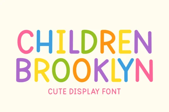
Clean rounded monoline marker caps for kids' design
Children Brooklyn is a tidy, outline-free rounded marker display font with tall friendly capitals and calm Nordic-playroom clarity.
Ideas for this font
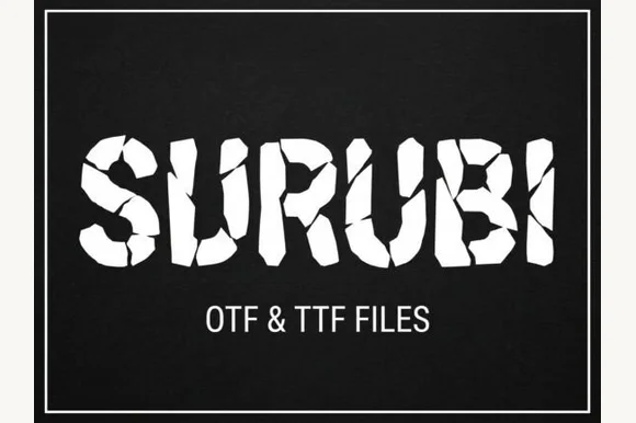
Cracked fragment display
Surubi is a cracked display in white on black: heavy caps built from separate fragments, with wide crack lines running through the bowls and stems and displaced pieces at the edges, set inside a thin rule frame with the file formats noted beneath.
Same independent foundry
Allow optional Google Analytics to measure visits and catalogue actions. Your search words and notes are not included. Privacy & storage