Neutral Sans Workhorse

Ideal Lover + Furion
Lets Ideal Lover own the focal silhouette while handling secondary copy, sizing and subheads cleanly.
Inspect Furion specimenDisclosure: MakerFileHub may earn a commission from qualifying purchases via paid links on this page. How our links work.
Tall double-line capitals interrupted by small open hearts near the lower stems
Ideal Lover is a decorative line face in which each tall capital is drawn as an inline outline and a small heart sits inside the base of the stroke, so a word marches along a row of little hearts.
Paid link
Get this fontProject & layout blueprintsAt-a-glance maker compatibility
Sturdy stroke walls and open counters weed cleanly on adhesive vinyl, HTV apparel film, and cut cardstock.
Visual anatomy & craft review
IDEAL over LOVER fills the card in a magenta line drawing on white, the letters narrow and tall with a double contour, and every letter carries a heart at its foot: the I holds one under the serif, the D has one inside the bowl, the E has one at each stem, and the R finishes the row with a heart in its leg. The hearts are drawn at the same stroke weight as the letters, which is what makes the set read as a single drawing rather than as type with icons attached. A spaced caption above introduces the face and one below names it, both in the same magenta at a small size. Because everything is a line, the face can be printed in one colour on any stock, and it can be cut as a stencil, which is the practical use: vinyl, paper, cake stencils. It needs height, since the hearts sit at the baseline where a short setting would close them up.
Tall double-line capitals interrupted by small open hearts near the lower stems
Two-font hierarchy recipes
Tested contrast partners — pairing Ideal Lover with grounded secondary typography.
Ideal Lover + Furion
Lets Ideal Lover own the focal silhouette while handling secondary copy, sizing and subheads cleanly.
Inspect Furion specimen
Ideal Lover + Papillon Serif – Elegant Modern Luxury
Grounds bold display lettering with classic typographic authority on posters, badges and apparel.
Inspect Papillon Serif – Elegant Modern Luxury specimenPractical applications
Concrete hierarchy, scale and production guidance tailored to Ideal Lover’s stroke geometry.
One word in this face supplies the occasion, the decoration and the symbol at once, so the card needs nothing else on the front but a short line underneath.
Hierarchy & layout recipe
Print a 105 by 148 mm card: set the word at 56 pt on one row, keep 16 mm of clear ground beneath before the message at 9 pt, and hold 13 mm from the last heart to the card edge.
Pre-production check
The inline outline fills in below 20 pt; print one card at the finished size and check the hearts before the batch.
The hearts repeat along the line without a second ornament, and the thin outline prints cleanly on the card a venue uses for small signs.
Hierarchy & layout recipe
Print a 200 by 150 mm sign: set the greeting at 54 pt on one row, keep 18 mm of clear ground beneath before the names at 12 pt, and hold 16 mm of margin so the lowest heart is not cropped.
Pre-production check
Thin outlines buckle on foam board; print one sign on the intended material and check the inline weight before the set.
The line construction makes a clean stencil, and the hearts suit a shop that sells small decorated things rather than large plain ones.
Hierarchy & layout recipe
Print a 120 by 90 mm box lid: set the shop name at 30 pt on one row, keep 10 mm of clear ground beneath before the contact line at 5 pt, and hold 8 mm from the outline to the lid edge.
Pre-production check
Stencil bridges need width in the outline; cut one test lid and check that the hearts hold before the box order.
Technical & licence verification
Confirm included OTF/TTF/WOFF formats, full glyph tables and licence coverage on the live store page before batch production.
Closest visual alternatives
Matched across letterform anatomy, stroke behaviour and craft applications.
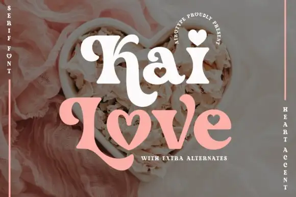
Chunky curled serif forms with heart-shaped accents and counters
Kai Love shows thick white and pink lettering over a floral photograph, where large rolled terminals extend from the K and L, a heart sits above the i, another fills the counter of the a and the o of the lower word is drawn as an open heart rather than a conventional oval.
Ideas for this font
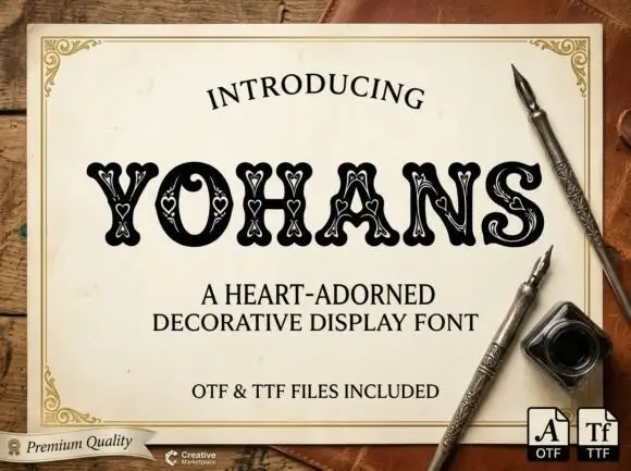
Heart-nested soft display
Yohans is a soft heavy display in black on an aged paper card: rounded capitals with small pale heart outlines nested along the strokes, a fine inner outline and slight serifs, set as one word between a curved introducing line and two plain lines naming the style and the formats, with a maker badge at the lower left.
Ideas for this font
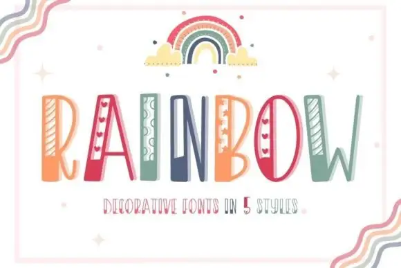
Striped narrow novelty capitals
Rainbow is a tall narrow novelty display on a white sheet inside a pale frame: capitals carrying different side details — diagonal stripes, hearts, loops, dots — in a palette of coral, teal and green, with a drawn rainbow above and a small line beneath naming five styles.
Ideas for this font
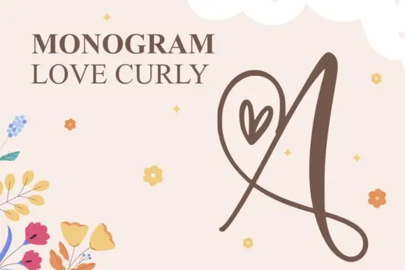
Looping heart monogram initial
Monogram Love Curly is a monogram mark on a blush ground: a tall looping A drawn as one continuous stroke with a heart set into the loop, a long crossing flourish below and a fine tail, with a serif title at the upper left and scattered small flowers and stars around it.
Ideas for this font
Same independent foundry
Allow optional Google Analytics to measure visits and catalogue actions. Your search words and notes are not included. Privacy & storage