Neutral Sans Workhorse

Clyde + Prime Nordic
Lets Clyde own the focal silhouette while handling secondary copy, sizing and subheads cleanly.
Inspect Prime Nordic specimenDisclosure: MakerFileHub may earn a commission from qualifying purchases via paid links on this page. How our links work.
Heavy irregular block capitals with broad slab ends and slightly tilted stems
Clyde is a bold block display face with wide squared letters, a warm copper finish and a burnished edge that makes the shapes look cast rather than printed.
Paid link
Get this fontProject & layout blueprintsAt-a-glance maker compatibility
Sturdy stroke walls and open counters weed cleanly on adhesive vinyl, HTV apparel film, and cut cardstock.
Visual anatomy & craft review
CLYDE fills the middle of the card in a copper tone on a deep green ground, and the letters are heavy and wide with flat tops, short stems and rounded outer corners, sitting on a slight arc so the word looks stamped onto a curved surface. The fill is a gradient with a highlight along one edge and a darker side opposite, which gives the shapes a metallic body, and small speckles of the same copper are scattered around the card like splashes. A caption at the top introduces the face and two lines at the foot name the style and the formats. The face is a display cut for packaging, signage and posters, and its character comes from the finish rather than the skeleton, so it prints well in a single metallic ink or a flat colour at large sizes.
Heavy irregular block capitals with broad slab ends and slightly tilted stems
Two-font hierarchy recipes
Tested contrast partners — pairing Clyde with grounded secondary typography.
Clyde + Prime Nordic
Lets Clyde own the focal silhouette while handling secondary copy, sizing and subheads cleanly.
Inspect Prime Nordic specimen
Clyde + The Lumina Awesome
Grounds bold display lettering with classic typographic authority on posters, badges and apparel.
Inspect The Lumina Awesome specimenPractical applications
Concrete hierarchy, scale and production guidance tailored to Clyde’s stroke geometry.
The copper finish suggests a still and a barrel, and the heavy block letters hold a short brand name on a bottle at arm's length.
Hierarchy & layout recipe
Print a 60 by 105 mm label: set the brand name at 24 pt on one row, keep 9 mm of clear ground beneath before the strength at 5 pt, and hold 6 mm from the widest letter to the die line.
Pre-production check
Metallic inks band on a curved label; print one label and roll it onto the bottle before the run.
The block letters read as a brewery sign, and the metallic tone gives a plain cover a finished look without a photograph.
Hierarchy & layout recipe
Print a 210 by 280 mm cover: set the title at 90 pt across two rows, keep 26 mm of clear ground beneath before the edition line at 11 pt, and hold 18 mm from the widest letter to the trim.
Pre-production check
Copper on coated stock shows roller marks; print one cover and check it under a raking light before the run.
The face reads from the far end of a lunch queue, and the metallic warmth matches hot food and a paper tray better than a cold white sans would at the same size.
Hierarchy & layout recipe
Print a 1800 by 450 mm side panel: set the truck name at 240 pt on one row, keep 50 mm of clear ground beneath before the menu line at 24 pt, and hold 50 mm of margin at each end of the panel.
Pre-production check
Vinyl metallic films lift at the corners; print one panel and check the edge before the second side.
Technical & licence verification
Confirm included OTF/TTF/WOFF formats, full glyph tables and licence coverage on the live store page before batch production.
Closest visual alternatives
Matched across letterform anatomy, stroke behaviour and craft applications.
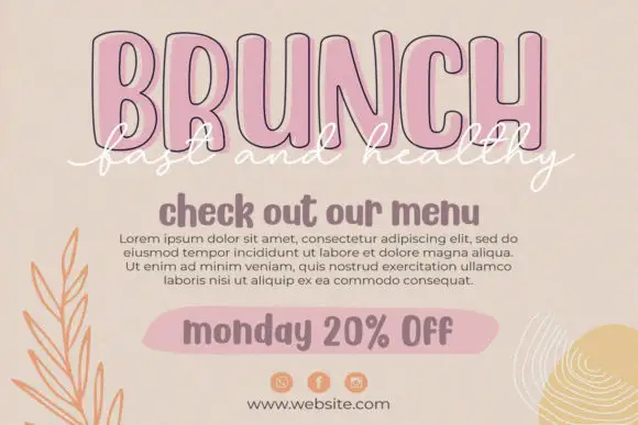
Condensed outline capitals with a script overlay
Twinkling Stars is a layered set on a beige page: tall condensed outline capitals in pink for a headline, a white script written across them, a rounded sans for a subhead and a tinted pill for a note, laid out as a social post.
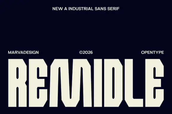
Clipped-corner block display
Remidle is a tall block display in cream on navy: capitals with clipped corners, small vertical slot counters, an even heavy stroke and squared terminals, set as one word across the full width with a small line above and three credits spread along the foot.
Ideas for this font
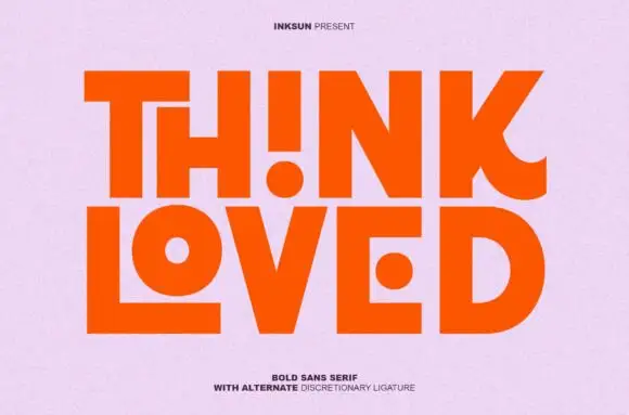
Bold sans with ligature alternates
Think Loved is a bold sans in orange on a pale ground: wide geometric caps with flat terminals, a very high waist and tight spacing, with a ligature that fuses two letters into a single drawn shape, set in two lines with a small tracked note beneath naming the alternate.
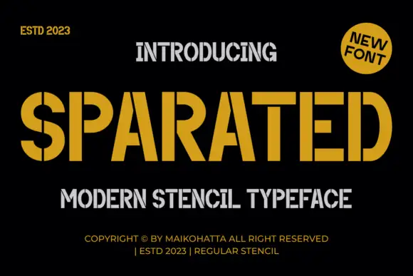
Angular stencil display
Sparated is an angular stencil display in mustard on black: heavy condensed caps with narrow vertical breaks through the bowls and the upright joins, squared corners and flat terminals, with a grey secondary line beneath and tracked credits at the foot.
Same independent foundry
Allow optional Google Analytics to measure visits and catalogue actions. Your search words and notes are not included. Privacy & storage