Neutral Sans Workhorse

Charm Divine + Inkora
Lets Charm Divine own the focal silhouette while handling secondary copy, sizing and subheads cleanly.
Inspect Inkora specimenDisclosure: MakerFileHub may earn a commission from qualifying purchases via paid links on this page. How our links work.
Broad rounded capitals with compact inner spaces and an offset outline
Charm Divine is a broad rounded capital alphabet in which the strokes are fat, the inner spaces stay small and each letter carries an offset outline, so a word reads as a bold sticker with weight behind it.
Paid link
Get this fontProject & layout blueprintsAt-a-glance maker compatibility
Sturdy stroke walls and open counters weed cleanly on adhesive vinyl, HTV apparel film, and cut cardstock.
Visual anatomy & craft review
The C opens a wide crescent, the H keeps two heavy stems and a low bar, the A carries a bar set low and the E holds three fat arms, all at a maximal weight with fully rounded corners and a low contrast. The counters are deliberately small relative to the strokes, which is what gives the face its bold sticker proportion rather than the look of a rounded sans. The offset outline in the sample is a treatment: it sits behind the letters rather than around them, so it reads as depth without extra weight. Because the letters are simple and equally weighted, the face holds at 24 pt on a sticker and reads at 100 pt on a poster. The pale ground, the orange fill, the small labels are presentation; the display face is the two words.
Broad · Rounded · Bold
Two-font hierarchy recipes
Tested contrast partners — pairing Charm Divine with grounded secondary typography.
Charm Divine + Inkora
Lets Charm Divine own the focal silhouette while handling secondary copy, sizing and subheads cleanly.
Inspect Inkora specimen
Charm Divine + The Avenue Editorial
Grounds bold display lettering with classic typographic authority on posters, badges and apparel.
Inspect The Avenue Editorial specimenPractical applications
Concrete hierarchy, scale and production guidance tailored to Charm Divine’s stroke geometry.
The broad rounded blocks read at 14 pt on a small sticker, and the compact counters keep a two-word name as one solid shape on a coloured bag.
Hierarchy & layout recipe
Print a 50 mm round sticker: set the name at 14 pt, keep 5 mm inside the die so the offset outline is not clipped, and check that the counter of the A still opens at that size.
Pre-production check
Small counters under 1 mm close on a digital press; check the printed sticker and raise the size rather than thinning the strokes.
The bold rounded weight carries a cover line at 80 pt without reading as a corporate sans, and the offset outline gives it depth on a plain ground.
Hierarchy & layout recipe
Print an A4 cover: set the cover line at 80 pt across the upper third, set the standfirst in an 11 pt sans beneath, and keep 20 mm of margin so the outline sits clear of the trim on both sides.
Pre-production check
An offset outline printed over a photograph reads as a shadow error; check the cover and keep the outline for plain grounds only.
The rounded blocks read at 35 mm on a printed cake board, and the compact counters keep a greeting legible between the printed decoration.
Hierarchy & layout recipe
Print a 250 mm round board: set the greeting at 35 mm across the upper half, set the bakery credit in a 9 pt rounded sans at the foot, and keep 25 mm of clear board around the edge so the rim does not cut the outline.
Pre-production check
A board trimmed after printing can clip the outline; check the trim line against the artwork and keep the type inside 85 percent of the diameter.
Technical & licence verification
Confirm included OTF/TTF/WOFF formats, full glyph tables and licence coverage on the live store page before batch production.
Closest visual alternatives
Matched across letterform anatomy, stroke behaviour and craft applications.
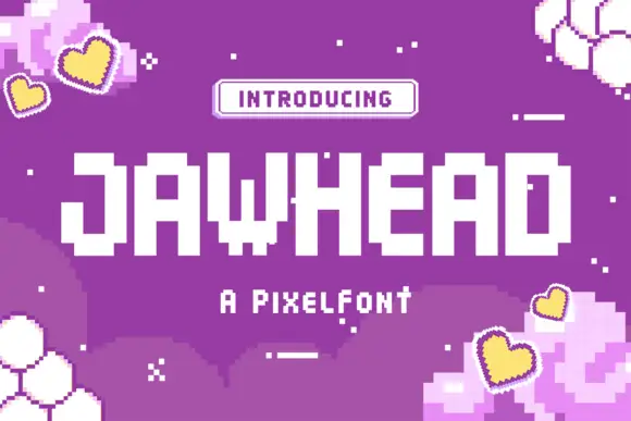
Blocky pixel capitals with stepped corners and square counters
Jawhead is a pixel font drawn on a coarse square grid: chunky capitals built from visible blocks, stair-stepped diagonals, and counters that close up if the word is set small.
Ideas for this font
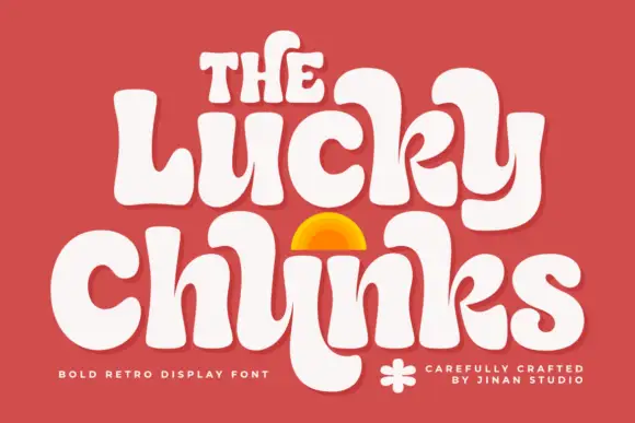
Bulging retro forms with curled joins
Lucky Chunks is a bold retro display face in cream on terracotta: very fat letters whose bowls bulge past the stems, curled joins between the letters of a word, and a half-sun arch drawn between the two lines.
Ideas for this font
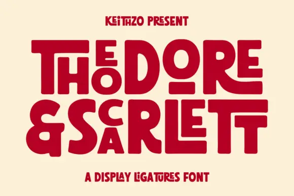
Fat geometric ligature display with nested letters
Theodore and Scarlett is a display ligature face in deep red on cream: fat geometric letters where small letters nest inside the counters of large ones, the two words interlocking so the block reads as one shape with two lines inside it.
Ideas for this font
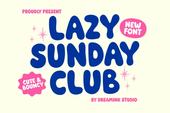
Heavy bouncy rounded capitals
Lazy Sunday Club is a heavy bouncy rounded capital display in navy on cream: very fat letters with fully rounded ends, uneven heights across a word, a wide open O and small pastel sparks drawn around the block.
Ideas for this font
Same independent foundry
Allow optional Google Analytics to measure visits and catalogue actions. Your search words and notes are not included. Privacy & storage