Neutral Sans Workhorse

Lazy Sunday Club + Bargain Condensed
Lets Lazy Sunday Club own the focal silhouette while handling secondary copy, sizing and subheads cleanly.
Inspect Bargain Condensed specimenDisclosure: MakerFileHub may earn a commission from qualifying purchases via paid links on this page. How our links work.
Heavy bouncy rounded capitals
Lazy Sunday Club is a heavy bouncy rounded capital display in navy on cream: very fat letters with fully rounded ends, uneven heights across a word, a wide open O and small pastel sparks drawn around the block.
Paid link
Get this fontProject & layout blueprintsAt-a-glance maker compatibility
Sturdy stroke walls and open counters weed cleanly on adhesive vinyl, HTV apparel film, and cut cardstock.
Visual anatomy & craft review
The three words are stacked in capitals, and the face is a bouncy display: each letter is a fat rounded form whose corners are completely soft, the L and the S lean a little, the A carries a low bar, the Y throws a short tail and the C and the O are nearly circular, while the letters sit at slightly different heights so a short word looks hand-set rather than typed. The stroke is uniform and very heavy, the counters are small and the spacing is tight, which is what makes the face read at poster distance. A pink badge, a starburst and small four-pointed sparks in pastel sit around the block, and two tracked lines name the style and the studio. The ground is a flat cream. Lazy Sunday Club is a display capital for posters, packaging and party goods, and it needs one or two short words at a large size.
A fat bouncy capital set in one navy
Two-font hierarchy recipes
Tested contrast partners — pairing Lazy Sunday Club with grounded secondary typography.
Lazy Sunday Club + Bargain Condensed
Lets Lazy Sunday Club own the focal silhouette while handling secondary copy, sizing and subheads cleanly.
Inspect Bargain Condensed specimen
Lazy Sunday Club + Aureline
Grounds bold display lettering with classic typographic authority on posters, badges and apparel.
Inspect Aureline specimenPractical applications
Concrete hierarchy, scale and production guidance tailored to Lazy Sunday Club’s stroke geometry.
A fat bouncy capital reads across a room and looks made for the day, and the heavy strokes stay separate on a fabric banner.
Hierarchy & layout recipe
Print a 900 by 400 mm banner: set the greeting at 140 pt over two lines, keep 30 mm of clear ground beneath before the name at 44 pt, and hold 26 mm of border on all four sides of the banner.
Pre-production check
A bouncy baseline can look crooked on a long banner; print one section at the final size and check the level before the order.
A heavy capital set gives a can a bold identity, and the rounded shapes suit a product that wants to look easy and friendly.
Hierarchy & layout recipe
Print a 60 by 100 mm can label: set the brand at 18 pt on one line, keep 7 mm of clear ground beneath before the flavour at 5.5 pt, and hold 5 mm of margin on all four sides of the label.
Pre-production check
Very heavy letters on a curved can can distort at the edges; print one on the real can and check the outer letters before the order.
A rounded capital fills a round die without an illustration, and the thick strokes survive a small cut with no fine detail to lose.
Hierarchy & layout recipe
Print a 100 by 150 mm sheet of 40 mm stickers: set the word at 20 pt inside each die, keep 7 mm of clear ground to the die line, and repeat the block across the sheet.
Pre-production check
A letter edge can cross a tight die; print one sheet and cut it before running the rest of the batch.
Technical & licence verification
Confirm included OTF/TTF/WOFF formats, full glyph tables and licence coverage on the live store page before batch production.
Closest visual alternatives
Matched across letterform anatomy, stroke behaviour and craft applications.
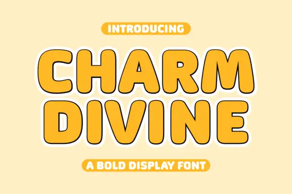
Broad rounded capitals with compact inner spaces and an offset outline
Charm Divine is a broad rounded capital alphabet in which the strokes are fat, the inner spaces stay small and each letter carries an offset outline, so a word reads as a bold sticker with weight behind it.
Ideas for this font
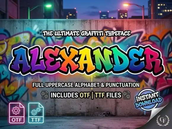
Heavy angular graffiti-like capitals with uneven baselines and layered outline styling
Alexander spreads broad coloured capitals across a graffiti-wall scene, where the letters lean in different directions with pointed corners and heavy curved sides, and multiple outlines stack behind the fills while gradients run through the wall behind.
Ideas for this font
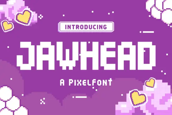
Blocky pixel capitals with stepped corners and square counters
Jawhead is a pixel font drawn on a coarse square grid: chunky capitals built from visible blocks, stair-stepped diagonals, and counters that close up if the word is set small.
Ideas for this font
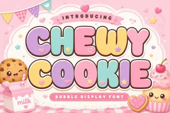
Squat bubble capitals packed tightly with heart accents between letters
Chewy Cookie is a squat bubble capital alphabet packed so tightly that the letters touch, with small hearts scattered into the gaps and a soft outline around the whole phrase.
Ideas for this font
Same independent foundry
Allow optional Google Analytics to measure visits and catalogue actions. Your search words and notes are not included. Privacy & storage