Neutral Sans Workhorse

Chalkboard + Bargain Condensed
Lets Chalkboard own the focal silhouette while handling secondary copy, sizing and subheads cleanly.
Inspect Bargain Condensed specimenDisclosure: MakerFileHub may earn a commission from qualifying purchases via paid links on this page. How our links work.
Hollow outlined school print with rounded counters and even strokes
Chalkboard is a clean hollow-outline print in which every letter is drawn as a double contour, so a word reads as chalk lettering on a board without the texture of real chalk.
Paid link
Get this fontProject & layout blueprintsAt-a-glance maker compatibility
Fine grain and micro-texture excel in 300 DPI print, sublimation, and screen print rather than small vinyl weeding.
Visual anatomy & craft review
The C closes a wide crescent, the h keeps a tall stem and a round shoulder, the a holds a single-storey bowl and the d rises into a full ascender, all at an even medium weight with the outline forming a continuous hollow shape. Because the letters are hollow, they can carry a coloured fill or stay open on a dark ground, which is how the sample reads as chalk without any grain. The contour is the fragile part: it needs 24 pt minimum on print and a print method that does not fill the fine inner line. Counters stay open and the x-height is tall, so the face works on a classroom board as well as on a worksheet header. The dark chalkboard ground, the wooden frame and the two caption lines are presentation; the typeface is the word.
Outlined · Neat · School
Two-font hierarchy recipes
Tested contrast partners — pairing Chalkboard with grounded secondary typography.
Chalkboard + Bargain Condensed
Lets Chalkboard own the focal silhouette while handling secondary copy, sizing and subheads cleanly.
Inspect Bargain Condensed specimen
Chalkboard + Alerigue
Grounds bold display lettering with classic typographic authority on posters, badges and apparel.
Inspect Alerigue specimenPractical applications
Concrete hierarchy, scale and production guidance tailored to Chalkboard’s stroke geometry.
The hollow contour reads on a dark board as if chalked, and the even weight keeps a long heading legible at 40 mm without real chalk dust.
Hierarchy & layout recipe
Print a 700 by 400 mm board: set the heading at 40 mm across the upper half, set the class list in a 12 mm rounded sans beneath, and keep 30 mm of margin so the open contour is not cut by the board frame.
Pre-production check
A hollow outline under 0.5 mm fills in on a matte print; check the proof and choose a heavier contour rather than a darker ink.
The outlined letters stay legible at 22 pt on a photocopied sheet, and the hollow construction keeps a routine page from looking institutional.
Hierarchy & layout recipe
Print an A4 worksheet: set the header at 22 pt in the top margin, set the instructions in an 11 pt sans at 15 pt leading, and keep 10 mm below the header so the pupils' writing starts on blank paper.
Pre-production check
Photocopiers close hollow contours at small sizes; check a copy at full size and drop the outline below 20 pt.
The hollow face gives a printed sign the look of a chalked label, and the open counters keep a long section name readable at 30 mm.
Hierarchy & layout recipe
Print a 300 by 200 mm sign: set the section name at 30 mm, set the opening hours in a 9 mm sans beneath, and leave 20 mm of border so the contour sits clear of the mounting holes in the corners.
Pre-production check
Mounting holes drilled near a hollow letter can break it; check the fixings against the artwork and keep the type inside the inner two thirds.
Technical & licence verification
Confirm included OTF/TTF/WOFF formats, full glyph tables and licence coverage on the live store page before batch production.
Closest visual alternatives
Matched across letterform anatomy, stroke behaviour and craft applications.
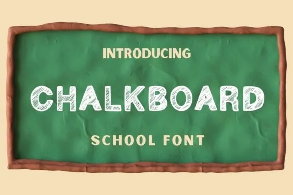
Hand-shaded classroom chalk capitals with hatched texture
Chalkboard is a classroom display alphabet in capitals, drawn with a hatched interior so each stroke reads as chalk dragged across a board rather than a solid fill.
Ideas for this font
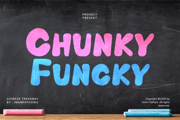
Extra-heavy bouncy block with chalk texture and rounded corners
Chunky Funky is an extra-heavy block alphabet with a chalk texture, rounded corners and a bounce across the baseline, so a word reads as something drawn thick on a blackboard.
Ideas for this font
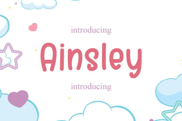
Solid marker-weight print with rounded joins and open counters
Ainsley is a solid marker-weight print in which the strokes keep an even thickness, the corners round off and the counters stay open, so a name reads as lettering written with a felt tip and then cleaned up for cutting.
Ideas for this font
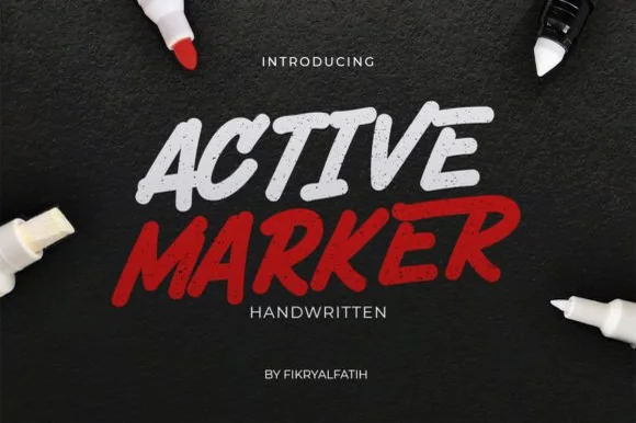
Slanted chisel-tip whiteboard & chalkboard marker sans
Active Marker captures brisk, slanted broad-tip marker lettering with organic stroke tapers and natural double-letter ligatures.
Ideas for this font
Same independent foundry
Allow optional Google Analytics to measure visits and catalogue actions. Your search words and notes are not included. Privacy & storage