Modern Grotesque Body

Cartton Style Bold + Memoir Slang
Creates crisp high-hierarchy contrast beneath Cartton Style Bold headlines across menus, websites and labels.
Inspect Memoir Slang specimenDisclosure: MakerFileHub may earn a commission from qualifying purchases via paid links on this page. How our links work.
Heavy compact mixed-case slabs with rounded bowls and blunt joins
Cartton Style Bold sets a heavy slab in black on white, its serifs squared, its bowls wide and its spacing tight, so two stacked words read as a solid block of ink.
Paid link
Get this fontProject & layout blueprintsAt-a-glance maker compatibility
Sturdy stroke walls and open counters weed cleanly on adhesive vinyl, HTV apparel film, and cut cardstock.
Visual anatomy & craft review
The name fills the card in two rows, the C and the a drawing broad curves and the t carrying a flat bar, with the weight heavy enough that the counters become small slots. Serifs are slabs rather than brackets, so the letters look built from rectangles, and the tight spacing makes the block read as a unit. A tracked caption in a ruled box sits below, and light botanical sketches sit at the edges of the page. The face is a headline weight with no contrast, which makes it strong at poster size and muddy in a paragraph or at small sizes.
Heavy compact mixed-case slabs with rounded bowls and blunt joins
Two-font hierarchy recipes
Tested contrast partners — pairing Cartton Style Bold with grounded secondary typography.
Cartton Style Bold + Memoir Slang
Creates crisp high-hierarchy contrast beneath Cartton Style Bold headlines across menus, websites and labels.
Inspect Memoir Slang specimen
Cartton Style Bold + Handmade Calligraphy
Adds a warm human signature touch for 1-to-3-word callouts without competing against structured serif capitals.
Inspect Handmade Calligraphy specimenPractical applications
Concrete hierarchy, scale and production guidance tailored to Cartton Style Bold’s stroke geometry.
The block weight holds a headline over a full-bleed photograph, and the squared serifs stay crisp in newsprint where brackets would clog.
Hierarchy & layout recipe
Print a 210 by 280 mm page: set the headline at 60 pt across two lines, keep 18 mm of clear ground beneath before the standfirst at 10 pt, and keep 16 mm of margin from the text block on each side.
Pre-production check
Heavy coverage sets off on uncoated stock; check the press proof before the issue is signed.
The slab weight gives a box a confident front, and a short product name fits the wide block on a narrow carton face beside a barcode.
Hierarchy & layout recipe
Print a 90 by 140 mm carton face: set the product at 24 pt on one row, keep 11 mm of clear ground beneath before the weight at 7 pt, and keep 8 mm to the fold so the serifs are not cut.
Pre-production check
Tight spacing merges on a fold; check the layout at final size before the print run. Have the printer send a physical sample first.
The block letters read on a shelf of yearbooks, and the plain shapes stay legible when the cover is reproduced small in a catalogue.
Hierarchy & layout recipe
Print an A4 cover: set the title at 48 pt across two rows, keep 18 mm of clear ground beneath before the year at 14 pt, and keep 20 mm of margin from the trim edge.
Pre-production check
Small counters close in a cheap print; check a proof before the yearbook order. Request a proof on the actual stock before signing off.
Technical & licence verification
Confirm included OTF/TTF/WOFF formats, full glyph tables and licence coverage on the live store page before batch production.
Closest visual alternatives
Matched across letterform anatomy, stroke behaviour and craft applications.
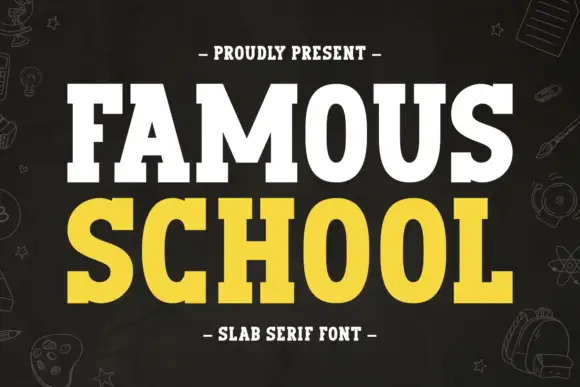
Broad clean slabs with rounded bowls and small flared joins
Famous School shows white FAMOUS above yellow SCHOOL on dark charcoal, where the O bowls are broad and rounded, the M carries a deep centre, and short sturdy slab ends give the title a friendly school-sign weight with almost no variation between the two rows.
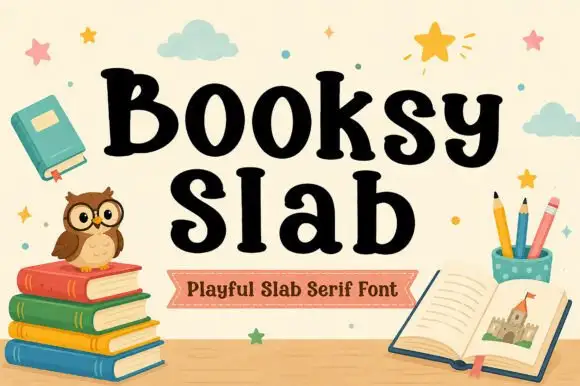
Soft heavy mixed-case slabs with rounded bowls and curled terminals
Booksy Slab shows black mixed-case lettering over an illustrated reading scene, where the capital B carries a small inward curl near its upper bowl, rounded o forms sit beside a tall l and the terminals curve rather than end square, while the owl, books and stars fill the cover around the word.
Ideas for this font
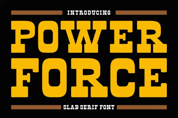
Fat slab serif with heavy rectangular serifs
Power Force is a fat slab serif in yellow on black: very heavy capitals with rectangular serifs as thick as the stems, tight fitting and short counters, framed by two thin brown rules and a small capital line.
Ideas for this font
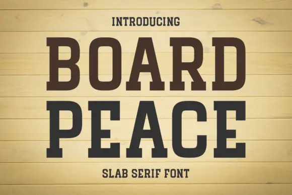
Condensed solid slabs with softly rounded rectangular bowls
Board Peace shows dark brown capitals over pale horizontal boards, where tall narrow stems end in broad rectangular feet, the B and O keep rounded rectangular counters and the R kicks outward into a fine leg.
Ideas for this font
Same independent foundry
Allow optional Google Analytics to measure visits and catalogue actions. Your search words and notes are not included. Privacy & storage



