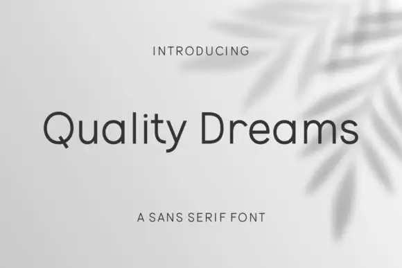
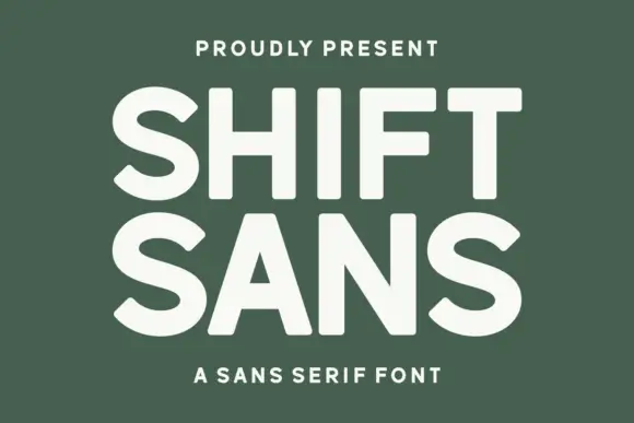
Modern Grotesque Body

Power Force + Miniplate
Creates crisp high-hierarchy contrast beneath Power Force headlines across menus, websites and labels.
Inspect Miniplate specimenDisclosure: MakerFileHub may earn a commission from qualifying purchases via paid links on this page. How our links work.
Fat slab serif with heavy rectangular serifs
Power Force is a fat slab serif in yellow on black: very heavy capitals with rectangular serifs as thick as the stems, tight fitting and short counters, framed by two thin brown rules and a small capital line.
Paid link
Get this fontProject & layout blueprintsAt-a-glance maker compatibility
Sturdy stroke walls and open counters weed cleanly on adhesive vinyl, HTV apparel film, and cut cardstock.
Visual anatomy & craft review
Two words are stacked and the face is a fat slab: the stems are extremely heavy, the serifs are rectangles as thick as the stems and only slightly wider than them, the counters are short slots, and the letters are fitted so tightly that each word reads as a single block with notches cut into it. The A and the V keep flat apexes, the R has a straight leg and the S closes into squared shoulders, so nothing about the face is rounded, and there is no contrast at all. The result is a face that holds at a distance and looks like a sign painted on a crate; the sample makes the point by placing two thin rules above and below and keeping everything else off the page. The palette is a warm yellow on black, with a muted brown for the rules. Power Force is a display face for posters, packaging, apparel and signage, and it needs capitals at a large size and a dark ground so the weight carries.
Fat, blocked, bold
Two-font hierarchy recipes
Tested contrast partners — pairing Power Force with grounded secondary typography.
Power Force + Miniplate
Creates crisp high-hierarchy contrast beneath Power Force headlines across menus, websites and labels.
Inspect Miniplate specimen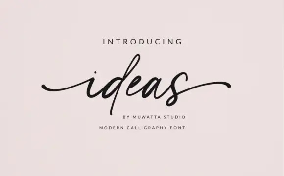
Power Force + Ideas
Adds a warm human signature touch for 1-to-3-word callouts without competing against structured serif capitals.
Inspect Ideas specimenPractical applications
Concrete hierarchy, scale and production guidance tailored to Power Force’s stroke geometry.
A fat slab reads across a field, and the yellow on black pairing is visible in poor light where a low-contrast sign disappears.
Hierarchy & layout recipe
Print a 1200 by 500 mm banner: set the fixture at 200 pt over two lines, keep 40 mm of clear ground beneath before the date at 34 pt, and hold 30 mm of border on all four sides.
Pre-production check
A very heavy face on fabric can bleed at the edges; print one section at the final size and check before the run.
A fat slab reads as industrial, and the tight fit keeps a long product code inside a small label without shrinking the type.
Hierarchy & layout recipe
Print a 45 by 25 mm label: set the brand at 9 pt on one line, keep 3 mm of clear ground beneath before the code at 4 pt, and hold 2.5 mm of margin on all four sides.
Pre-production check
A tight fit at nine points can merge letters in flexo; print one label on the real board and inspect the gaps.
A heavy slab gives a cover the weight of a printed programme, and the short counters keep the title legible at thumbnail size.
Hierarchy & layout recipe
Print a 210 by 280 mm cover: set the title at 96 pt over two lines, keep 24 mm of clear ground beneath before the coverlines at 10 pt, and hold 16 mm of margin on all four sides.
Pre-production check
A very heavy block on a busy cover will fight the photograph; keep the lower third clear and proof the page.
Technical & licence verification
Confirm included OTF/TTF/WOFF formats, full glyph tables and licence coverage on the live store page before batch production.
Closest visual alternatives
Matched across letterform anatomy, stroke behaviour and craft applications.
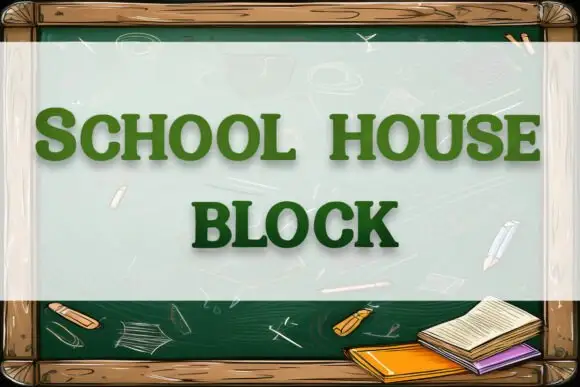
Soft rounded block slab
School House Block is a soft heavy slab in green on a chalkboard illustration: wide caps with rounded bowls and heavy square slabs, set on two lines inside a wooden frame with chalk marks and a small stack of books at the lower right.
Ideas for this font

Very heavy rounded sport slab capitals
Chicago Titans pushes slab weight to its limit: thick stems, counters narrowed to slots, wide flat feet and almost no space left between the letters of a word.
Ideas for this font
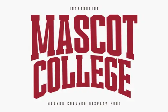
Very condensed collegiate slabs with tall stems and flat feet
Mascot College is a very condensed collegiate slab in which the stems run tall, the slabs are flat and thin and the counters close to slits, so a long name fits one line on a narrow format.
Ideas for this font

Broad angular baseball slabs with wedge serifs and a tight fit
Baseball Athlete Jersey is a broad slab capital alphabet with wedge serifs, angular bowls and a tight fit, drawn so a word reads as a sewn athletic letter rather than as a sports headline.
Ideas for this font
Same independent foundry
Allow optional Google Analytics to measure visits and catalogue actions. Your search words and notes are not included. Privacy & storage