Modern Grotesque Body

Board Peace + Limited Coffee
Creates crisp high-hierarchy contrast beneath Board Peace headlines across menus, websites and labels.
Inspect Limited Coffee specimenDisclosure: MakerFileHub may earn a commission from qualifying purchases via paid links on this page. How our links work.
Condensed solid slabs with softly rounded rectangular bowls
Board Peace shows dark brown capitals over pale horizontal boards, where tall narrow stems end in broad rectangular feet, the B and O keep rounded rectangular counters and the R kicks outward into a fine leg.
Paid link
Get this fontProject & layout blueprintsAt-a-glance maker compatibility
Fine grain and micro-texture excel in 300 DPI print, sublimation, and screen print rather than small vinyl weeding.
Visual anatomy & craft review
The stems stay tall and narrow, the feet spread wide and flat, the counters square off with softened corners and one leg breaks the block. That solid foot is the character: the word reads as a stencilled crate mark rather than a varsity face, which is why the sample sets one short uppercase line on wood. The wood grain belongs to the background, and only a short specimen is shown, so check numbers, punctuation and long headings directly and keep 34 pt as the floor.
Condensed slabs · Rounded rectangles · Solid
Two-font hierarchy recipes
Tested contrast partners — pairing Board Peace with grounded secondary typography.
Board Peace + Limited Coffee
Creates crisp high-hierarchy contrast beneath Board Peace headlines across menus, websites and labels.
Inspect Limited Coffee specimen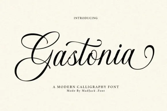
Board Peace + Gastonia Script
Adds a warm human signature touch for 1-to-3-word callouts without competing against structured serif capitals.
Inspect Gastonia Script specimenPractical applications
Concrete hierarchy, scale and production guidance tailored to Board Peace’s stroke geometry.
The solid slabs suit a crate mark, and the broad feet stay sharp at 40 mm on a branded panel, where the narrow counters keep the word compact.
Hierarchy & layout recipe
Print a 250 mm crate panel: set the word at 40 mm on one row, keep the counters at 3 mm minimum, and keep 12 mm of clear ground so the feet stay whole.
Pre-production check
The rectangular counters close under 20 mm; check the plate proof and hold the word at 34 mm or above.
The condensed slabs read across a stand, and the tall stems hold a short name at 60 pt on a painted board, where the feet carry the weight.
Hierarchy & layout recipe
Paint a 500 by 250 mm board: set the name at 60 pt on one row, keep every rectangular counter at 4 mm minimum, and keep 24 mm of border on all sides so the broad feet stay whole.
Pre-production check
A narrow counter painted at 2 mm closes; check the mask and hold the name at 52 pt or above.
The solid slabs set a craft heading, and the broad feet hold a two-word title at 46 pt on a page, where the square counters stay open.
Hierarchy & layout recipe
Print a 210 mm page: set the heading at 46 pt on one row, keep 18 mm of clear ground beneath before the standfirst at 10 pt, and keep the block inside the text column.
Pre-production check
Numbers set in a short uppercase specimen may not exist; check the file before setting a date or a price.
Technical & licence verification
Confirm included OTF/TTF/WOFF formats, full glyph tables and licence coverage on the live store page before batch production.
Closest visual alternatives
Matched across letterform anatomy, stroke behaviour and craft applications.
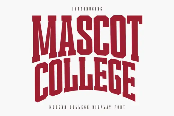
Very condensed collegiate slabs with tall stems and flat feet
Mascot College is a very condensed collegiate slab in which the stems run tall, the slabs are flat and thin and the counters close to slits, so a long name fits one line on a narrow format.
Ideas for this font

Wide geometric variable sans
Mechacore is a wide geometric sans in black on yellow: square extended letters, a flat-topped C, a stencil variant, five weights from light to bold, and an ultra-expanded width, laid out as a technical sheet with rules, labels and a barcode, so the plate reads as a system rather than a single font.
Ideas for this font

College slab with outline cut
Varsity College is a vintage college slab in cream with an outline cut on a near-black ground: heavy caps with block serifs, a high waist and narrow counters, set on two lines with tracked lines above and beneath naming the style, the outline version and the studio.
Ideas for this font
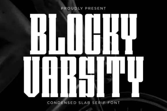
Extremely condensed straight slabs with narrow vertical counters
Blocky Varsity stacks tall white capitals on a dark fabric-like background. The stems are long and close, the O counter is a narrow vertical slot, the Y descends as an unusually long upright stem, small square feet sit at the baseline and tight row spacing emphasises height over width.
Same independent foundry
Allow optional Google Analytics to measure visits and catalogue actions. Your search words and notes are not included. Privacy & storage