Modern Grotesque Body

Famous School + Noar
Creates crisp high-hierarchy contrast beneath Famous School headlines across menus, websites and labels.
Inspect Noar specimenDisclosure: MakerFileHub may earn a commission from qualifying purchases via paid links on this page. How our links work.
Broad clean slabs with rounded bowls and small flared joins
Famous School shows white FAMOUS above yellow SCHOOL on dark charcoal, where the O bowls are broad and rounded, the M carries a deep centre, and short sturdy slab ends give the title a friendly school-sign weight with almost no variation between the two rows.
Paid link
Get this fontProject & layout blueprintsAt-a-glance maker compatibility
Sturdy stroke walls and open counters weed cleanly on adhesive vinyl, HTV apparel film, and cut cardstock.
Visual anatomy & craft review
The strokes stay heavy and even, the bowls stay broad, the slabs stay short and square and the two rows keep identical weight. That plainness is the character: the sample reads as a painted school sign rather than a decorated display face, which is why the small chalk drawings around the margins sit outside the type block. Those drawings are separate illustrations, not glyphs. Keep 40 pt so the slab ends stay distinct and check the deep M centre against a narrow column before setting a long name.
Broad clean slabs with rounded bowls and small flared joins
Two-font hierarchy recipes
Tested contrast partners — pairing Famous School with grounded secondary typography.
Famous School + Noar
Creates crisp high-hierarchy contrast beneath Famous School headlines across menus, websites and labels.
Inspect Noar specimen
Famous School + Honey and Lemon
Adds a warm human signature touch for 1-to-3-word callouts without competing against structured serif capitals.
Inspect Honey and Lemon specimenPractical applications
Concrete hierarchy, scale and production guidance tailored to Famous School’s stroke geometry.
The heavy slabs hold a school name across a shirt back, and the even weight survives a single-colour transfer without losing the slab ends.
Hierarchy & layout recipe
Print a 280 mm back panel: set the school name at 64 mm on one row, keep 14 mm between letters so the slab ends stay separate, and keep 20 mm of margin from each side seam.
Pre-production check
Slab ends merge under a heat press; check a transfer proof and keep the spacing at 12 mm or more.
The painted-sign weight reads from a path and the broad bowls keep a long institution name legible at forty paces on a wet morning.
Hierarchy & layout recipe
Print a 700 by 300 mm panel: set the school name at 56 mm on one row, keep 24 mm of clear ground beneath before the motto at 15 pt, and keep 28 mm of border so the broad bowls are not trimmed.
Pre-production check
The deep M centre fills at painted size; check the mask artwork and keep the counters at 8 mm.
The friendly slab weight suits a camp sign, where the lettering has to look sturdy rather than official and read across a field.
Hierarchy & layout recipe
Paint a 900 by 400 mm board: set the camp name at 70 mm across two rows with 26 mm between baselines, keep 30 mm of clear ground beneath before the dates at 18 pt, and keep 34 mm of border.
Pre-production check
Chalk-style surroundings are separate art; check the artwork file before promising them with the type.
Technical & licence verification
Confirm included OTF/TTF/WOFF formats, full glyph tables and licence coverage on the live store page before batch production.
Closest visual alternatives
Matched across letterform anatomy, stroke behaviour and craft applications.
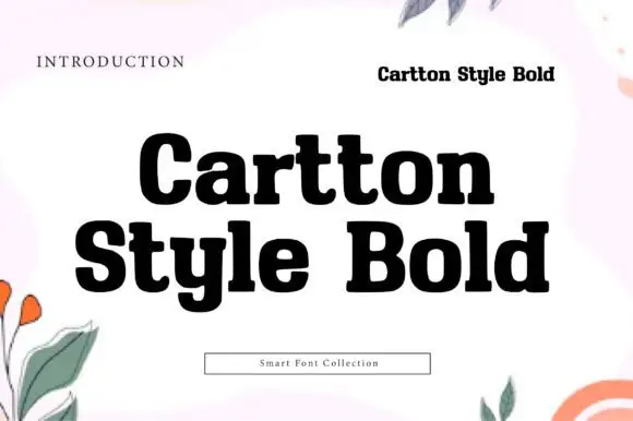
Heavy compact mixed-case slabs with rounded bowls and blunt joins
Cartton Style Bold sets a heavy slab in black on white, its serifs squared, its bowls wide and its spacing tight, so two stacked words read as a solid block of ink.
Ideas for this font

Uneven upright slabs with tipped bars and rounded joins
Jolly Tales places white capitals in two lively rows on black, where the J hooks broadly, the Y arms and several top bars tilt and the feet sit at slightly different angles, so rounded joins soften the otherwise substantial upright strokes.
Ideas for this font
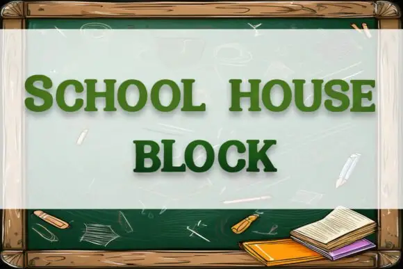
Soft rounded block slab
School House Block is a soft heavy slab in green on a chalkboard illustration: wide caps with rounded bowls and heavy square slabs, set on two lines inside a wooden frame with chalk marks and a small stack of books at the lower right.
Ideas for this font
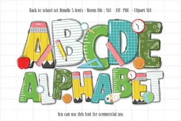
School-material block letters with pencils, rulers and chalkboard fills
Back to School Set gathers five colour fonts in which the letters are classroom supplies — a pencil A, a notebook C, a ruler D, a green alphabet with a chalkboard pattern — plus clipart of apples, balls and clocks.
Ideas for this font
Same independent foundry
Allow optional Google Analytics to measure visits and catalogue actions. Your search words and notes are not included. Privacy & storage