Modern Grotesque Body

Booksy Slab + Lemon Milk Pro FTR
Creates crisp high-hierarchy contrast beneath Booksy Slab headlines across menus, websites and labels.
Inspect Lemon Milk Pro FTR specimenDisclosure: MakerFileHub may earn a commission from qualifying purchases via paid links on this page. How our links work.
Soft heavy mixed-case slabs with rounded bowls and curled terminals
Booksy Slab shows black mixed-case lettering over an illustrated reading scene, where the capital B carries a small inward curl near its upper bowl, rounded o forms sit beside a tall l and the terminals curve rather than end square, while the owl, books and stars fill the cover around the word.
Paid link
Get this fontProject & layout blueprintsAt-a-glance maker compatibility
Sturdy stroke walls and open counters weed cleanly on adhesive vinyl, HTV apparel film, and cut cardstock.
Visual anatomy & craft review
The slabs stay soft and heavy, the bowls round, the ascenders rise tall and the terminals curl inward. That curl is the character: a reading-themed slab gains a bookish detail, which is why the sample keeps it near an illustrated shelf. The owl, clouds and pencils are cover illustration rather than part of the letters, so test the bare word, check the case mapping your lesson text needs, keep 26 pt and keep any instructions in a plain sans. The curled terminals are the fine detail: they close at about 24 pt and silt on absorbent stock, so keep 26 pt and set lesson text in a plain sans rather than this face.
Soft heavy mixed-case slabs with rounded bowls and curled terminals
Two-font hierarchy recipes
Tested contrast partners — pairing Booksy Slab with grounded secondary typography.
Booksy Slab + Lemon Milk Pro FTR
Creates crisp high-hierarchy contrast beneath Booksy Slab headlines across menus, websites and labels.
Inspect Lemon Milk Pro FTR specimen
Booksy Slab + Black Ink Brush
Adds a warm human signature touch for 1-to-3-word callouts without competing against structured serif capitals.
Inspect Black Ink Brush specimenPractical applications
Concrete hierarchy, scale and production guidance tailored to Booksy Slab’s stroke geometry.
The soft slabs suit a workbook cover, and the rounded bowls hold a two-word title at 44 pt on an A4 cover, where the curled terminals stay friendly for a young reader.
Hierarchy & layout recipe
Print an A4 workbook cover: set the title at 44 pt on one row, keep 20 mm of clear ground beneath before the grade line at 13 pt, and keep the illustration above the title so the two do not overlap.
Pre-production check
A busy illustration behind the title hides the slab feet; check the cover and keep the type on plain colour.
The soft caps read at a glance, and the mixed case holds a subject label at 22 pt on an 80 by 25 mm strip, where the rounded bowls stay clear under classroom light.
Hierarchy & layout recipe
Print an 80 by 25 mm shelf strip: set the subject at 22 pt on one row, keep 5 mm of clear ground at each end, and keep any reading level at 8 pt in a plain sans so the display face stays the label.
Pre-production check
Lesson instructions set in this face are hard to read; check the sheet and keep them in a plain sans.
The curled terminals give a card warmth, and the heavy forms hold a short greeting at 30 pt on an A6 sheet, where the rounded o keeps the tone soft.
Hierarchy & layout recipe
Print an A6 card: set the greeting at 30 pt on one row, keep 16 mm of clear ground beneath before the name at 12 pt, and keep the illustration to one small motif beside the type.
Pre-production check
Case mapping may not cover every letter you need; check the character set before writing a name.
Technical & licence verification
Confirm included OTF/TTF/WOFF formats, full glyph tables and licence coverage on the live store page before batch production.
Closest visual alternatives
Matched across letterform anatomy, stroke behaviour and craft applications.
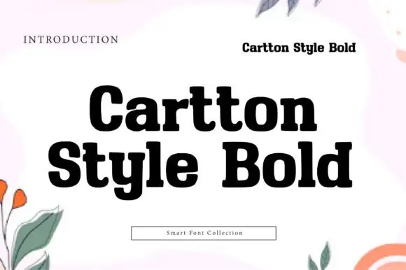
Heavy compact mixed-case slabs with rounded bowls and blunt joins
Cartton Style Bold sets a heavy slab in black on white, its serifs squared, its bowls wide and its spacing tight, so two stacked words read as a solid block of ink.
Ideas for this font
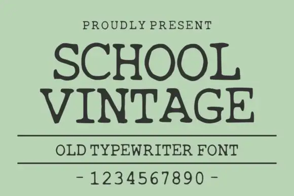
Old typewriter serif with a numeral row
School Vintage is an old typewriter serif in dark ink on sage green: slab serifs with slightly rounded feet, a moderate even stroke, wide spacing, shown with a ruled caption and a full numeral row.
Ideas for this font
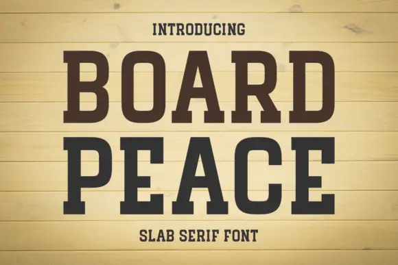
Condensed solid slabs with softly rounded rectangular bowls
Board Peace shows dark brown capitals over pale horizontal boards, where tall narrow stems end in broad rectangular feet, the B and O keep rounded rectangular counters and the R kicks outward into a fine leg.
Ideas for this font
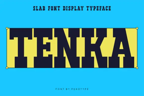
Very heavy square slab
Tenka is a very heavy square slab in dark navy on bright cyan: capitals built from wide slab blocks with tall tight counters and blunt serifs, set as one word between two corner dots inside a hairline box, with a plain line above and a credit beneath.
Ideas for this font
Same independent foundry
Allow optional Google Analytics to measure visits and catalogue actions. Your search words and notes are not included. Privacy & storage



