Editorial Serif Anchor

Card Notes + Resquel
Anchors Card Notes's fluid strokes with crisp Roman proportions on wedding suites, headers and packaging.
Inspect Resquel specimenDisclosure: MakerFileHub may earn a commission from qualifying purchases via paid links on this page. How our links work.
Light narrow separate handwriting with tall even stems
Card Notes is light narrow handwriting in which every letter stands apart, ascenders climb well above a small x-height and stems stay vertical, so a word reads as a row of thin upright strokes with generous air between them.
Paid link
Get this fontProject & layout blueprintsAt-a-glance maker compatibility
Weld or Unite overlapping script joins into one continuous vector path before sending to the blade.
Visual anatomy & craft review
Nothing connects in this face. Each letter is finished with a blunt vertical end, and the space between letters is roughly a third of the x-height, which is why a two-word title can stay airy even when it fills a card. The capital C is a narrow open crescent that starts above the cap line, the a keeps a small bowl with a short straight stem, and the d rises to the same height as the capital without a loop. The t is a plain cross with a short bar, and the s runs a tight double curve with almost no contrast. Weight is uniform and light, so the face depends on the spaces inside and between letters rather than on ink. The wavy printed rules and the line above and below are presentation; the handwriting is the two words.
Narrow · Even · Minimal
Two-font hierarchy recipes
Tested contrast partners — pairing Card Notes with grounded secondary typography.
Card Notes + Resquel
Anchors Card Notes's fluid strokes with crisp Roman proportions on wedding suites, headers and packaging.
Inspect Resquel specimen
Card Notes + Kohilo
Keeps small-scale dates, URLs, nutrition facts and care instructions crisp and legible below script titles.
Inspect Kohilo specimenPractical applications
Concrete hierarchy, scale and production guidance tailored to Card Notes’s stroke geometry.
A light even hand writes well at the size of a note card and leaves room for a real message, and because the letters do not join, the card stays legible when it is photographed for an online listing.
Hierarchy & layout recipe
Set the greeting at 12 pt on a 105 by 148 mm card, keep an unruled band of 60 mm in the middle for handwriting, and leave 12 mm at the foot for the brand mark in the same face at 7 pt.
Pre-production check
A light weight in a digital print can drop below the printer's minimum; check the proof on the actual card stock and hold the greeting at 12 pt rather than going lighter.
Separate narrow letters read as annotation rather than body text, which lets a caption sit under a photograph without competing with the image, and the even weight keeps the page calm.
Hierarchy & layout recipe
Set captions at 9 pt on a 70 mm measure under the images, keep 4 pt of leading between caption lines, and hold the body copy in a 10 pt serif so the two textures stay clearly separate.
Pre-production check
At 9 pt a light narrow hand can close its counters in offset; print one spread and check the a and e before the essay is plated.
Unconnected upright letters are the shapes early readers recognise, and the light even stroke stays readable when a label is printed small and stuck to a folder that gets handled.
Hierarchy & layout recipe
Set the group name at 18 pt on a 50 by 25 mm label, keep the teacher's name at 8 pt beneath, and leave 3 mm of margin so the label cutter never crosses the tall d and l stems.
Pre-production check
Adhesive labels on plastic folders lift at the corners; print a sheet, apply one to a real folder and check that the fine strokes survive the edge trim.
Technical & licence verification
Confirm included OTF/TTF/WOFF formats, full glyph tables and licence coverage on the live store page before batch production.
Closest visual alternatives
Matched across letterform anatomy, stroke behaviour and craft applications.
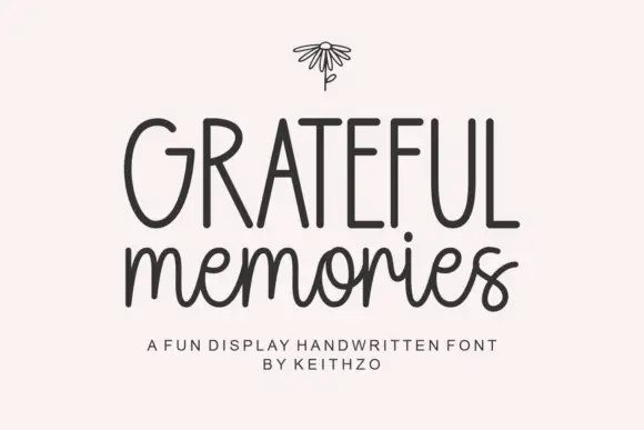
Tall handwritten capitals over a rounded script with a bouncing baseline
Grateful Memories is a handwritten display alphabet in which tall rounded capitals sit above a bouncy connected script, with even weights and fully rounded ends throughout.
Ideas for this font
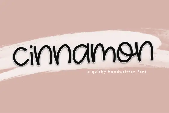
Low rounded handwriting with uneven arches and a playful tilt
Cinnamon is low rounded handwriting in which the letters squat close to the baseline, the arches vary in height and the whole word tilts a little as it goes.
Ideas for this font
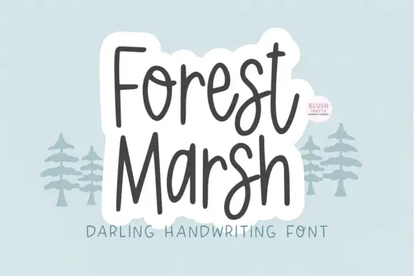
Loose upright handwriting with tall narrow frames and uneven baselines
Forest Marsh is loose upright handwriting in which the frames stay tall and narrow, the baselines drift a little and the strokes keep an even medium weight throughout.
Ideas for this font
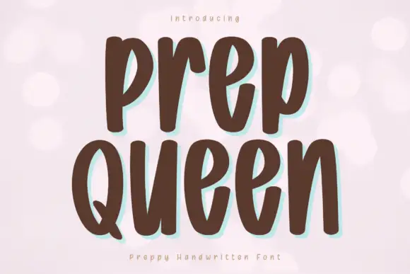
Tall heavy separate letters
Prep Queen is a tall heavy hand-drawn print in chocolate brown on pale pink: narrow letters with blunt ends, a light bounce, and a mint shadow behind each stroke.
Ideas for this font
Same independent foundry
Allow optional Google Analytics to measure visits and catalogue actions. Your search words and notes are not included. Privacy & storage