Editorial Serif Anchor

Grateful Memories + Orvelia
Anchors Grateful Memories's fluid strokes with crisp Roman proportions on wedding suites, headers and packaging.
Inspect Orvelia specimenDisclosure: MakerFileHub may earn a commission from qualifying purchases via paid links on this page. How our links work.
Tall handwritten capitals over a rounded script with a bouncing baseline
Grateful Memories is a handwritten display alphabet in which tall rounded capitals sit above a bouncy connected script, with even weights and fully rounded ends throughout.
Paid link
Get this fontProject & layout blueprintsAt-a-glance maker compatibility
Weld or Unite overlapping script joins into one continuous vector path before sending to the blade.
Visual anatomy & craft review
The capitals are narrow and tall, built from even strokes with rounded terminals: the G opens with a small straight flag, the R carries a straight leg, the A closes to a rounded apex and the E holds three even arms. Beneath them the script is smaller and rounder, its baseline rising and falling letter by letter, with wide arches on the m and the n and a final s that curls back on itself. Both halves share the same even weight and the same rounded ends, which is what makes the two lines read as one hand rather than two faces. Nothing tapers and nothing is contrasted. The thin ornamental sprig at the top and the two tracked captions are presentation; the lettering is the two words.
Tall · Rounded · Bouncy
Two-font hierarchy recipes
Tested contrast partners — pairing Grateful Memories with grounded secondary typography.
Grateful Memories + Orvelia
Anchors Grateful Memories's fluid strokes with crisp Roman proportions on wedding suites, headers and packaging.
Inspect Orvelia specimen
Grateful Memories + Bielchon
Keeps small-scale dates, URLs, nutrition facts and care instructions crisp and legible below script titles.
Inspect Bielchon specimenPractical applications
Concrete hierarchy, scale and production guidance tailored to Grateful Memories’s stroke geometry.
The warm round hand suits a personal note, and the tall capitals let a short closing line sit above a smaller message without a second typeface.
Hierarchy & layout recipe
Set the capitals at 28 pt at the head of a 105 by 148 mm card, set the message in the script at 14 pt, and leave the lower third of the card clear for handwriting.
Pre-production check
A bouncing baseline printed at 14 pt can look like a setting error; check the proof at final size and keep the drift to the ends of the line only.
The rounded hand looks written rather than printed, which suits a small ceremony where the stationery is finished by hand, and the even weight reads at a metre.
Hierarchy & layout recipe
Set the greeting at 60 mm on a 400 by 300 mm board, set the names in the script at 30 mm beneath, and leave 20 mm of margin so the tallest capital is not clipped.
Pre-production check
Hand-finished boards are often lettered last; check the board under the venue lighting and thin the layout rather than the strokes if it looks crowded.
The round hand fits a small tag and the tall capitals give a two-word greeting presence at 14 pt, which is where most handmade tags live.
Hierarchy & layout recipe
Set the greeting at 14 pt on a 35 by 70 mm tag, keep the recipient's name in the same script at 9 pt, and leave a 10 mm clear zone for the punched hole.
Pre-production check
Thin tags tear at the hole; check the die position against the artwork and move the shortest word away from the punch before printing.
Technical & licence verification
Confirm included OTF/TTF/WOFF formats, full glyph tables and licence coverage on the live store page before batch production.
Closest visual alternatives
Matched across letterform anatomy, stroke behaviour and craft applications.
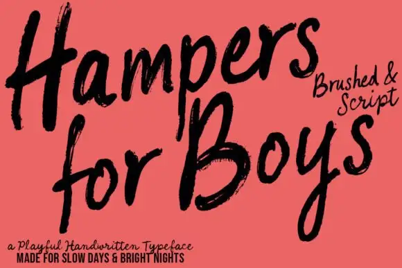
Loose brushed handwriting with slanted bodies and dry swept ends
Hampers for Boys is loose brushed handwriting in which the letters lean forward, the strokes sweep through each letter and the ends lift dry off the page.
Ideas for this font
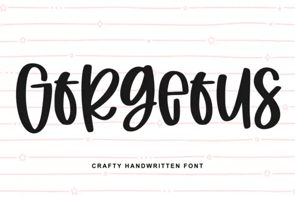
Heavy narrow handwriting with tight counters
Gorgeous is a heavy narrow handwriting that keeps a tall x-height and nearly closed counters, so a single word reads as a dense band with a lively, uneven baseline running under it.
Ideas for this font
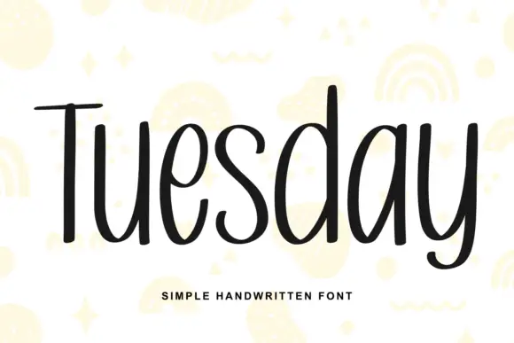
Simple unjoined handwriting with a light bounce
Tuesday is a simple handwritten face in black on white: a monoline, unjoined hand with tall ascenders, circular bowls and a slight bounce along the line, shown over pale yellow doodles of rainbows, stars and squiggles.
Ideas for this font
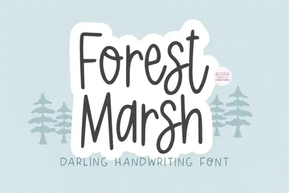
Loose upright handwriting with tall narrow frames and uneven baselines
Forest Marsh is loose upright handwriting in which the frames stay tall and narrow, the baselines drift a little and the strokes keep an even medium weight throughout.
Ideas for this font
Same independent foundry
Allow optional Google Analytics to measure visits and catalogue actions. Your search words and notes are not included. Privacy & storage



