High-Contrast Display Serif

Broad Well + Cronelo
Pairs sculptural editorial warmth with Broad Well's clean modern geometry.
Inspect Cronelo specimenDisclosure: MakerFileHub may earn a commission from qualifying purchases via paid links on this page. How our links work.
Soft substantial mixed case with circular bowls and curved feet on tall l stems
Broad Well shows pale mixed-case words over dark folded shapes. Near-even substantial strokes form rounded B bowls and open circular counters, the r ends in a small curved shoulder, the W turns softly at its lower points, and the tall l stems finish with curved right-facing feet.
Paid link
Get this fontProject & layout blueprintsAt-a-glance maker compatibility
Sturdy stroke walls and open counters weed cleanly on adhesive vinyl, HTV apparel film, and cut cardstock.
Visual anatomy & craft review
The strokes stay substantial and even, the bowls turn circular, the joins round softly and the tall stems end in curves. Those curved feet are the character: a neutral sans gains a hand-friendly finish, which is why the sample works as a short heading over dark fabric. The specimen supports a heading rather than paragraphs, so check the repeated l spacing and the W construction before a tight label, keep 18 pt as the floor and expect the wide forms to use the space.
Soft substantial mixed case with circular bowls and curved feet on tall l stems
Two-font hierarchy recipes
Tested contrast partners — pairing Broad Well with grounded secondary typography.
Broad Well + Cronelo
Pairs sculptural editorial warmth with Broad Well's clean modern geometry.
Inspect Cronelo specimen
Broad Well + Honey and Lemon
Introduces organic movement on pull-quotes, signatures and gift tags.
Inspect Honey and Lemon specimenPractical applications
Concrete hierarchy, scale and production guidance tailored to Broad Well’s stroke geometry.
The soft weight gives a bar of soap warmth, and the circular bowls hold a two-word name at 18 pt on a 70 by 45 mm wrap, where the curved feet stay visible at small size.
Hierarchy & layout recipe
Print a 70 by 45 mm wrap label: set the name at 18 pt on one row, keep 8 mm of clear ground beneath before the scent at 6 pt, and keep the wrap flat around the bar so the feet are not distorted.
Pre-production check
Curved feet printed under 12 pt read as a smudge; check the label proof and hold the name at 16 pt.
The rounded forms keep a note approachable, and the soft weight holds a short line at 28 pt on a folded card, where the open counters stay comfortable at reading distance.
Hierarchy & layout recipe
Print a 120 mm square folded card: set the line at 28 pt across the upper third, keep 16 mm of clear ground beneath before the signature at 12 pt, and keep 16 mm of margin all round.
Pre-production check
Two soft rows on one card flatten the rhythm; check the card and keep the signature in a lighter cut.
The circular bowls read at a glance, and the even weight holds a room label at 36 pt on an acrylic plate, where the W turns stay distinct from the doorway distance.
Hierarchy & layout recipe
Cut a 250 by 100 mm acrylic plate: set the label at 36 pt on one row, keep 14 mm of clear ground beneath before the room number at 18 pt, and keep 14 mm of margin for the fixings.
Pre-production check
The wide W printed at 24 pt crowds a narrow plate; check the artwork and open the sign to landscape.
Technical & licence verification
Confirm included OTF/TTF/WOFF formats, full glyph tables and licence coverage on the live store page before batch production.
Closest visual alternatives
Matched across letterform anatomy, stroke behaviour and craft applications.
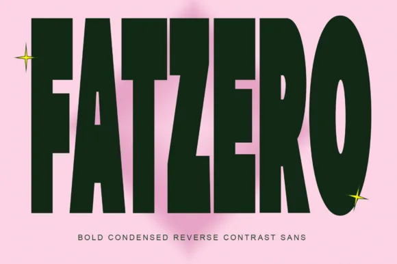
Bold condensed reverse-contrast sans with heavy bars and thin counters
Fatzero is a bold condensed reverse-contrast sans in which the horizontals run thick, the verticals thin and the counters close to slots, so a single word reads as a fashion poster rather than as a headline.
Ideas for this font

Tall distressed vintage capitals with speckled edges and tight fit
Modern Vintage is a tall capital alphabet with a distressed print texture, tight letterfit and vertical proportions, so a word reads as letterpress that has been used a hundred times.
Ideas for this font
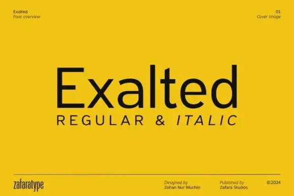
Plain upright mixed case with broad open curves and a compact t crossbar
Exalted is a neo-grotesque in the plain sense: even strokes, closed apertures, horizontal terminals and nothing decorative, set in black on a yellow field as a specimen cover.
Ideas for this font
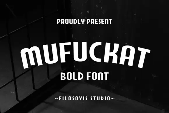
Narrow rounded bold sans
Mufuckat is a narrow rounded sans in white over a dark fence at night: tall condensed letters with softened corners, open counters and a small m, set as one word across the plate with two short tracked lines above and beneath and a studio credit at the foot.
Ideas for this font
Same independent foundry
Allow optional Google Analytics to measure visits and catalogue actions. Your search words and notes are not included. Privacy & storage