High-Contrast Display Serif

Bright Ridge + Worldstar
Pairs sculptural editorial warmth with Bright Ridge's clean modern geometry.
Inspect Worldstar specimenDisclosure: MakerFileHub may earn a commission from qualifying purchases via paid links on this page. How our links work.
Narrow contrasting mixed case with tall ascenders and a low double-storey g
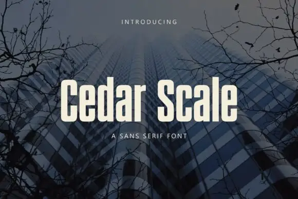
Bright Ridge sets a cream mixed-case line over a dusk photo of a curved tower, its letterforms wide with small wedge serifs, a high x-height and strokes that stay almost even from stem to join.
Paid link
Get this fontProject & layout blueprintsAt-a-glance maker compatibility
Sturdy stroke walls and open counters weed cleanly on adhesive vinyl, HTV apparel film, and cut cardstock.
Visual anatomy & craft review
The name is the only element on the cover besides two small tracked captions, one above and one below, and that leaves the letterforms to carry the image. Terminals flare very slightly into short serifs, the bowls are generous and the i and the dots sit round and high. There is almost no contrast, so the face behaves like a sans with small feet, which is why it stays readable against a busy photograph. On a dark scene the cream turns the type into the brightest object in the frame, so the picture has to be quiet where the letters sit. It is a calm, modern face that is easy to underestimate and easy to use badly at very small sizes.
Narrow contrasting mixed case with tall ascenders and a low double-storey g
Two-font hierarchy recipes
Tested contrast partners — pairing Bright Ridge with grounded secondary typography.
Bright Ridge + Worldstar
Pairs sculptural editorial warmth with Bright Ridge's clean modern geometry.
Inspect Worldstar specimen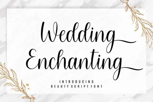
Bright Ridge + Wedding Enchanting
Introduces organic movement on pull-quotes, signatures and gift tags.
Inspect Wedding Enchanting specimenPractical applications
Concrete hierarchy, scale and production guidance tailored to Bright Ridge’s stroke geometry.
The quiet letterforms sit over a building photograph without fighting it, and the small serifs give an architectural cover a little authority.
Hierarchy & layout recipe
Print a 210 by 280 mm cover: set the cover line at 80 pt on one row, keep 20 mm of clear ground beneath before the standfirst at 11 pt, and keep 18 mm of margin from the trim.
Pre-production check
The face is pale in the sample; check contrast against your own photograph before the proof.
The wide letters carry a short building name across a facade, and the even strokes survive vinyl cutting at full sign scale.
Hierarchy & layout recipe
Print a 900 by 300 mm vinyl panel: set the name at 90 mm on one row, keep 30 mm of clear ground beneath before the suite number at 20 mm, and keep 34 mm of border so the serifs are not cut.
Pre-production check
Wedges are small at sign scale; check a physical cut test before the vinyl panel is produced.
The face feels settled rather than seasonal, which suits a cafe that changes its menu with the weather, and the wide setting keeps a short header readable.
Hierarchy & layout recipe
Print an A4 menu: set the header at 40 pt on one row, keep 14 mm of clear ground beneath before the first dish at 11 pt, and keep 16 mm of margin on both sides of the sheet.
Pre-production check
Small x-height counters fill at 9 pt; check the printed menu before setting a long dish list.
Technical & licence verification
Confirm included OTF/TTF/WOFF formats, full glyph tables and licence coverage on the live store page before batch production.
Closest visual alternatives
Matched across letterform anatomy, stroke behaviour and craft applications.
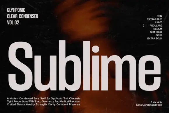
Condensed grotesque family display
Sublime is a condensed grotesque in light grey on a dark ground: tall narrow letters with sharp geometry, flat terminals, a short crossbar on the e and a straight tail on the l, presented as an eight-weight family with a sidebar of weight names and a set of descriptive lines at the foot.
Ideas for this font
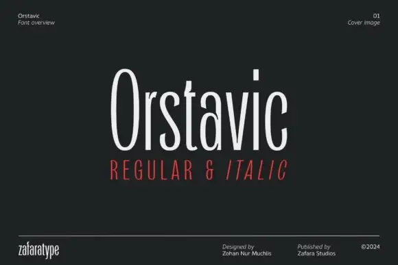
Extremely tall narrow family
Orstavic is an extremely tall narrow sans on black: mixed case with long oval bowls, a rectangular i dot and a very narrow fit, set as one line with a red line beneath that names the cuts, and a small credits row along the foot that names the designer and the studio.
Ideas for this font

Double-stroke geometric caps
Nyxar is a double-stroke geometric sans in gold on green marble: wide uppercase letters drawn with two parallel strokes, sharp mitred junctions and a flat, high waist, with oversized ghost letters floating behind and a specification strip at the foot.
Ideas for this font
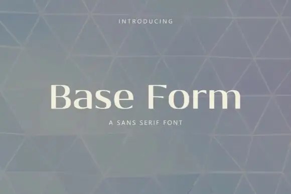
Contrast mixed case with strong upright stems and fine curved joins
Base Form is a text serif with low stroke contrast, short bracketed serifs and open counters, shown here at display size where the plainness of the skeleton is the point.
Ideas for this font
Same independent foundry
Allow optional Google Analytics to measure visits and catalogue actions. Your search words and notes are not included. Privacy & storage