High-Contrast Display Serif

Cedar Scale + Glofi
Pairs sculptural editorial warmth with Cedar Scale's clean modern geometry.
Inspect Glofi specimenDisclosure: MakerFileHub may earn a commission from qualifying purchases via paid links on this page. How our links work.
Narrow upright mixed case with squared shoulders and softened corners
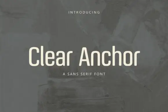
Cedar Scale sets a condensed grotesque in cream against a dusk tower, the letters narrow with a tall x-height, flat terminals and a weight that sits between regular and bold.
Paid link
Get this fontProject & layout blueprintsAt-a-glance maker compatibility
Sturdy stroke walls and open counters weed cleanly on adhesive vinyl, HTV apparel film, and cut cardstock.
Visual anatomy & craft review
The name runs as one line of mixed case, the C and the d drawing tight curves and the a keeping a small closed bowl, so the word looks built for a narrow sign rather than a page. Spacing is tight but not touching, and the ascenders reach only slightly above the cap height, which keeps the line compact and lets it fit where a wide face would not. Two tracked captions frame the word above and below, and the surrounding photograph supplies all the texture. The face is a workhorse in the best sense: it will hold a heading over photography at moderate size, and it will not draw attention to itself while doing it.
Narrow upright mixed case with squared shoulders and softened corners
Two-font hierarchy recipes
Tested contrast partners — pairing Cedar Scale with grounded secondary typography.
Cedar Scale + Glofi
Pairs sculptural editorial warmth with Cedar Scale's clean modern geometry.
Inspect Glofi specimen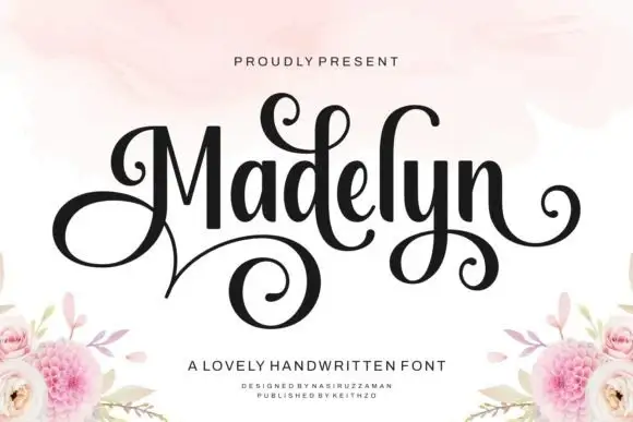
Cedar Scale + Madelyn
Introduces organic movement on pull-quotes, signatures and gift tags.
Inspect Madelyn specimenPractical applications
Concrete hierarchy, scale and production guidance tailored to Cedar Scale’s stroke geometry.
The condensed letterforms fit long headlines into a narrow column, and the flat terminals stay crisp over a full-bleed photograph.
Hierarchy & layout recipe
Print a 210 by 280 mm page: set the heading at 56 pt across two lines, keep 18 mm of clear ground beneath before the standfirst at 10 pt, and keep 16 mm of margin from the text block.
Pre-production check
Tight spacing crowds at 14 pt; check the printed page before setting a long caption block.
The narrow letters suit a tall vertical sign board, and the cream on a dark ground reads through a wet evening at the gate.
Hierarchy & layout recipe
Print a 300 by 600 mm board: set the name at 56 mm on one row, keep 24 mm of clear ground beneath before the phone line at 14 mm, and keep 26 mm of border so the terminals keep their edge.
Pre-production check
Painted edges soften at this scale; check a mask proof before the sign board is cut to size.
A condensed heading fits a slim bottle label, and the even weight keeps a short product name bold without crowding the wrap.
Hierarchy & layout recipe
Print a 50 by 110 mm wrap label: set the product name at 18 pt on one row, keep 9 mm of clear ground beneath before the roast note at 6 pt, and keep 6 mm of clear area at each side of the wrap.
Pre-production check
Curved stock distorts long words; check a wrapped bottle mock-up before the label print run.
Technical & licence verification
Confirm included OTF/TTF/WOFF formats, full glyph tables and licence coverage on the live store page before batch production.
Closest visual alternatives
Matched across letterform anatomy, stroke behaviour and craft applications.
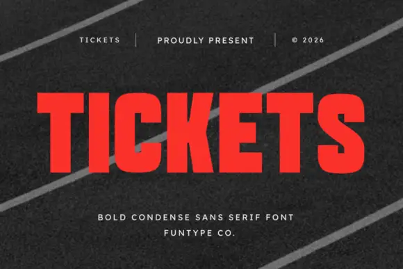
Bold condensed sans display
Tickets is a bold condensed sans in red on a dark striped ground: heavy stems, narrow counters, flat terminals and a tall x-height, set edge to edge with a tracked header and credit above and below, so the word reads as a ticket stub headline.
Ideas for this font
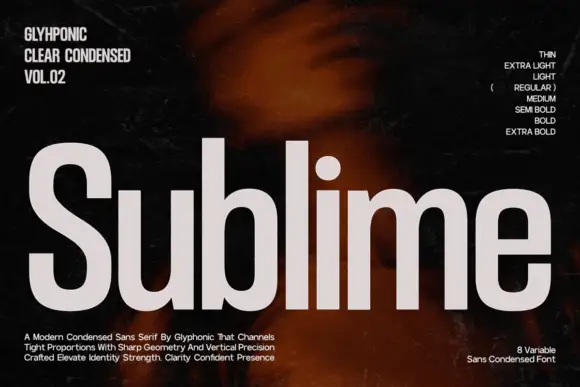
Condensed grotesque family display
Sublime is a condensed grotesque in light grey on a dark ground: tall narrow letters with sharp geometry, flat terminals, a short crossbar on the e and a straight tail on the l, presented as an eight-weight family with a sidebar of weight names and a set of descriptive lines at the foot.
Ideas for this font

Tall editorial contrast sans
Monure is a tall contrast sans in charcoal on a pale fashion portrait: mixed case with very tall letters, thick stems, fine joins and broad curved bowls, set as one word across the lower plate between three small tracked notes.
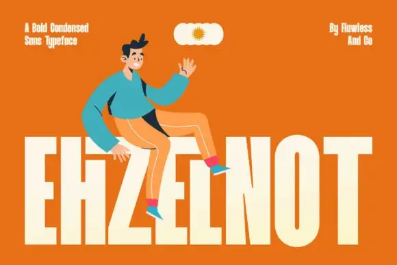
Very tall heavy capitals with narrow vertical counters and a tightly joined H area
Ehzelnot sets a bold condensed sans in cream on orange, the stems tall, the terminals flat and the letters packed tight, so a single word fills the lower half of the frame.
Same independent foundry
Allow optional Google Analytics to measure visits and catalogue actions. Your search words and notes are not included. Privacy & storage