High-Contrast Display Serif

Mufuckat + Vanielst Elegant Serif Display Stylistic
Pairs sculptural editorial warmth with Mufuckat's clean modern geometry.
Inspect Vanielst Elegant Serif Display Stylistic specimenDisclosure: MakerFileHub may earn a commission from qualifying purchases via paid links on this page. How our links work.
Narrow rounded bold sans
Mufuckat is a narrow rounded sans in white over a dark fence at night: tall condensed letters with softened corners, open counters and a small m, set as one word across the plate with two short tracked lines above and beneath and a studio credit at the foot.
Paid link
Get this fontProject & layout blueprintsAt-a-glance maker compatibility
Sturdy stroke walls and open counters weed cleanly on adhesive vinyl, HTV apparel film, and cut cardstock.
Visual anatomy & craft review
The word spans the width and the drawing is a condensed grotesque: the letters are tall, the corners are rounded rather than sharp, and the counters are open, which keeps a heavy weight looking friendly instead of aggressive. That construction is why the face works on a shirt and on a poster at the same size, and the specimen sets it as wide as the sheet allows to show the full alphabet width in one line. The dark photograph of a fence gives the white maximum contrast, which is the honest test for a face that will be used on signage and apparel. The two short lines above and beneath are set in the same family at a fraction of the size, and the studio credit is tracked and small.
Sans serif, bold, condensed, urban
Two-font hierarchy recipes
Tested contrast partners — pairing Mufuckat with grounded secondary typography.
Mufuckat + Vanielst Elegant Serif Display Stylistic
Pairs sculptural editorial warmth with Mufuckat's clean modern geometry.
Inspect Vanielst Elegant Serif Display Stylistic specimen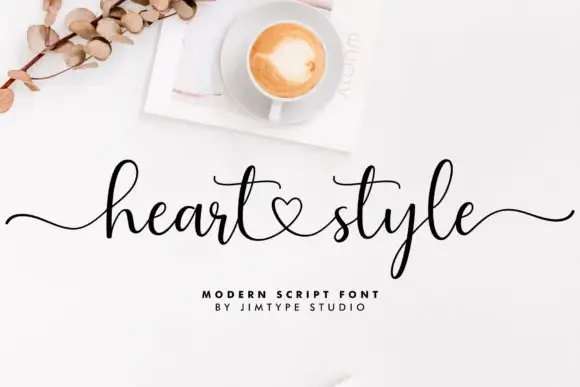
Mufuckat + Heart Style
Introduces organic movement on pull-quotes, signatures and gift tags.
Inspect Heart Style specimenPractical applications
Concrete hierarchy, scale and production guidance tailored to Mufuckat’s stroke geometry.
A condensed bold sans reads as a training space, and the open counters stay legible on a fascia that drivers only see from a moving car.
Hierarchy & layout recipe
Paint a 1,000 by 380 mm board: the gym at 120 mm cap height, the classes in a 22 mm sans, and a 5 mm rule. Keep 25 mm margins and paint two colours on a dark panel.
Pre-production check
Check the board at five metres, where a rounded corner can read as a chip; keep the edges even. Confirm the 22 mm classes read at two metres and that the rule clears the frame.
A condensed face sets a long fixture line in a single row, and the heavy weight still reads from the far side of a sports hall.
Hierarchy & layout recipe
A3 poster: the fixture at 80 mm cap height, the date in a 26 mm sans, and the venue at 10 mm. Keep 22 mm margins and print one colour on a light sheet with a bold rule.
Pre-production check
Check the A3 at three metres, where tight spacing can join the letters; add 2 percent tracking. Confirm the 10 mm venue reads at arm's length and that the title fits the sheet.
A condensed bold sans prints as one screen and reads as streetwear, which suits a themed celebration better than a serif.
Hierarchy & layout recipe
Print a 240 mm chest graphic: the slogan at 60 mm cap height, the year at 30 mm, and one ink on a light shirt. Keep the narrowest counter at 4 mm and place the graphic 80 mm below the collar.
Pre-production check
Check the screen at actual mesh, where a 4 mm counter can fill; open the spacing. Wash-test one shirt and confirm the letters stay legible after five cycles.
Technical & licence verification
Confirm included OTF/TTF/WOFF formats, full glyph tables and licence coverage on the live store page before batch production.
Closest visual alternatives
Matched across letterform anatomy, stroke behaviour and craft applications.
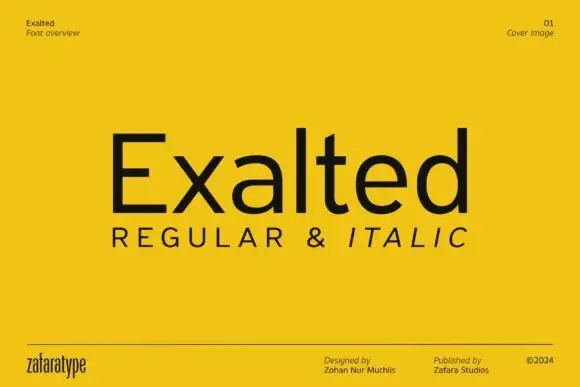
Plain upright mixed case with broad open curves and a compact t crossbar
Exalted is a neo-grotesque in the plain sense: even strokes, closed apertures, horizontal terminals and nothing decorative, set in black on a yellow field as a specimen cover.
Ideas for this font
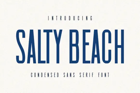
Tall narrow sans
Salty Beach is a tall narrow sans in navy on an off-white sheet: capitals with flat endings, compressed rounded bowls, a low middle bar and an even stroke, with tracked caps above and beneath that name the style.
Ideas for this font
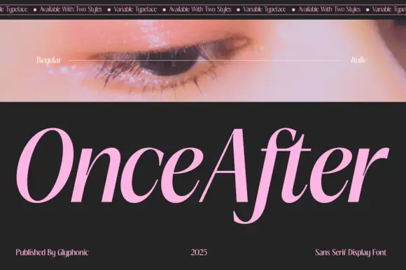
Slanted high contrast display
Once After is a slanted high contrast display in pink on black: mixed case with tall ascenders, a deep f descender, hairline joins and a forward lean, set as one word below a strip of patterned banner text and beside a photograph of an eye.
Ideas for this font
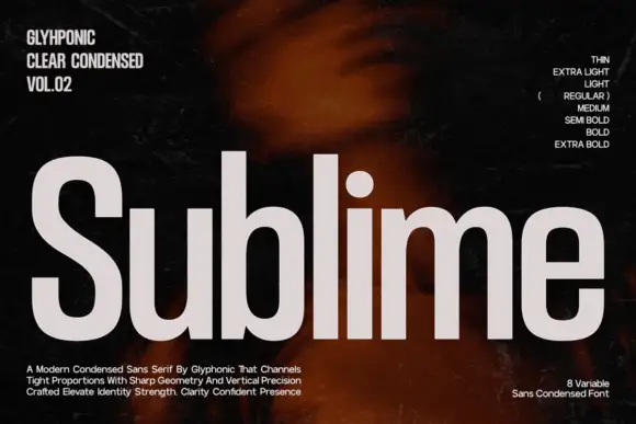
Condensed grotesque family display
Sublime is a condensed grotesque in light grey on a dark ground: tall narrow letters with sharp geometry, flat terminals, a short crossbar on the e and a straight tail on the l, presented as an eight-weight family with a sidebar of weight names and a set of descriptive lines at the foot.
Ideas for this font
Allow optional Google Analytics to measure visits and catalogue actions. Your search words and notes are not included. Privacy & storage