Modern Grotesque Body

Vintage Retro + Prime Nordic
Creates crisp high-hierarchy contrast beneath Vintage Retro headlines across menus, websites and labels.
Inspect Prime Nordic specimenDisclosure: MakerFileHub may earn a commission from qualifying purchases via paid links on this page. How our links work.
Heavy distressed slab serif
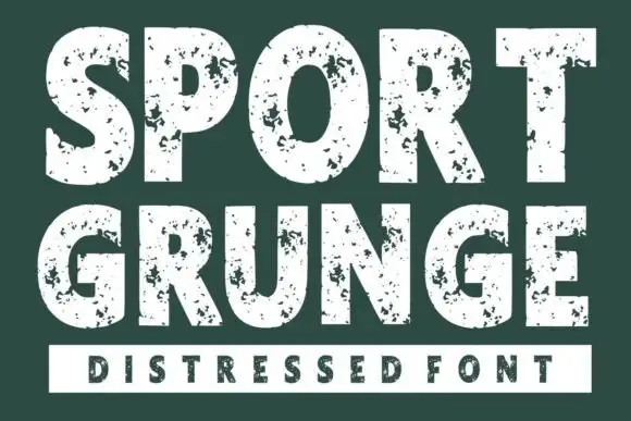
Vintage Retro is a heavy slab serif printed as a distressed cream on dark green: thick squared serifs, tight spacing, and a scatter of grit and small pinholes through the fills that reads as a worn letterpress block.
Paid link
Get this fontProject & layout blueprintsAt-a-glance maker compatibility
Fine grain and micro-texture excel in 300 DPI print, sublimation, and screen print rather than small vinyl weeding.
Visual anatomy & craft review
The two words are stacked and set almost edge to edge, with the serifs of one letter nearly touching the shoulder of the next, and the construction is a bracketed slab: thick stems, heavy horizontal serifs and short spurs on the S and the R. The wear is drawn into the glyphs rather than applied as a texture overlay, so the grit follows the stroke direction, and the pinholes sit in the thick parts where a real block would pit. Because the fills are nearly solid, the face needs generous line spacing when it is used for more than one line, which suits it to a two-word lockup and to numbers on a card rather than to running text. The ground is a flat dark green with a thin cream border drawn inside the page margin, and the small supporting lines are the same slab at a much lighter weight, which confirms the face is a display cut meant to be surrounded by air.
Worn, heavy, rustic, slab
Two-font hierarchy recipes
Tested contrast partners — pairing Vintage Retro with grounded secondary typography.
Vintage Retro + Prime Nordic
Creates crisp high-hierarchy contrast beneath Vintage Retro headlines across menus, websites and labels.
Inspect Prime Nordic specimen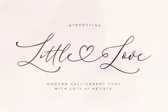
Vintage Retro + Little Love
Adds a warm human signature touch for 1-to-3-word callouts without competing against structured serif capitals.
Inspect Little Love specimenPractical applications
Concrete hierarchy, scale and production guidance tailored to Vintage Retro’s stroke geometry.
A distressed slab carries a workshop, inked-by-hand story that suits small-batch packaging, and one flat ink keeps the worn texture readable on a kraft label.
Hierarchy & layout recipe
Print a 70 by 100 mm label: the roast name at 26 pt in the distressed slab, the origin in a 7.5 pt sans beneath, and the weight in 7 pt caps at the foot. Keep 8 mm of clear kraft around the word so the pinholes read as wear rather than as dirt.
Pre-production check
Check the pinholes at print size on kraft, where a light ink over a dark ground reverses the effect and the tiny holes fill with the paper tone; proof both the positive and the reversed version. Confirm the 7.5 pt origin line survives the label's curve.
A heavy distressed slab evokes a printed sleeve from the era the record comes from, and a single word at large size gives the reissue a graphic that needs no photograph.
Hierarchy & layout recipe
Set the word at 140 pt across a 300 mm sleeve, forced to the left margin with the right edge bleeding 4 mm, and print one ink on uncoated board. Put the catalogue number in a 7 pt grotesque at the lower right, aligned to the sleeve's trim.
Pre-production check
Check the bleed at the trim: the worn edge must not eat the last letter's serif once the sleeve is cut. Confirm the 140 pt grit does not look like a printing fault at proof stage and that the catalogue number stays inside the safe area.
A worn slab reads as a hand-cut poster from an earlier decade, which sets the theme of a vintage fair faster than a date line can.
Hierarchy & layout recipe
A2 portrait: the word at 170 mm cap height stacked on two lines, cream on a dark green ground with a 6 mm inner border, and the details in a bold sans at 18 mm at the foot. Keep the two display lines at least 8 mm apart so the serifs do not collide.
Pre-production check
Check the spacing between the lines at full size: heavy slab serifs on adjacent lines will touch if the leading is tighter than a quarter of the cap height. Confirm the 18 mm details stay legible at two metres and that the border rule clears the trim.
Technical & licence verification
Confirm included OTF/TTF/WOFF formats, full glyph tables and licence coverage on the live store page before batch production.
Closest visual alternatives
Matched across letterform anatomy, stroke behaviour and craft applications.
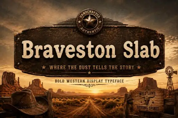
Rounded mixed-case slabs with blunt feet and irregular rustic edges
Braveston Slab is a rounded mixed-case slab in which the bowls stay heavy, the feet blunt off, the edges carry a slight unevenness and the lowercase keeps a warm width, so a title reads as a ranch sign rather than a hard Western face.
Ideas for this font
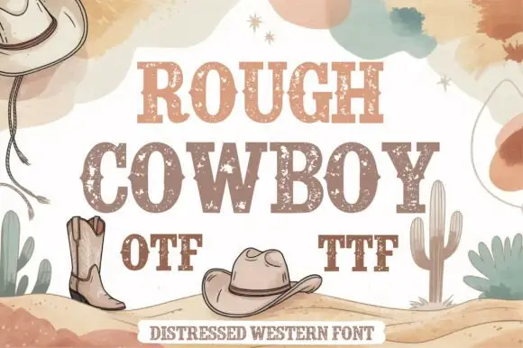
Distressed western slab in two tones
Rough Cowboy is a distressed western slab in brown and beige on cream: heavy capitals with thick flat serifs and a worn texture, printed in two tones so each letter reads as a stencil, with boots, hats, cacti and watercolour clouds around them.
Ideas for this font
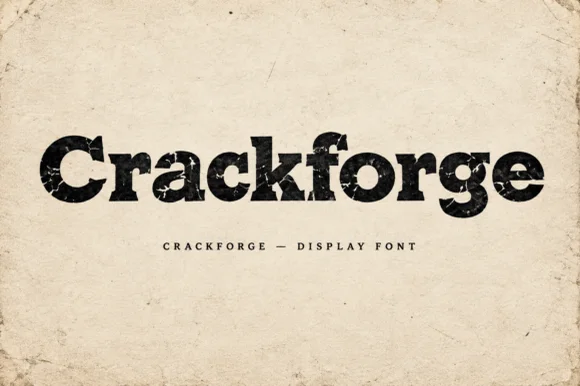
Heavy slab display with a cracked, weathered texture
Crackforge is a heavy slab display alphabet in which the stems stay thick, the serifs turn square and the surface breaks into fine cracks, so a word reads as a cast metal plate that has been outdoors for years.
Ideas for this font

Condensed western capitals with stem ornaments
Saddlewick is a condensed western slab in dark brown on leather: very tall capitals, squared serifs and small nicked ornaments cut into the stems, with a spur and a star in the counters.
Ideas for this font
Same independent foundry
Allow optional Google Analytics to measure visits and catalogue actions. Your search words and notes are not included. Privacy & storage