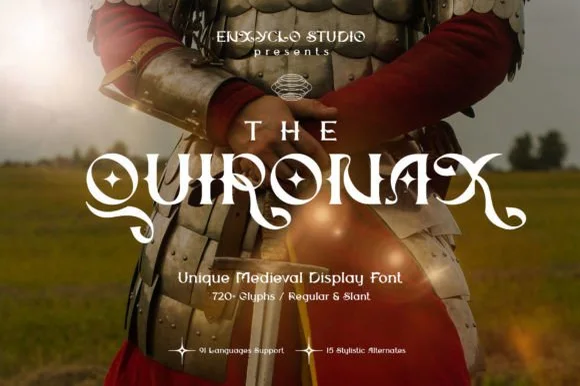
Neutral Sans Workhorse

Noskale + Bareum
Lets Noskale own the focal silhouette while handling secondary copy, sizing and subheads cleanly.
Inspect Bareum specimenDisclosure: MakerFileHub may earn a commission from qualifying purchases via paid links on this page. How our links work.
Imperfect hand-drawn marker display
Noskale is an imperfect hand-drawn display in yellow on hot pink: wobbly thick marker letters with uneven widths and heights, drawn over a vintage engraving of a polar bear, with printed corner notes in a scrawled hand.
Paid link
Get this fontProject & layout blueprintsAt-a-glance maker compatibility
Sturdy stroke walls and open counters weed cleanly on adhesive vinyl, HTV apparel film, and cut cardstock.
Visual anatomy & craft review
The word fills the lower half of the frame and the drawing refuses consistency: the N is narrow, the o is a wide oval, the k has an angular arm, and the letters sit at four different heights, so the line looks like a sign painted quickly in a window. The stroke is thick and even in weight but the outlines wobble, and the counters are irregular, which is what makes the word read as drawn rather than set. The ground is a hot pink field with a nineteenth-century engraving of a bear printed over it, and the yellow type sits on top of both, so the composition deliberately looks like a printed poster that has been marked up by hand. The corner notes are set in a scrawled caps cut and in a stamped plate, which adds to the imperfection rather than tidying it.
Hand-drawn, imperfect, loud, editorial
Two-font hierarchy recipes
Tested contrast partners — pairing Noskale with grounded secondary typography.
Noskale + Bareum
Lets Noskale own the focal silhouette while handling secondary copy, sizing and subheads cleanly.
Inspect Bareum specimen
Noskale + Mewah
Grounds bold display lettering with classic typographic authority on posters, badges and apparel.
Inspect Mewah specimenPractical applications
Concrete hierarchy, scale and production guidance tailored to Noskale’s stroke geometry.
An imperfect hand-drawn face gives a zine cover the look of a signed print, and the irregular letters let a small run feel individual rather than templated.
Hierarchy & layout recipe
Set the title at 120 mm wide on an A5 cover, the issue details in a 7 pt grotesque at the corner, and keep the engraving visible behind at 100 percent. Print two flat inks on a mid stock so the wobble reads as drawn rather than as a printing fault.
Pre-production check
Check the title at 120 mm, where a wobbly outline can look like a registration error when printed over an image; keep the type on a clear area of the engraving. Confirm the 7 pt details survive the small run and that the two inks register cleanly.
A hand-drawn marker word suits a label that wants to look like a one-off, and one ink keeps a short screen-print run affordable.
Hierarchy & layout recipe
Print a 280 mm chest graphic: the word at 90 mm cap height in one ink on a dark shirt, with the label name in a 6 mm scrawled cut beneath. Keep the letter edges at least 1 mm thick so the screen holds the wobble.
Pre-production check
Check the screen at actual mesh, where a thin wobbling edge can break into a dotted line; thicken the stroke for print. Wash-test one shirt and confirm the word still reads as hand-drawn rather than as a printing defect.
A hand-drawn imperfect display suits an improvised venue, and the loud colour pairing reads at night where a refined face would look like a corporate flyer.
Hierarchy & layout recipe
A2 portrait: the name at 150 mm wide, the line-up in a 12 mm grotesque, and the address at 10 mm. Keep the display in one bright ink on a dark ground so the wobble is the only texture, and leave 25 mm margins.
Pre-production check
Check the poster at night under street lighting, where a bright ink on dark ground can glow and blur; keep the stroke heavy. Confirm the 12 mm line-up reads at two metres and that the address line is legible from a phone photo.
Technical & licence verification
Confirm included OTF/TTF/WOFF formats, full glyph tables and licence coverage on the live store page before batch production.
Closest visual alternatives
Matched across letterform anatomy, stroke behaviour and craft applications.
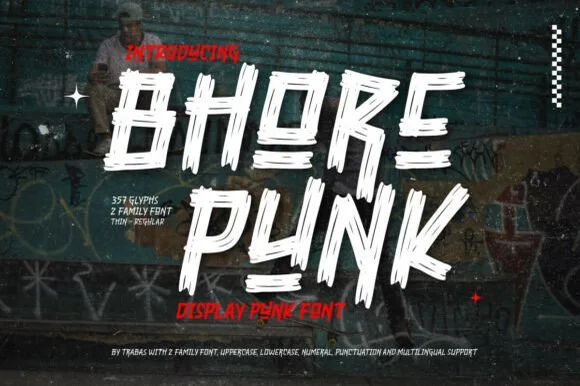
Slashed stencil-cut punk & streetwear display
Bhore Punk is a fierce, slanted punk-rock display typeface sliced through with diagonal razor-cut stencil splits and jagged dry-brush spurs.
Ideas for this font
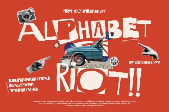
Rebellious mixed-case collage & street-poster ransom font
Alphabet Riot is a bold, gritty street-collage ransom font mixing solid hand-cut block letters with tilted cutout boxes and exclamation energy.
Ideas for this font
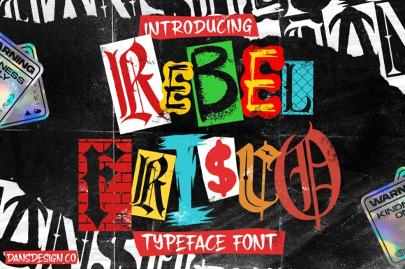
Cut-and-paste punk zine & brick-wall ransom-note alphabet
Rebel Frisco Graffiti Urban Y2k is a wild cut-out ransom-note decorative font mixing brick-wall blocks, dollar signs, blackletter, and newspaper clippings!
Ideas for this font
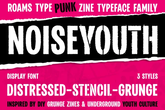
Punk zine display in three distressed styles
Noise Youth is a punk zine typeface family in white and black on magenta: tall condensed capitals shown in distressed, stencil and grunge styles, with ink bands and a caption line about DIY zines.
Ideas for this font
Same independent foundry
Allow optional Google Analytics to measure visits and catalogue actions. Your search words and notes are not included. Privacy & storage