Modern Grotesque Body

Tenka + Lemon Milk Pro FTR
Creates crisp high-hierarchy contrast beneath Tenka headlines across menus, websites and labels.
Inspect Lemon Milk Pro FTR specimenDisclosure: MakerFileHub may earn a commission from qualifying purchases via paid links on this page. How our links work.
Very heavy square slab
Tenka is a very heavy square slab in dark navy on bright cyan: capitals built from wide slab blocks with tall tight counters and blunt serifs, set as one word between two corner dots inside a hairline box, with a plain line above and a credit beneath.
Paid link
Get this fontProject & layout blueprintsAt-a-glance maker compatibility
Sturdy stroke walls and open counters weed cleanly on adhesive vinyl, HTV apparel film, and cut cardstock.
Visual anatomy & craft review
The word fills the box and the drawing is a slab at the extreme of weight: the serifs are blunt and wide, the counters are tall and narrow, and the strokes are nearly as thick as the letters are wide, so the block reads as a stencil cut from a plate. That construction sets a moderate size floor, because the tight counters close first, and the cyan ground is a useful check on the colour, because a navy on cyan is a hard pair and it works here. The hairline box and the corner dots are staging, and the two plain lines are product copy. Because the letters are heavy and square, the face suits a poster, a sign and a package where one short line has to land hard.
Slab, heavy, square, poster
Two-font hierarchy recipes
Tested contrast partners — pairing Tenka with grounded secondary typography.
Tenka + Lemon Milk Pro FTR
Creates crisp high-hierarchy contrast beneath Tenka headlines across menus, websites and labels.
Inspect Lemon Milk Pro FTR specimen
Tenka + Easy Handwriting
Adds a warm human signature touch for 1-to-3-word callouts without competing against structured serif capitals.
Inspect Easy Handwriting specimenPractical applications
Concrete hierarchy, scale and production guidance tailored to Tenka’s stroke geometry.
A heavy square slab reads as a printed bill, and the tight counters hold at distance where a lighter slab would blur. The weight holds at distance.
Hierarchy & layout recipe
A2 poster: the event at 110 mm cap height, the heats in a 22 mm slab, and the venue at 11 mm. Keep 28 mm margins and print two colours on a light stock.
Pre-production check
Check the A2 at five metres, where a tight counter can close; keep it above 5 mm. Confirm the 11 mm venue reads at two metres and that the box clears the trim.
A heavy slab gives a workshop a sign that reads as industrial, and the blunt serifs hold in vinyl on a dark window. It reads as built.
Hierarchy & layout recipe
Cut 900 by 320 mm vinyl: the workshop at 110 mm cap height, the hours in a 22 mm slab, and a 4 mm contour. Keep 22 mm margins and apply to a clean pane out of direct sun.
Pre-production check
Check the cut at 110 mm, where a 4 mm serif can tear on weeding; widen it to 6 mm. Confirm the 22 mm hours read at three metres and that the contour clears the door frame.
A heavy slab gives an annual a title that holds at thumbnail size, and the square construction suits a results-led design.
Hierarchy & layout recipe
Set the title at 95 mm cap height across 200 mm, the subtitle in a 9 pt sans, and the year at 7 pt. Print two colours on a matte stock and keep 22 mm margins at the head.
Pre-production check
Check the title at 95 mm, where a counter can fill on a matte sheet; proof it. Confirm the 7 pt year survives lamination and that the title clears the trim at both ends.
Technical & licence verification
Confirm included OTF/TTF/WOFF formats, full glyph tables and licence coverage on the live store page before batch production.
Closest visual alternatives
Matched across letterform anatomy, stroke behaviour and craft applications.
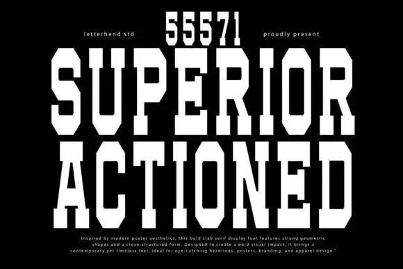
Tall geometric chamfered slab
Superior Actioned is a tall geometric slab in white on black: extremely tall caps with deep chamfers and narrow vertical counters, a full numeral row above, and a small block of description at the foot.
Ideas for this font
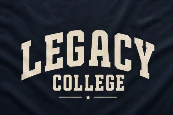
Narrow solid college capitals
Legacy College is a narrow solid college block in cream on navy heather fabric: the word is arched over a straight second line, with a rule and a star closing the composition.
Ideas for this font
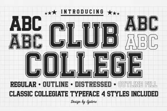
Tall collegiate blocks supplied in regular, outline, distressed and filled styles
Club College is a tall collegiate capital alphabet supplied in four treatments — regular, outline, distressed and outline fill — all built on the same squared skeleton with heavy slabs.
Ideas for this font
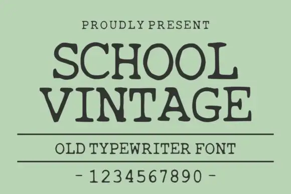
Old typewriter serif with a numeral row
School Vintage is an old typewriter serif in dark ink on sage green: slab serifs with slightly rounded feet, a moderate even stroke, wide spacing, shown with a ruled caption and a full numeral row.
Ideas for this font
Same independent foundry
Allow optional Google Analytics to measure visits and catalogue actions. Your search words and notes are not included. Privacy & storage